Graphic Design
Graphic Design
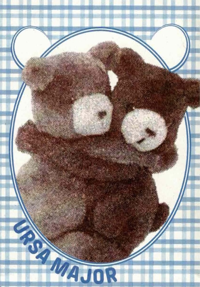
Ursa Major
Ce jeu memory invite à découvrir la symbolique de l’ours à travers l’Histoire, et plus précisément à travers l’histoire de l’ours en peluche. L’animal n’a pas toujours eu bonne réputation chez les humains. Comment un jouet à son effigie a-t-il pu devenir un emblème de l’enfance ? Le jeu se compose de 54 cartes numérotées (27 paires) et d’un poster explicatif imprimés en risographie.
This game of memory is an invitation to discover the symbolism of the bear through history, more specifically, through the history of the teddy bear. The animal didn’t always have such a good reputation among humans. How could a toy in his likeness become an emblem of childhood ? The game is made of 54 numbered cards (27 pairs), and an explanatory poster printed in risography.

Estonian Academy of Arts / EKA GD MA
to flaunt, really
“… Ever since its inception as a profession, graphic design has exhibited its necessity to make information public. Its urge to expand and to reproduce reflects its capitalist inheritance. This desire however isn’t always shared by all stories molded and articulated by the discipline.
Publishing is preceded by a series of labours, but the act itself consists just of a very instant. It is one loud shriek from the top of a hill. A toppling-over. From then on a story will tumble downhill—distribute and disseminate. However that happens, and who it reaches is an unpredictable process. Thereafter publishing enables, and sets in motion, all its future readings and retellings.
Wondering the many contradictory sensibilities contained in this process, we attempt to grasp their whys, their hows and their ifs. The following essays— written by Sunny Lei, Haron Barashed, Agathe Mathel, Alina Scharnhorst, Villem Sarapuu, Gal Šnajder, Seppe-Hazel Laeremans, Fernanda Saval and Eva Claycomb—stretch and curl in between these various registers of opening up and closing in.
Unraveling the movements, strategies, forms and intentions of publishing, this book attempts to unfold their utterances, platforms, languidities, reinterpretations, identities, tactilities, ambiguities, characters and audiences.”
—from the introduction by Seppe-Hazel Laeremans and Agathe Mathel.
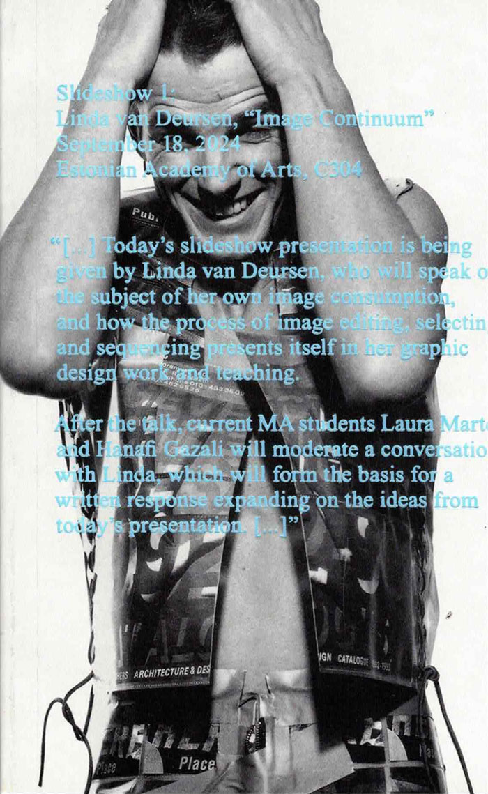
SLIDESHOW 1: LINDA VAN DEURSEN, “IMAGE CONTINUUM”
Linda van Deursen, Alexandra Margetic and 1 more
In “Image Continuum,” Linda van Deursen speaks on the subject of her own image consumption, and how the process of image editing, selecting and sequencing presents itself in her graphic design work and teaching. The book includes contributions by MA students Hanafi Gazali and Laura Martens, who further expand on the topic and ideas introduced by Linda.
This is the first volume in “Slideshow,” a new lecture-to-book series inviting graphic designers to share the research, methods, and material processes behind their applied work, positioning their practice as a site of inquiry.
The series is organized and edited by current teaching staff members Alexandra Margetic and Sean Yendrys
Published by APPLIED WORK, a new imprint within the MA Graphic Design at the Estonian Academy of Arts

A Queer Year of Love Letters
A Queer Year of Love Letters: Alphabets Against Erasure is a toolkit for writing and remembering queer and trans histories. Expanding on Nat Pyper’s series of fonts whose letterforms derive from the life stories and printed traces of countercultural queers of the last several decades, this new book showcases overlooked biographies alongside previously unseen archival materials, as well as Pyper’s unique approach to designing fonts as containers for memory.
The book debuts a new essay by Pyper, and includes contributions from Paul Soulellis, Claire Star Finch, Silas Munro, Lukaza Branfman-Verissimo, Rosen Eveleigh, and G. B. Jones that offer vital perspectives on queer archival practices, language lineages, design as protest, and love as the basis for research. Part reader, part type specimen, part love letter, these fonts foreground the politics of queer memory while opening up new avenues for writers, designers, and curious readers.
Dear writer,
A Queer Year of Love Letters is a series of fonts that remembers the lives and work of countercultural queers of the past several decades. The series aims to make the act of remembering these overlooked and illegitimate histories accessible to other people, as easy as typing. Better yet: it aims to make the act of typing an act of remembering. That these fonts might be considered typefaces is incidental. They are an attempt to improvise a clandestine lineage, an aspatial and atemporal kind of queer kinship, through the act of writing.
I began making these fonts in order to rapidly document and disseminate the work and ideas that they cite. I pack these histories, or part of them, into fonts for a couple of reasons. First, font files are durable. OpenType fonts (.OTFs) have persisted in their ubiquity since the late '90s and maintain their utility as a nimble and reliable format. Second, fonts have the capacity to contain a hefty amount of information within a tiny package. In under 100 kilobytes, an entire alphabet! In the font’s metadata, a manifesto! Fonts then function as a useful format for ferrying information from one place to another.
I am using these fonts as time machines. These machines take me back—to Robert Ford and Black gay and lesbian underground publishing in early 1990s Chicago; to the Lesbian Alliance, a socialist-feminist enclave in 1970s St. Louis, Missouri; to G.B. Jones and queer punk filmmaking in 1980s downtown Toronto—but they also take me forward to unknown futures through the act of writing itself. In use, these fonts engage the past as a provocation. They engage the past as a verb.
Is this romantic? Yes.
Love,
Nat
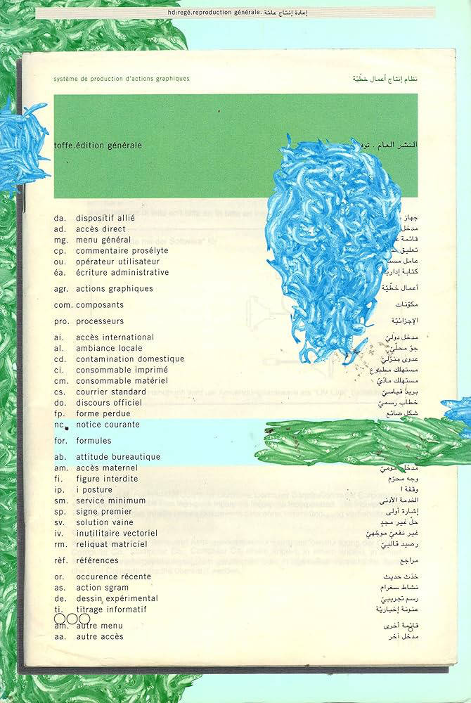
Toffe. édition générale : système de production d'actions graphiques
toffe. édition générale
publication issue de reproduction générale,
système de production d'actions graphiques
développé en trois temps :
projection générale
dispositif multi-écran, pour la chaufferie
galerie de l'école supérieure des arts décoratifs de strasbourg
du 14 février au 23 mars 2003
présentation, édition générale
école nationale supérieure des beaux-arts d'alger
du 24 mai 2003
exposition, occurrence récente
diffusion, édition générale
galerie madé, paris
du 12 mai au 5 juin 2003
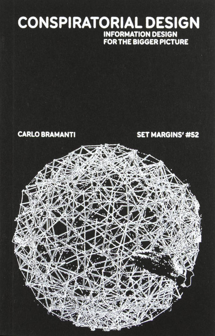
Conspiratorial Design. Information design for the bigger picture
This book deals with Design and Conspiracy Theories, two things that are often thought of as opposites. Design is generally perceived as something that simplifies and targets the essence of things; something that should say the Truth. Conspiracy theories instead are far-fetched and create confusion. Design is expected to be able to bypass false rhetorics because its very premise is to deal with how things work in reality. However, what is argued in this book is that design and conspiracy theories mirror each other. They act with similar goals and they adopt comparable representations. They intersect in their practices and in their artifacts because they share a common ground at their fundaments. This common ground is Conspiratorial Design.

Unbound
‘Unbound’ accompanies Karel Martens’ first solo exhibition at the Stedelijk Museum Amsterdam, bringing together a wide-ranging body of work Martens made and collected over the entire span of his decades long career. Containing works from the show, collaged, overprinted, and juxtaposed with elements found around his studio, the book balances between being an artist book and a catalogue. This publication, thoughtfully designed by Jordi de Vetten and Susu Lee in close collaboration with Martens himself, functions as a handbook to his work. But it’s an unconventional one: unstructured, non-hierarchical, playful, personal, and associative.
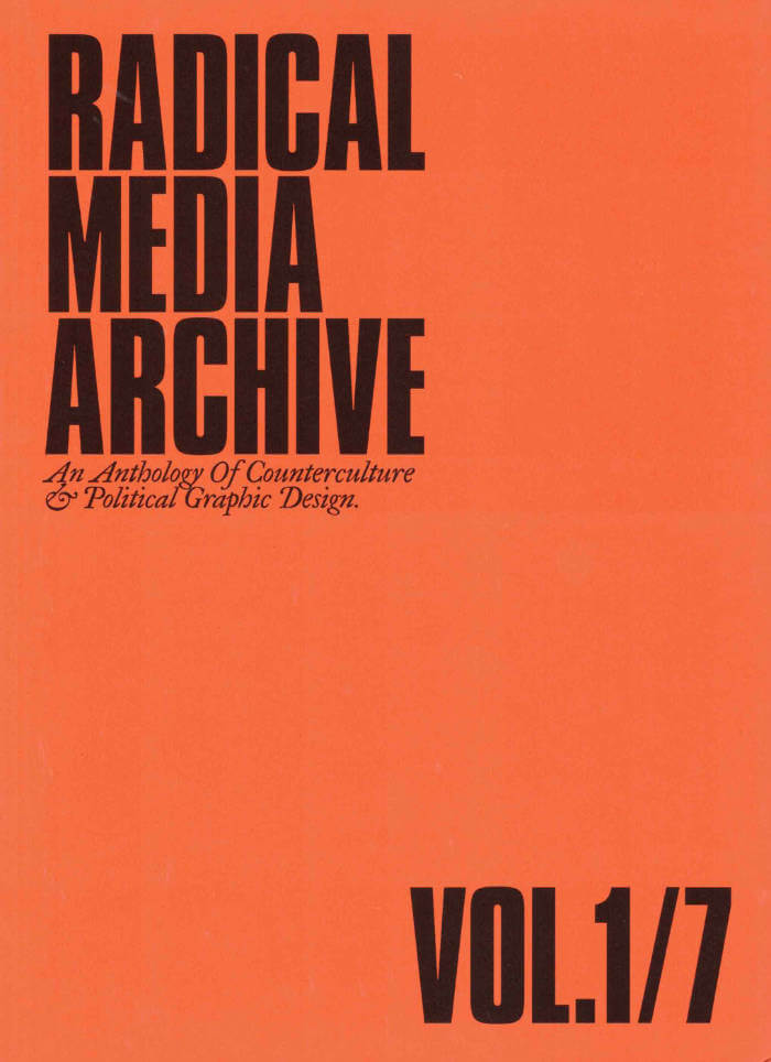
Radical Media Archive Vol 01
Ramdane Touhami, Émile Shahidi
Do you remember the last time you were looking forward to the future? We're not talking about flying cars or floating screens. We're talking about a credible vision of a better time to come. So when was the last time? How did it look? How did it feel?
Have a glance at page 223, about two-thirds in. This is a portrait of Frantz Fanon by Milton Glaser. One of the biggest names in commercial graphic design of the 20th century, painting the likeness of the giant of anti-colonial thought. Let’s leave aside the question of "who's the Milton Glaser of today?" for now, but if there was one, whose portrait would they be painting?
What we’re attempting, in these few hundred pages, is to track our favorite examples of the visual language of revolt and solidarity in the 1960s and 1970s, put them in dialogue with our most beloved works of graphic design of those decades, and celebrate the heroes who made them.
Creative currents flowing from Paris to Tokyo, Cuba to Milano, Beirut to New York, Berkeley to London, with innovations and revolutions (both political and artistic) happening every year. Causes supported by incredible talent and inspiring design that activated people, uplifted liberation movements, advanced the struggles for social justice, and created bonds of global solidarity.
Sadly this cross-pollination between commercial art and the political ended around the late 1980s and those two worlds are now completely isolated from one another.
Why do movements not produce beautiful and memorable visuals anymore? Why do the biggest image makers of today not lend their talents to the good fights that need their help? We hope that these will intersect again, and the first step is to study their history.Friends, we are here to tell you that fighting for a better world is, in fact, not only extremely cool, but the coolest thing you can do — and we have the images to prove it!
Ramdane Touhami and Émile Shahidi have spent years researching and traveling to assemble a huge collection of books, rare periodicals and radical art that will soon be available for consultation in person and online, and of which this little book is just a taste.
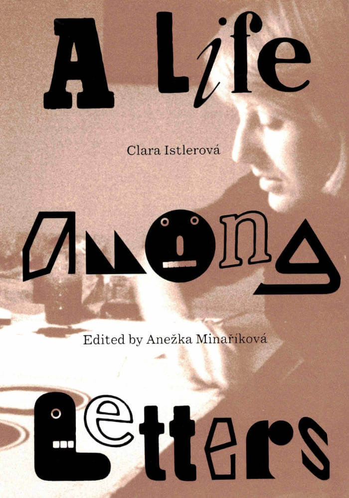
Clara Istlerová: a Life Among Letters
Anežka Minaříková, Clara Istlerová
Clara Istlerová: A Life Among Letters is the first publication in the United States to delve into the design landscape of the former Czechoslovakia through the lens of Czech designer Clara Istlerová (born 1944). A trailblazer in her field, Istlerová was one of the few women in the male-dominated field of Czech typography. This publication introduces readers to Istlerová’s renowned book designs, particularly highlighting the analog processes she utilized to create one of the most influential books on Czech architecture, Švácha, Rostislav. From Modernity to Functionalism (Odeon, 1985).
The publication features an intimate interview with Istlerová conducted by editor Anežka Minaříková, accompanied by work from Istlerová’s personal archive alongside discussions detailing her creative process. Offering a vivid portrayal of an era where design was a tangible, labor-intensive endeavor carried out in close collaboration with typesetters and printers, the publication unveils the Czech design narrative of the twentieth century to English-speaking readers, highlighting Istlerová’s lasting impact and central role.
Design by Anežka Minaříková and Marek Nedelka
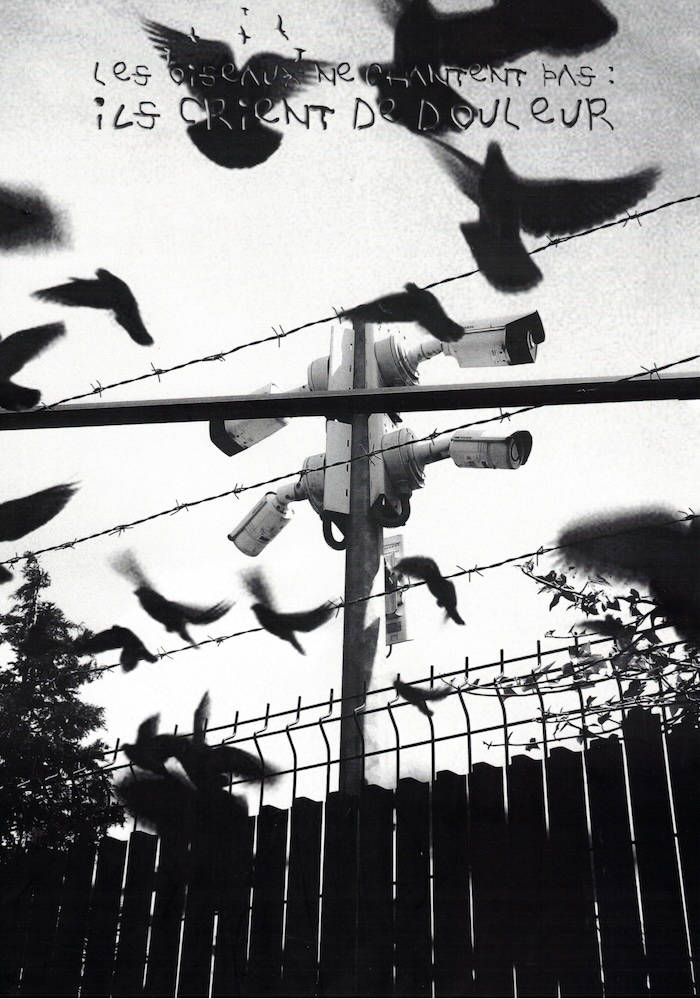
Miam 09 : Les oiseaux ne chantent pas : ils crient de douleur
4SPIKE & howawfulallanis, Alex Less, Alice Royer, Alligataure, Amelie Clicquot, Anjol, Arañada, Axel Fievet , Axelle Bourguignon, Baron & Tosma, Charlie Cooper, Charlotte Sallan Gémard, Délora Abbal, Elliott Sanchez, Erimoczi, femo, Fleur Douglas, Gaia Bergelin & Inès Camrla, Justine Bouvet, Kara, Kiara Patry, Lilian Magardeau & Elisa Grondin, Loreleï, Lucile Moreau, Manon Souza, Marie Martin Design, Mira, Migraine, Nathan Peron, Nathanael Brelin, Nomaison, Ema Tomas, Othilie Jourde Ledoux, Piquico , Rémy Bellariva, Séraphin Degroote Ferrera et Arthur Diguet, Syan Fischer, Tanikawa Sari, Vanessa Kintzel, Virginie Contier, Viviane Le Borgne, Zoé Vincent.

Handwerk
David Schatz, Philipp Herrmann and 1 more
Handwerk revives Berthold Wolpe’s early type design, originally called Wolpe Kursiv and cut in metal by Paul Koch in 1932. It first appeared in a 1936 craft symbol book featuring unique blackletter capitals. Due to persecution as a Jewish designer under the Nazi regime, Wolpe’s work faced delays and alterations and was finally released in 1952 in a modified form. Handwerk captures the original hand-lettered feel and includes stylistic sets that reference both the 1952 release and the original blackletter capitals, providing a historical perspective on Wolpe’s type design.
This Handwerk specimen is edited by Hammer (David Schatz & Sereina Rothenberger) with Philipp Herrmann and designed by Rietlanden Women’s Office. It accompanies the release of the same name font on www.outofthedark.swiss.

Designing History - Documents and the Design Imperative to Immutability
Moving beyond the usual genres of form in graphic design’s canonical history, ‘Designing History’ proposes a model centred on bureaucratic instruments of identity, ownership, value, and permission: money, passports, certificates, property deeds, etc. It considers the implications of a design history of the document, where the designer shifts from being a practitioner of conventional design histories to become subject and agency of bureaucratic authority. The book is a revised edition of ‘Immutable: Designing History’ (2022) and includes an extended essay that contextualizes the project as a remapping of graphic design’s historical, pedagogical, and practical assumptions.

Natural Enemies Of Books: A Messy History Of Women In Printing And Typography
Sara Kaaman, Maryam Fanni and 1 more
Natural Enemies of Books is a response to the groundbreaking 1937 publication 'Bookmaking on the Distaff Side', which brought together contributions by women printers, illustrators, authors, typographers, and typesetters, highlighting the print industry’s inequalities and proposing a takeover of the history of the book. Edited by feminist graphic design collective MMS, the publication includes newly commissioned essays and poems, conversations with former typesetters Inger Humlesjö, Ingegärd Waaranperä, Gail Cartmail, and Megan Downey, and reprints of the original book and other publications.

One And Many Mirrors: Perspectives On Graphic Design Education
This ambitious book brings together a wide international selection of new and recent writing by educators and practitioners who question the rules and hierarchies of graphic design education today. It holds a vivid mirror up to the ways in which graphic design is imagined, taught, received, and reproduced. Edited by two designer-educators (Brad Haylock and Luke Wood), 'One and Many Mirrors' provides an urgent overview of the field of contemporary graphic design education for all those concerned with its past, present, and possible futures.
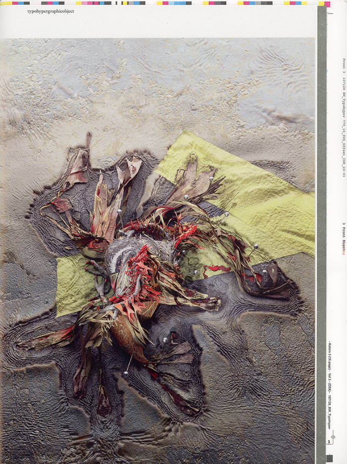
typohypergraphicobject
typohypergraphicobject is a teachable agenda for conscious graphic design.
Written, edited, designed, and published by James Langdon.
typohypergraphicobject is approximately 32×24cm, 52 pages, printed and overprinted in multiple offset and silkscreen inks on make-ready sheets and leftovers from four other books.
Produced with the technical co-operation of die Keure, Bruges; Spreedruck, Berlin; DZA, Altenburg; Kajsa Ståhl, London; OK-RM, London; and Stina Gromark, Stinsensqueeze, Paris.
Contributions from
Brad Haylock
Bryony Quinn
Caleb Klaces and Daisy Hildyard
Gilbert Again with Michael Fowler
Karl Nawrot
Sam Rolfes
Susanne Kriemann
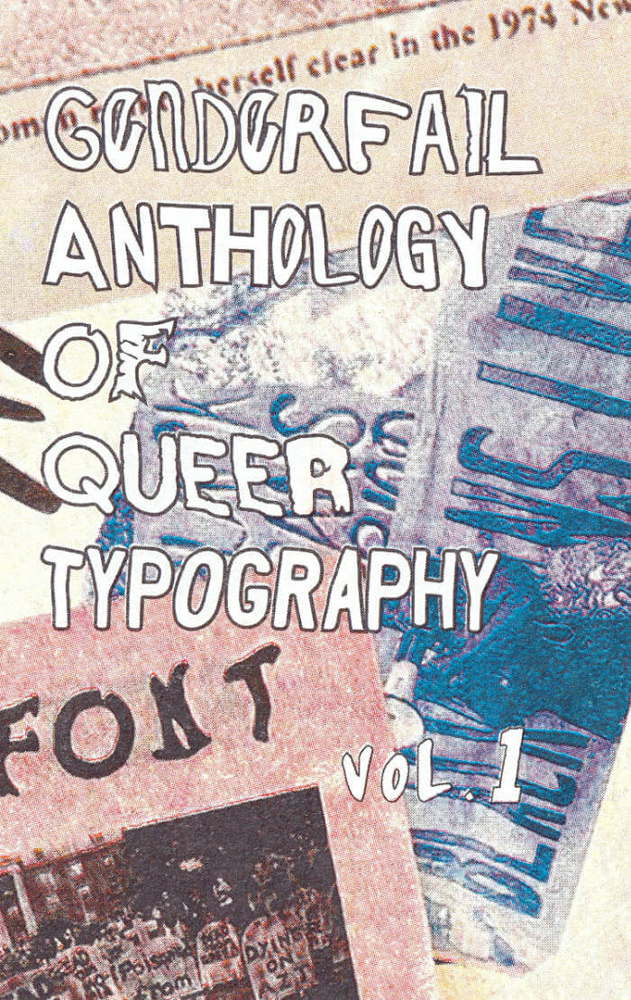
GenderFail Anthology of Queer Typography Vol.1
GenderFail Anthology of Queer Typography Vol.1 is the first volume in a series of publications, workshops, and programs exploring queer and trans exploration and experiments in typography. This first volume focuses on GenderFail's ongoing typographic series of fonts created from the hand letters of protest signs from historical and contemporary acts of resistance centering the voices of queer, trans, black, and other marginalized voices.
This first volume also features a reprinting of Paul Soulellis's What is Queer Typography? that acts as both the forward to this anthology and the series in general. Soulellis first printed this text as a fundraiser for Queer.Archive.Work to help raise urgent funds for the organization. GenderFail is humbled to be able to reprint this work and have it included as a seminal text in this anthology series exploring non-dominant modes of typographic exploration.
This third edition features a four-color risograph printed cover and new sections showing open-source examples of the fonts.
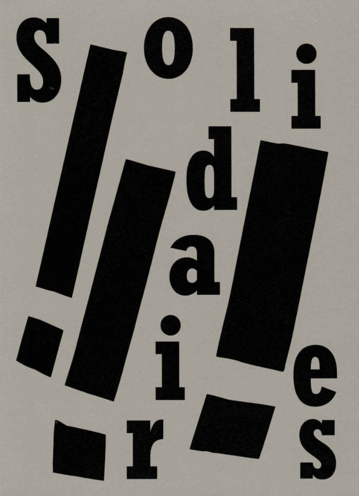
Solidaires!!!
Solidaires est un syndicat de lutte et de transformation sociale qui défend les travailleuses et travailleurs de France.
Cet ouvrage réunit une sélection de plus de 70 visuels créés par la graphiste Anaïs Enjalbert et des militant·e·s pour l'Union syndicale Solidaires.
Ce livre est une archive sélective de visuels dont les slogans accompagnent des valeurs et des pratiques émancipatrices allant du féminisme à l’antiracisme, de l’internationalisme à l’anti fascisme, de la lutte contre les lgbtphobies à celle contre le validisme. Ils soutiennent la lutte contre le capitalisme et pour les services publics.
Format 14 x 19,5 cm
Conception graphique: Magali Brueder

Estonian Academy of Arts / EKA GD MA
Typing...
The fourth in a series of publications, featuring writing by graphic design students of EKA GD MA. Typing... includes essays, scripts, translations and stories on a wide range of topics: killing vowels and milling fonts, personal knowledge management, shortcuts, tedious/careful/tiring/joyful typesetting, type of Georgianness, typing in 3rab(izi) and typing in all lowercase.
With contributions by Anna Wittenkamp Rich, Archil Tsereteli, Fa(tima)-Ezzahra El Khammas, João (Juca) Pedro Nogueira, Karthik Palepu, Laura Martens, Linnea Lindgren, Rok Ifko Kranjc.
Designed by Fatima-Ezzahra El Khammas and Laura Martens
Cover by Hanafi Gazali

Beginnings
What do we start with when telling a story — What tensions activate it — What does it promise — What do we want from it — How do we deliver it — Must it have an end — What about a story which never began — Stories we wish were told — Stories which have always been there — Stories we don’t know how to start.
Beginnings is a collective attempt at questioning protocols and forms of narration, initiated by Manon Michèle. The publication gathers textual and visual works from twenty-nine artists, writers and collectives. With two covers, ninety-six pages, and no end, the publication remains in flux, with no definitive conclusions but the shape of an ongoing question: Where do we start and where might the act of arriving lead.
There’s bodies thrusted through motion, accelerations, collapses, into the folly of life, death, borders and language. There’s following intuition, rabbits, leaders, and the shape of clouds, switching from script to script to escape latched circles and compliance. There’s braiding together clashing dimensions and vital landmarks, processing ghosts to reclaim space, feeding them to trusted spirits. There’s foreseeing new shapes, and believing in what grows. There’s the poetry of saving what can be saved and the pull of letting go. There’s so much to begin with
Contributors
Alice dos Reis, Anaïs Fontanges, Anna Bierler, Auriane Preud’homme, Bravas Graphix, Calli Uzza Layton, Clara Pasteau, Cleo Tsw, D-E-A-L, Elina Birkehag, Eliott Déchamboux, Emilie Pitoiset, Heleen Mineur, Hyo Young Chu, Josefina Anjou, Juliette Lepineau, Kimberley Cosmilla, Manon Michèle, Maria Paris, Marie-Mam Sai Bellier, Mathis Perron, Mia Trabalon, Pablo Bardinet, Pays de Glossolalie, Philip Ullman, Raphaël Massart, Sanae Oujjit, Silvana Mc Nulty, Yunie Chae
Beginnings was edited and designed by Manon Michèle and Oliver Boulton, and published by Ex. Coda, 2025.

Artistes typographes
Artistes typographes (Artists as typographers) is a visual corpus that brings together one hundred and thirty-two artists' books collected and reproduced as part of an artistic residency conducted at the Centre des livres d'artistes (Saint-Yrieix-la-Perche). This compilation of images demonstrate the interest of some figures of the art field for the substances of the book object. They show singular compositions and other typographic details: handwritten letters, character designs, stamps, logotypes.
Featuring Jean-Michel Alberola, John Baldessari, Christian Boltanski, Jean-François Bory, Broutin, Pol Bury, Philippe Cazal, Ulises Carrión, Henri Chopin, Claude Closky, Joëlle de la Casinière, herman de vries, Hamish Fulton, Jochen Gerz, Raoul Hausmann, Simone Forti, Paul-Armand Gette, Dick Higgins, Isidore Isou, Joseph Kosuth, Edmund Kuppel, La Monte Young, Pascal Le Coq, Jean Le Gac, Lefevre Jean Claude, Claude Lévêque, Mario Merz, Annette Messager, Jean-Claude Moineau, Matt Mullican, Maurizio Nannucci, Clemente Padín, Dieter Roth, Claude Rutault, Seth Siegelaub, Roman Signer, Harald Szeemann, Ernest T., Ben Vautier, Bernard Villers, Wolf Vostell, Martha Wilson...

One Shape of the Language: Cyrillic Archives
‘One Shape of the Language: Cyrillic Archives’ is an artist’s book documenting Inna Kochkina’s research into the history, style, and politics of traditional Cyrillic.
This research was born from Kochkina’s self-reflective curiosity about the relationship between cultural heritage and typography and evolved into an examination of the socio-political role of traditional Cyrillic. An ancient script, Cyrillic has been used to express various forms of cultural and territorial domination and continues to serve as an imperialist tool, having long been deployed in support of Slavic nationalism both in Russia and in the former USSR territories.
This publication is the result of Kochkina’s own research into and engagement with archives of typography, as well as conversations with anti-colonial activists, artists, and historians who interrogate traditional Cyrillic and its relationship to colonial power.
Alongside conducting scholarly research, Kochkina also produced drawings in response to archives of traditional Cyrillic. Making these drawings constituted a form of “studying by making.” With these efforts she has sought to construct an anti-colonial feminist narrative, employing both typographic artifacts and ‘patriarchal’ letterforms.
To make her drawings, Kochkina took samples from these low quality typographic archives, enlarging and transforming them into unexpected graphic shapes that were then recorded in a series of experimental prints. The drawing, collating and contact printing process that she followed allowed her to document and reveal the qualities lent to historical artifacts by digital noise. Through this working method she sought to rethink both the subject of her work as well as traditional approaches to type design practice. This book presents the prints in a roughly chronological sequence, poetically portraying Kochkina’s complex relationship with her native script. Variously precise, messy, and destructive, these works ultimately convey a series of “imaginary” shapes through which to reinterpret traditional Cyrillic of the past and present.
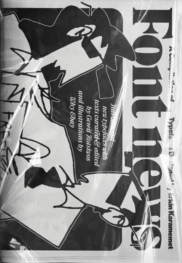
Font News
For the very first time, the newspaper Font News, published together with the supplement Font Menu, showcases the typographic work of Erkin Karamemet from his own label as printed matter. The large format of the newspaper invites the viewer to appreciate the typefaces in large, poster-like sizes. The curated texts by Gerrit Kotsivos reference pop-cultural curiosities and are further enhanced by overlaid spreads with amusing illustrations by the London-based artist Why Ebay. This limited issue, produced as a special artist edition of only 300 copies, is something for typography enthusiasts to collect, explore, and celebrate contemporary type design.

Archival Textures - Posting
Carolina Valente Pinto, Tabea Nixdorff
The book Posting brings together a selection of feminist posters from Dutch archives to reflect on posting as an activist strategy, holding the potential to create counter-publics to mainstream culture and to fight against the erasure, exoticization, or tokenism of bodies and experiences that deviate from normative preconceptions.
As is the case for many professions, in the history of Dutch graphic design the absence of women, non-binary, queer, Black designers is striking. This doesn’t only point back to systematic processes of exclusion in the first place, but also to the biases at play regarding whose work is remembered and archived. While efforts have been made to add forgotten names to the existing canon, the many posters, flyers and other printed matter shelved in queer and feminist archives remind us to question the notion of single authorship altogether and instead study graphic design as a decisively collaborative and transdisciplinary practice, which is especially true for community-led and volunteer-based projects.
The posters featured in this book point to this rich landscape of feminist organizing, and were found at the International Institute of Social History and the International Archive for the Women’s Movement (IAV-Atria) in Amsterdam.
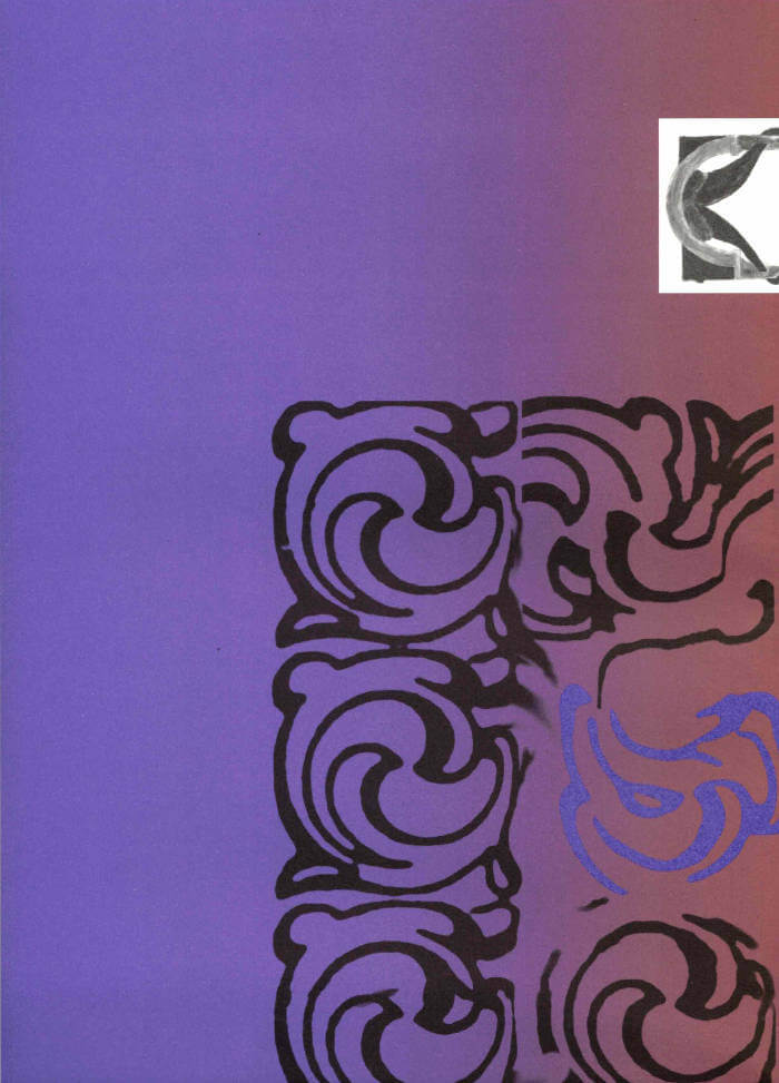
The Palace of Typographic Masonry
Ornamental Portal
The Palace of Typographic Masonry is an (imaginary) institute for the splendour and variety of visual languages. The Ornamental Portal informs the ornamental attitude of Rietlanden Women’s Office, the collective that designed this folding sheet for Von Wersin’s Kitchen. On the backside ‘The Redemptive Qualities Of Ornament’, a text by Dirk Vis, is printed. This iris printed sheet is send in a specific envelope depicting and describing the updated collection of Von Wersin's Kitchen.