rile*books

Search books

Search books by title, author, publisher, keywords...

Cover of LSD #03 – A DIY Issue

Les Presses du Reel

LSD #03 – A DIY Issue

Jean-Michel Géridan ed.

€12.00

The third issue of Le Signe Design (the Cahiers of the National Graphic Design Center) is about DIY practices and is based on the work of Gilles de Brock, graphic designer who became a ceramic tile manufacturer.

Do It Yourself practices are not, as is commonly assumed, limited to home improvement, nor just a way of subverting—hacking—a given social and political organization. They are also a way of looking both forward and backward, at our future and our heritage. They involve our heritage insofar as they allow constituted groups to revive past knowledge and skills threatened with extinction. They look forward in that they make it possible to create tools that do not yet exist but could.

The applications of the Do It Yourself approach range from niche practices to everything everywhere, and what they have in common is that they are always in opposition to the mass market. Some examples of this extremely diversified movement include self-publishing, cosplay, biotechnology, hacking (especially in the sense of programming), and producing digital artworks and music. Its most mediatized (and often romanticized) contemporary manifestation is what are called fablabs, but this term is too limited to cover the phenomenon in all its vast variety.

The roots of the DIY movement go back to the magazines Popular Mechanics(1902) and Mechanix Illustrated (1928), popular education publications meant for readers in small towns and the countryside who needed to be self-reliant and repair broken manufactured items rather than buying new ones. The late 1960s saw the emergence of movements motivated by environmental concerns and a distrust of consumer society. Many people—like some student co-op members, hippies in North America and punks in Europe—wanted to share resources. Stewart Brand's famous Whole Earth Catalogue, subtitled "Access to tools", launched in 1968, constitutes our contemporary reference.

This issue is appearing in parallel with the solo exhibition retracing the career of Gilles de Brock, whose production is deeply infused with the DIY spirit. Yet his practice can't be reduced to the things he has actually made. It is part of the kind of knowledge-sharing economy proclaimed in Brand's counter-culture manifesto, able to go even further today thanks to the participatory and interactive Web 2.0.

Texts by Pao Lien Djie, Maya Ober, Nina Paim, Anthony Masure, Guillaume Helleu, Tereza Bettinardi, Jean-Michel Géridan.

recommendations

Cover of Dance First Think Later

Les Presses du Reel

Dance First Think Later

Olivier Kaeser

Performance €30.00

An encounter between dance and visual arts.

Dance First Think Later - The Thinking Body between Dance and Visual Arts follows on from the exhibition-festival Dance First Think Later - An Encounter between Dance and Visual Arts, presented in Geneva in summer 2020, documenting it with a wealth of iconography and enriching it with a critical, theoretical and historical perspective on the works and the project. Commissioned texts are devoted to the 22 artists, written by authors active in museums, festivals, art schools, independent critics and artists.

The biennial event Dance First Think Later explores the converging fields between dance, performance, visual arts and moving images. Arta Sperto, which is organising and producing the exhibition-festival and publishing the book, is developing a cross-disciplinary approach that combines the operating mechanisms of the visual and performing arts, and the respective characteristics of museums/art centres and theatres/festivals. This approach is motivated by the need to support artists whose cross-disciplinary practices come up against the way in which culture is still largely organised by field, whether in terms of cultural policies, institutions, funding or the media. Starting with the works themselves, the book offers food for thought on cross-disciplinary approaches to the contemporary arts.

With / around Halil Altindere, Alexandra Bachzetsis & Julia Born, Pauline Boudry & Renate Lorenz, Alex Cecchetti, Clément Cogitore, Dara Friedman, Gerard & Kelly, Marie-Caroline Hominal, Lenio Kaklea, La Ribot, Pierre Leguillon, Xavier Le Roy, Klara Lidén, Melanie Manchot, Olivier Mosset & Jacob Kassay, Samuel Pajand, Christodoulos Panayiotou, Alexandra Pirici, Julien Prévieux, Marinella Senatore, Gregory Stauffer, Barbara Wagner & Benjamin de Burca.

Cover of Theresa Hak Kyung Cha – Berkeley – 1968

Les Presses du Reel

Theresa Hak Kyung Cha – Berkeley – 1968

Elvan Zabunyan

Poetry €18.00

Première publication dédiée à l'œuvre singulière de l'artiste coréenne-américaine Theresa Hak Kyung Cha (1951-1982), à la croisée de la performance, de l'art conceptuel, de la vidéo et de la poésie, dont l'un des motifs principaux concerne sa représentation de l'Histoire, marquée par l'expérience de l'exil et de la migration, de la dislocation temporelle, culturelle, géographique et sociale.

Dans le courant de sa brève vie, Theresa Hak Kyung Cha a produit un travail artistique, littéraire et critique qui en fait une figure exemplaire, même si encore trop méconnue, de l'art contemporain américain. Est ici retracé ce parcours singulier qui se forge à la lumière d'une période exceptionnelle à la fois de l'histoire et de l'histoire de l'art. Theresa Hak Kyung Cha est à Berkeley en 1968, à Paris en 1976, à New York en 1980 et s'engage dans une pratique de l'art et de la pensée où sont brassés les concepts les plus novateurs des théories visuelles ou filmiques, de la philosophie, de la linguistique et de la littérature comparée. 

Theresa Hak Kyung Cha, Berkeley, 1968 est aussi une réflexion inédite sur la représentation de territoires culturels déplacés et leur rapport à la mémoire.

Historienne de l'art contemporain, Elvan Zabunyan est maître de conférences habilitée à l'université Rennes 2 et critique d'art. Ses recherches portent sur l'art nord-américain depuis les années 1960 et notamment le tournant 1970 autour des questions raciales et féministes. Elle travaille depuis le début des années 1990 sur les problématiques issues des cultural studies, des théories postcoloniales et des études de genre en cherchant à construire, grâce à ces pensées critiques, une méthodologie de l'histoire de l'art contemporain articulée autour d'une histoire culturelle, sociale et politique. Elle a publié Black is a color, une histoire de l'art africain américain (Dis Voir, 2004), co-dirigé plusieurs livres et a écrit de nombreux articles dans des ouvrages collectifs, des catalogues d'exposition et des périodiques.

Cover of Vampyroteuthis Infernalis

Les Presses du Reel

Vampyroteuthis Infernalis

Vilem Flusser

Philosophy €17.00

L'édition inédite et définitive (établie à partir des tapuscrits originaux en français) du traité fabuleux du philosophe tchéco-brésilien Vilém Flusser (1920-1991), une fiction philosophique et poétique qui, par des chemins détournés, nous confronte à la violence et à l'impasse des sociétés contemporaines.

Un monstre venu des profondeurs de l'océan, un poulpe vampire. Sa violence rappelle les nazis, ses mœurs sont libertaires et libidineuses. C'est une créature infernale, cannibale et brutale, pouvant changer de couleur à volonté, et dotée de trois pénis.
Et c'est notre cousin.

Dans cette fable fantastique, Vampyroteuthis infernalis émerge, non des abysses de l'océan, mais du plus profond de nous-mêmes pour nous tendre un miroir, nous montrer à quel point nous, les hommes, sommes ses proches parents et que nos histoires, nos sociétés, nos modes de vie ne sont, au fond, pas si différents.
Ce texte délibérément provocateur du philosophe tchéco-brésilien Vilém Flusser (1920-1991) n'est ni scientifique, ni objectif : c'est une fiction philosophique et poétique qui, par des chemins détournés, nous confronte à la violence et à l'impasse des sociétés contemporaines.

Flusser avait écrit ce texte en français (outre des versions en allemand et en portugais), et ce livre est la première édition du texte original en français. Il est accompagné des fantastiques dessins de son ami l'artiste et « zoosystémicien » français Louis Bec (1936-2018), co-auteur du livre, traduisant en images pseudo-scientifiques les chimères vampyroteuthiques.

Des essais de Marc Lenot, Élise Rigot et Florent Barrère éclairent la démarche de Flusser et de Bec.

Cover of Artistes typographes

Tombolo Press

Artistes typographes

Various

Artistes typographes (Artists as typographers) is a visual corpus that brings together one hundred and thirty-two artists' books collected and reproduced as part of an artistic residency conducted at the Centre des livres d'artistes (Saint-Yrieix-la-Perche). This compilation of images demonstrate the interest of some figures of the art field for the substances of the book object. They show singular compositions and other typographic details: handwritten letters, character designs, stamps, logotypes.

Featuring Jean-Michel Alberola, John Baldessari, Christian Boltanski, Jean-François Bory, Broutin, Pol Bury, Philippe Cazal, Ulises Carrión, Henri Chopin, Claude Closky, Joëlle de la Casinière, herman de vries, Hamish Fulton, Jochen Gerz, Raoul Hausmann, Simone Forti, Paul-Armand Gette, Dick Higgins, Isidore Isou, Joseph Kosuth, Edmund Kuppel, La Monte Young, Pascal Le Coq, Jean Le Gac, Lefevre Jean Claude, Claude Lévêque, Mario Merz, Annette Messager, Jean-Claude Moineau, Matt Mullican, Maurizio Nannucci, Clemente Padín, Dieter Roth, Claude Rutault, Seth Siegelaub, Roman Signer, Harald Szeemann, Ernest T., Ben Vautier, Bernard Villers, Wolf Vostell, Martha Wilson...

Cover of Makulatur – 2010-2016

Bom Dia Books

Makulatur – 2010-2016

Manuel Raeder

A collection of misprinted sheets originating from books designed by graphic designer Manuel Raeder: a “behind the scene” project, which documents the early stage of book production and its conventions.

Makulatur, a German word that derives from lat. maculatura “something stained”, refers to misprinted paper that is discarded at the beginning of the printing process as use- and worthless. In 2010, the graphic designer Manuel Raeder started to collect and preserve misprinted sheets of all the publications he designed not only for his own publishing house Bom Dia Boa Tarde Boa Noite but also for fellow artists and institutions.

This waste paper that shows all difficulties arising in the early stage of production—trails, testy or stains—he combined to a new volume as a compilation of maculae “stains”. Thus, he dissolved the spoiled material from the realm of invisibility and displays it to the public whereby he reveals and reflects on the conventions of a book.

Graphic designer Manuel Raeder lives and works in Berlin.

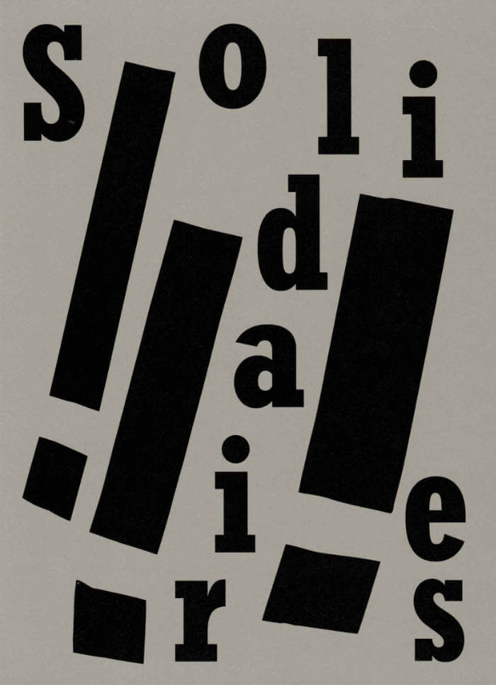
Cover of Solidaires!!!

La Mousse Éditions

Solidaires!!!

Anaïs Enjalbert

Solidaires est un syndicat de lutte et de transformation sociale qui défend les travailleuses et travailleurs de France.

Cet ouvrage réunit une sélection de plus de 70 visuels créés par la graphiste Anaïs Enjalbert et des militant·e·s pour l'Union syndicale Solidaires.
Ce livre est une archive sélective de visuels dont les slogans accompagnent des valeurs et des pratiques émancipatrices allant du féminisme à l’antiracisme, de l’internationalisme à l’anti fascisme, de la lutte contre les lgbtphobies à celle contre le validisme. Ils soutiennent la lutte contre le capitalisme et pour les services publics.

Format 14 x 19,5 cm
Conception graphique: Magali Brueder

Cover of A New Program for Graphic Design

Inventory Press

A New Program for Graphic Design

David Reinfurt

A New Program for Graphic Design is the first communication-design textbook expressly of and for the 21st century. Three courses—Typography, Gestalt and Interface—provide the foundation of this book.

Through a series of in-depth historical case studies (from Benjamin Franklin to the Macintosh computer) and assignments that progressively build in complexity, A New Program for Graphic Design serves as a practical guide both for designers and for undergraduate students coming from a range of other disciplines.

Synthesizing the pragmatic with the experimental, and drawing on the work of Max Bill, Beatrice Warde, Muriel Cooper and Stewart Brand (among many others), it builds upon mid-to-late 20th-century pedagogical models to convey contemporary design principles in an understandable form for students of all levels—treating graphic design as a liberal art that informs the dissemination of knowledge across all disciplines. For those seeking to understand and shape our increasingly networked world of information, this guide to visual literacy is an indispensable tool.

David Reinfurt (born 1971), a graphic designer, writer and educator, reestablished the Typography Studio at Princeton University and introduced the study of graphic design. Previously, he held positions at Columbia University Graduate School of Architecture, Planning and Preservation, Rhode Island School of Design and Yale University School of Art. As a cofounder of O-R-G inc. (2000), Dexter Sinister (2006) and the Serving Library (2012), Reinfurt has been involved in several studios that have reimagined graphic design, publishing and archiving in the 21st century. He was the lead designer for the New York City MTA Metrocard vending machine interface, still in use today. His work is included in the collections of the Walker Art Center, Whitney Museum of American Art, Cooper Hewitt National Design Museum and the Museum of Modern Art. He is the co-author of Muriel Cooper (MIT Press, 2017), a book about the pioneering designer.

Cover of MsHERESIES 3 — AMNIOTECHNICS

Rietlanden Women's Office

MsHERESIES 3 — AMNIOTECHNICS

Johanna Ehde, Elisabeth Rafstedt

Dedicated to the incredible – and incredibly beautiful – publication Triple Jeopardy (1971–75, by the Third World Women’s Alliance), as well as the ideas in Sophie Lewis’s book Full Surrogacy Now! – Feminism Against Family (Verso, 2019). Ms Heresies 3 is reprinting the book’s final chapter, the essay *Amniotechnics.*

Each spread weaves edited material from Triple Jeopardy with Sophie Lewis’s essay. These intuitive and meticulous compositions are the outcome of looking at Triple Jeopardy through the lens of collaborative graphic design. Reading, typesetting, collaging, painting, and ornamenting became a way of designing together while attempting an homage, a re-reading, and a cross-publication friendship.