rile*books

Search books

Search books by title, author, publisher, keywords...

Cover of Clara Istlerová: a Life Among Letters

Inventory Press

Clara Istlerová: a Life Among Letters

Anežka Minaříková ed., Clara Istlerová

€35.00

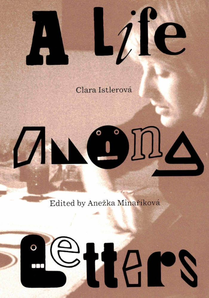
Clara Istlerová: A Life Among Letters is the first publication in the United States to delve into the design landscape of the former Czechoslovakia through the lens of Czech designer Clara Istlerová (born 1944). A trailblazer in her field, Istlerová was one of the few women in the male-dominated field of Czech typography. This publication introduces readers to Istlerová’s renowned book designs, particularly highlighting the analog processes she utilized to create one of the most influential books on Czech architecture, Švácha, Rostislav. From Modernity to Functionalism (Odeon, 1985).

The publication features an intimate interview with Istlerová conducted by editor Anežka Minaříková, accompanied by work from Istlerová’s personal archive alongside discussions detailing her creative process. Offering a vivid portrayal of an era where design was a tangible, labor-intensive endeavor carried out in close collaboration with typesetters and printers, the publication unveils the Czech design narrative of the twentieth century to English-speaking readers, highlighting Istlerová’s lasting impact and central role.

Design by Anežka Minaříková and Marek Nedelka
Published in 2025 ┊ 288 pages ┊ Language: English

recommendations

Cover of Teddy Sandoval and the Butch Gardens School of Art

Inventory Press

Teddy Sandoval and the Butch Gardens School of Art

C. Ondine Chavoya, David Evans Frantz

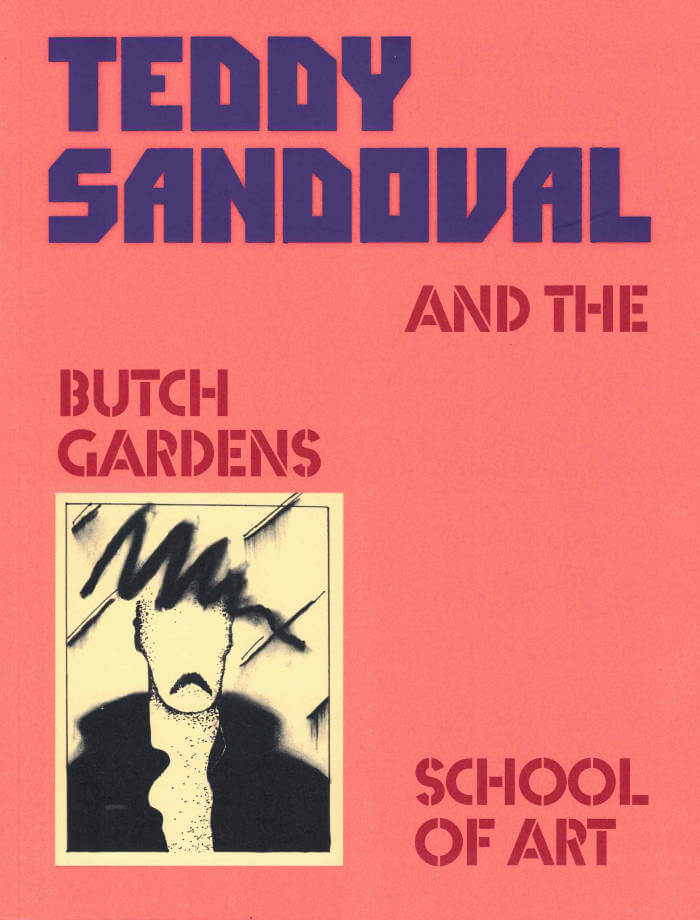
Published to accompany the artist’s first retrospective exhibition, Teddy Sandoval and the Butch Gardens School of Art examines the work of the inventive yet overlooked Teddy Sandoval, a central figure in Los Angeles’s queer and Chicanx artistic circles. Sandoval was known for producing subversive and playful artworks in a range of media that explored the codes of gender and sexuality, particularly conceptions of masculinity.

This publication surveys Sandoval’s work alongside other queer, Latinx, and Latin American artists whose practices profoundly resonate. This expansive catalogue features essays by C. Ondine Chavoya, David Evans Frantz, Raquel Gutiérrez, and Mari Rodríguez Binnie, as well as biographical entries on other artists featured in the exhibition, including Félix Ángel, Myrna Báez, Álvaro Barrios, Ester Hernández, Hudinilson Jr., Antonio Lopez, María Martínez-Cañas, Marisol, and Joey Terrill.

Design by Content Object
Co-published by Inventory Press, Williams College Museum of Art, Vincent Price Art Museum, and Independent Curators International

Cover of A New Program for Graphic Design

Inventory Press

A New Program for Graphic Design

David Reinfurt

A New Program for Graphic Design is the first communication-design textbook expressly of and for the 21st century. Three courses—Typography, Gestalt and Interface—provide the foundation of this book.

Through a series of in-depth historical case studies (from Benjamin Franklin to the Macintosh computer) and assignments that progressively build in complexity, A New Program for Graphic Design serves as a practical guide both for designers and for undergraduate students coming from a range of other disciplines.

Synthesizing the pragmatic with the experimental, and drawing on the work of Max Bill, Beatrice Warde, Muriel Cooper and Stewart Brand (among many others), it builds upon mid-to-late 20th-century pedagogical models to convey contemporary design principles in an understandable form for students of all levels—treating graphic design as a liberal art that informs the dissemination of knowledge across all disciplines. For those seeking to understand and shape our increasingly networked world of information, this guide to visual literacy is an indispensable tool.

David Reinfurt (born 1971), a graphic designer, writer and educator, reestablished the Typography Studio at Princeton University and introduced the study of graphic design. Previously, he held positions at Columbia University Graduate School of Architecture, Planning and Preservation, Rhode Island School of Design and Yale University School of Art. As a cofounder of O-R-G inc. (2000), Dexter Sinister (2006) and the Serving Library (2012), Reinfurt has been involved in several studios that have reimagined graphic design, publishing and archiving in the 21st century. He was the lead designer for the New York City MTA Metrocard vending machine interface, still in use today. His work is included in the collections of the Walker Art Center, Whitney Museum of American Art, Cooper Hewitt National Design Museum and the Museum of Modern Art. He is the co-author of Muriel Cooper (MIT Press, 2017), a book about the pioneering designer.

Cover of Image RIP: After Printing, Work & Planet Earth

Source Type

Image RIP: After Printing, Work & Planet Earth

Geoff Han

Image RIP, the first publication from Source Type, is centered around New York graphic designer Geoff Han’s investigation into the Shenzen-based printer Artron and explores subjects ranging from design, production, work, and the environment in the post-industrial economy. The book gathers essays by Danielle Aubert, David Bennewith, Geoff Han, Ming Lin, Shanzhai Lyric, David Reinfurt, Mindy Seu, and Dena Yago, and features images by Ann Woo. Image RIP reflects a consistent theme in Han’s practice of the manipulation of image reproduction, printing, production, code, and other techniques to affect the process of viewing and reading.

Cover of Designing History - Documents and the Design Imperative to Immutability

Set Margins'

Designing History - Documents and the Design Imperative to Immutability

Chris Lee

Essays €23.00

Moving beyond the usual genres of form in graphic design’s canonical history, ‘Designing History’ proposes a model centred on bureaucratic instruments of identity, ownership, value, and permission: money, passports, certificates, property deeds, etc. It considers the implications of a design history of the document, where the designer shifts from being a practitioner of conventional design histories to become subject and agency of bureaucratic authority. The book is a revised edition of ‘Immutable: Designing History’ (2022) and includes an extended essay that contextualizes the project as a remapping of graphic design’s historical, pedagogical, and practical assumptions.

Cover of Handwerk

Rollo Press

Handwerk

David Schatz, Philipp Herrmann and 1 more

Handwerk revives Berthold Wolpe’s early type design, originally called Wolpe Kursiv and cut in metal by Paul Koch in 1932. It first appeared in a 1936 craft symbol book featuring unique blackletter capitals. Due to persecution as a Jewish designer under the Nazi regime, Wolpe’s work faced delays and alterations and was finally released in 1952 in a modified form. Handwerk captures the original hand-lettered feel and includes stylistic sets that reference both the 1952 release and the original blackletter capitals, providing a historical perspective on Wolpe’s type design.

This Handwerk specimen is edited by Hammer (David Schatz & Sereina Rothenberger) with Philipp Herrmann and designed by Rietlanden Women’s Office. It accompanies the release of the same name font on www.outofthedark.swiss.

Cover of Radical Media Archive Vol 01

Permanent Files

Radical Media Archive Vol 01

Ramdane Touhami, Émile Shahidi

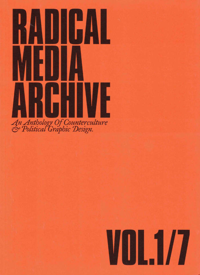
Do you remember the last time you were looking forward to the future? We're not talking about flying cars or floating screens. We're talking about a credible vision of a better time to come. So when was the last time? How did it look? How did it feel?

Have a glance at page 223, about two-thirds in. This is a portrait of Frantz Fanon by Milton Glaser. One of the biggest names in commercial graphic design of the 20th century, painting the likeness of the giant of anti-colonial thought. Let’s leave aside the question of "who's the Milton Glaser of today?" for now, but if there was one, whose portrait would they be painting?

What we’re attempting, in these few hundred pages, is to track our favorite examples of the visual language of revolt and solidarity in the 1960s and 1970s, put them in dialogue with our most beloved works of graphic design of those decades, and celebrate the heroes who made them. 
Creative currents flowing from Paris to Tokyo, Cuba to Milano, Beirut to New York, Berkeley to London, with innovations and revolutions (both political and artistic) happening every year. Causes supported by incredible talent and inspiring design that activated people, uplifted liberation movements, advanced the struggles for social justice, and created bonds of global solidarity.

Sadly this cross-pollination between commercial art and the political ended around the late 1980s and those two worlds are now completely isolated from one another.
Why do movements not produce beautiful and memorable visuals anymore? Why do the biggest image makers of today not lend their talents to the good fights that need their help? We hope that these will intersect again, and the first step is to study their history.Friends, we are here to tell you that fighting for a better world is, in fact, not only extremely cool, but the coolest thing you can do — and we have the images to prove it!

Ramdane Touhami and Émile Shahidi have spent years researching and traveling to assemble a huge collection of books, rare periodicals and radical art that will soon be available for consultation in person and online, and of which this little book is just a taste.

Cover of Unbound

Roma Publications

Unbound

Karel Martens

‘Unbound’ accompanies Karel Martens’ first solo exhibition at the Stedelijk Museum Amsterdam, bringing together a wide-ranging body of work Martens made and collected over the entire span of his decades long career. Containing works from the show, collaged, overprinted, and juxtaposed with elements found around his studio, the book balances between being an artist book and a catalogue. This publication, thoughtfully designed by Jordi de Vetten and Susu Lee in close collaboration with Martens himself, functions as a handbook to his work. But it’s an unconventional one: unstructured, non-hierarchical, playful, personal, and associative.