rile*books

Search books

Search books by title, author, publisher, keywords...

Cover of Makulatur – 2010-2016

Bom Dia Books

Makulatur – 2010-2016

Manuel Raeder

€34.00

A collection of misprinted sheets originating from books designed by graphic designer Manuel Raeder: a “behind the scene” project, which documents the early stage of book production and its conventions.

Makulatur, a German word that derives from lat. maculatura “something stained”, refers to misprinted paper that is discarded at the beginning of the printing process as use- and worthless. In 2010, the graphic designer Manuel Raeder started to collect and preserve misprinted sheets of all the publications he designed not only for his own publishing house Bom Dia Boa Tarde Boa Noite but also for fellow artists and institutions.

This waste paper that shows all difficulties arising in the early stage of production—trails, testy or stains—he combined to a new volume as a compilation of maculae “stains”. Thus, he dissolved the spoiled material from the realm of invisibility and displays it to the public whereby he reveals and reflects on the conventions of a book.

Graphic designer Manuel Raeder lives and works in Berlin.

Published in 2016 ┊ 336 pages ┊ Language: English

recommendations

Cover of Cento

Bom Dia Books

Cento

Cosima zu Knyphausen

A cento is a poem composed of verses or fragments from various literary texts that are collaged into a new one. The word comes from an ancient Latin term which means a blanket made of textile scraps.

This etymological root interweaves important aspects of Cosima zu Knyphausen's practice: the materiality of a piece of cloth—the support of the paintings—with the process of quoting, paraphrasing and appropriating art historical motifs, in order to imagine an alternative canon that is shaped by lesbian desire.

Cento brings together a selection of paintings by Cosima zu Knyphausen from the last five years. Instead of following a chronological order, the works are presented in an intertextual reading that puts them in dialogue and show the range of interests that the artist has pursued in her versatile practice, such as her variations on the motif of "women reading", Christine de Pizan's medieval feminist utopia, the interior of a Berlin queer bar, and egg shell universes.

Accompanied by an essay by Rahel Schrohe, and a poem of the artist, the pages of Cento are overarching Cosima zu Knyphausen's themes, as well as assembling the book itself as a context for the work: a mosaic, a patchwork garment, an egg.

Cover of Noa & Snow – Poem #9

Bom Dia Books

Noa & Snow – Poem #9

Alix Eynaudi

This book/catalogue is published on the occasion of the final event of Noa & Snow, a gentle experiment between the everyday and the event, at the Volkskundemuseum, Vienna.

Publication Concept Alix Eynaudi, Goda Budvytytė
Design Goda Budvytytė
Printing Robstolk, Amsterdam
Edition 600 copies
Proofreading Bella Marrin

ENVELOPE Pattern design based on the Lila Dress and its signature cording by An Breugelmans

LE VESTIAIRE
Costumes & objects An Breugelmans Tapestries & trompe-l’oeil Cécile Tonizzo Weaves Lydia McGlinchey Photos taken inside of Jason Dodge’ show Cut a Door in the Wolf at Macro Museum by Carlotta Pierleoni Photos in Vienna Samuel Feldhandler

THEM, PROTEXTIONS
Han-Gyeol Lie, Mette Edvartsen, Lydia McGlinchey, Clara Amaral, Ujjwal Kanishka Utkarsh, Jennifer Lacey, Cécile Tonizzo, Sabina Holzer, Alice Chauchat, Jason Dodge, Joachim Hamou, Quim Pujol, Litó Walkey, Serena Lee, Mihret Kebede

PUBLIC MEDITATIONS
Anne Faucheret, Elizabeth Ward, Kirsty Bell, Tony Just, Sabina Holzer, Samuel Feldhandler, Frida Robles

TEXTURAGES Paula Caspão VIGNETTES Alix Eynaudi

Poster picture of Claire Lefèvre’s Grimoire/Giant Notebook/Bison Book Rasa Juškevičiūtė

INSTITUTE OF REST(S)
Alix Eynaudi, Paula Caspão, Quim Pujol
Back side A thread for Alix Eynaudi, woven as a table placement by Genė Janušauskaitė in 1936, out of the flax she had sawn and harvested herself. Photographed by Kristien Daem in 2022, after Aldona Malašauskienė revealed the placement to her son Raimundas.

Cover of Jupiter: Andreas Sell ‘Life Performance’

Bom Dia Books

Jupiter: Andreas Sell ‘Life Performance’

Joel Mu

Performance €28.00

Jupiter is the monograph of the artist Andreas Sell by the curator Joel Mu and the outcome of their collaboration. It includes a selection of Andreas’ work of the last fifteen years, an essay in five parts by Joel and a poem by Alice Heyward. Andreas’ work often coincides with his life story, composing both a material and immaterial narration. Joel shares biographical and autobiographical stories in his writing about Andreas’ work. The narratives intertwine.

Personal experiences, memories and relationships take shape with matter, images and words trying to make sense of the world—its social conditions and politics, other people and life itself.

Jupiter is about Andreas Sell’s ‘Life Performance’ as the title of the book suggests; it explores life performance from the constant position of a foreigner, from a viewpoint on the side. Andreas and Joel reflect on identities and challenge categorization; they seek for a more inclusive sense of belonging and defend the multiplicity of oneness. Jupiter also defies categorization; it is a monograph, but also a biography, an autobiography, a catalogue, an artist book, a diary, a collective work on one person’s work. — Text by Galini Noti

Cover of Morceaux choisis – A Monograph

Bom Dia Books

Morceaux choisis – A Monograph

Saâdane Afif

Monograph €48.00

Morceaux choisis is the first seminal overview of Saâdane Afif's artistic practices. The publication features 48 exhibitions or performances organized in 28 separate sections, covering a period of 14 years.
Starting with Melancholic Beat at Museum Folkwang, Essen in 2004 and leading up to the recent exhibition Musiques pour tuyauterie, at mor charpentier, Paris in 2018, the monograph considers the format of the exhibition as Saâdane Afif's medium, through which his work takes form and can be read. 

Each one of the figuring exhibitions form an individual booklet: the pages with full color reproductions of the individual works and installation views are inserted within four additional pages providing the exhibition's title, description, details and captions. 
These 28 booklets form the body of the publication. The exhibition texts have been written by Lily Matras and Yasmine d'O. They are accompanied by an interview of Saâdane Afif by Lili Reynaud-Dewar, two critical texts by Zoë Gray and Jörn Schafaff, an index of the exhibited works and an index of Afif 's released books and records.

Saâdane Afif (born 1970 in Vendôme, France) creates installations made up of unexpected encounters between objects. These creations, of uncertain status, oscillate between function and symbol, between art and design, and provoke shifts of meaning that engage a reflection on today's industrial society.

Cover of Klosterruinenzines

Bom Dia Books

Klosterruinenzines

Anna M. Szaflarski, Christopher Weickenmeier

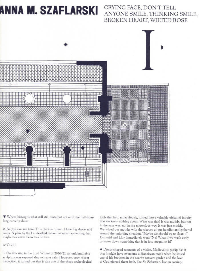
Four zines, documenting and continuing a series of four exhibitions that took place last summer, also known as the summer of 2021 at Klosterruine Berlin. Digging up what’s always already left behind, this series reframes the exhibition as an excavation site and engages archeology as a speculative and aesthetic procedure. A map, a notebook, a calendar and a dream diary, these four zines allow you to become your own archeologist.

Texts: Simone Fattal, Bassem Saad, Anna M. Szaflarski, Christopher Weickenmeier
Designer: Studio Manuel Raeder

Cover of One Shape of the Language: Cyrillic Archives

San Serriffe

One Shape of the Language: Cyrillic Archives

Inna Kochkina

‘One Shape of the Language: Cyrillic Archives’ is an artist’s book documenting Inna Kochkina’s research into the history, style, and politics of traditional Cyrillic.

This research was born from Kochkina’s self-reflective curiosity about the relationship between cultural heritage and typography and evolved into an examination of the socio-political role of traditional Cyrillic. An ancient script, Cyrillic has been used to express various forms of cultural and territorial domination and continues to serve as an imperialist tool, having long been deployed in support of Slavic nationalism both in Russia and in the former USSR territories. 

This publication is the result of Kochkina’s own research into and engagement with archives of typography, as well as conversations with anti-colonial activists, artists, and historians who interrogate traditional Cyrillic and its relationship to colonial power. 

Alongside conducting scholarly research, Kochkina also produced drawings in response to archives of traditional Cyrillic. Making these drawings constituted a form of “studying by making.” With these efforts she has sought to construct an anti-colonial feminist narrative, employing both typographic artifacts and ‘patriarchal’ letterforms.

To make her drawings, Kochkina took samples from these low quality typographic archives, enlarging and transforming them into unexpected graphic shapes that were then recorded in a series of experimental prints. The drawing, collating and contact printing process that she followed allowed her to document and reveal the qualities lent to historical artifacts by digital noise. Through this working method she sought to rethink both the subject of her work as well as traditional approaches to type design practice. This book presents the prints in a roughly chronological sequence, poetically portraying Kochkina’s complex relationship with her native script. Variously precise, messy, and destructive, these works ultimately convey a series of “imaginary” shapes through which to reinterpret traditional Cyrillic of the past and present.

Cover of MsHeresies 4 — Daffodils

Rietlanden Women's Office

MsHeresies 4 — Daffodils

Elisabeth Rafstedt, Johanna Ehde

This fourth issue of MsHeresies republishes the chapter *Daffodils* — a warped monologue about a domestic poisoning — from Rosalind Belben’s book Is Beauty Good (1989).

It is typeset alongside a collage of material from two medieval manuscripts: Isidore of Seville’s Etymologiae and De natura rerum (circa 1130–74), which was illuminated and transcribed by a group of eight nuns at the Benedictine abbey of Munsterbilzen in Maastricht; and the so called Claricia Psalter (late 12th–early 13th century) from the abbey of saints Ulrich and Afra in Augsberg, also made by a group of nuns and named after the novice Claricia who is believed to have drawn herself hanging like the tail of a drop-cap Q in the psalter section of the book.

Cover of Image RIP: After Printing, Work & Planet Earth

Source Type

Image RIP: After Printing, Work & Planet Earth

Geoff Han

Image RIP, the first publication from Source Type, is centered around New York graphic designer Geoff Han’s investigation into the Shenzen-based printer Artron and explores subjects ranging from design, production, work, and the environment in the post-industrial economy. The book gathers essays by Danielle Aubert, David Bennewith, Geoff Han, Ming Lin, Shanzhai Lyric, David Reinfurt, Mindy Seu, and Dena Yago, and features images by Ann Woo. Image RIP reflects a consistent theme in Han’s practice of the manipulation of image reproduction, printing, production, code, and other techniques to affect the process of viewing and reading.