Books
Books
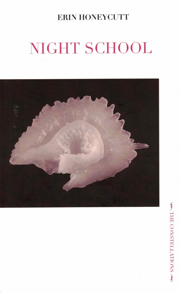
Night School
A synthesis of dreamwork and bookwork, combining collaboration with dream-vision report, creative writing, and AI—a “Media Archaeology of Dreams.” Its central character is the author’s voice in this process through ekphrasis. What/where is the separation between the ekphrastic object, the dream, and its description?
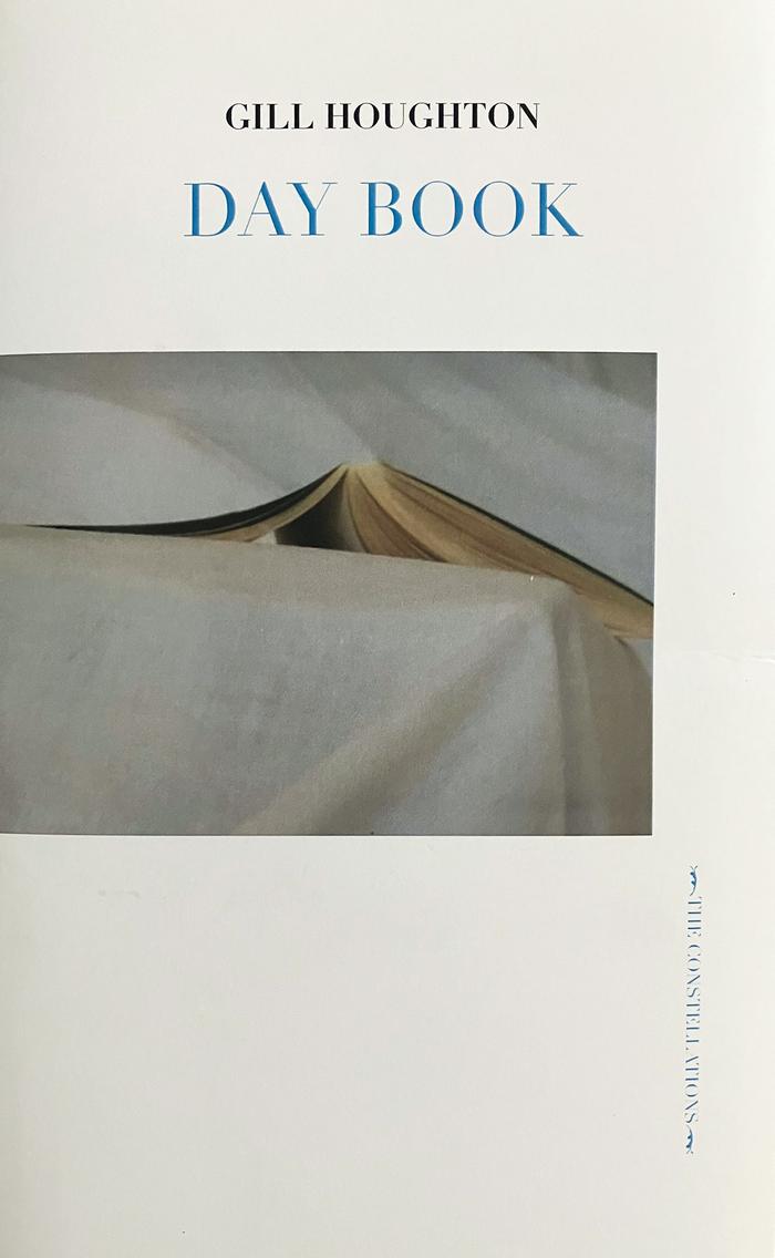
Day Book
Looking at pictures, she was reminded of the lack of time. And anyway, where did all the time go?
In Day Book a woman artist looks at time in an address to quotidian events and their unfolding. Exploring motherhood, unpaid labour, childcare, and the time of the artist, she reads the work of contemporary women filmmakers through the earlier works of filmmakers, writers, and photographers, including Chantal Akerman and Marguerite Duras, Natalia Ginzburg and Christa Wolf, Bertien van Manen and Bernadette Mayer. The inability to capture the accumulation of days emerges—a form without form, day after day after day.
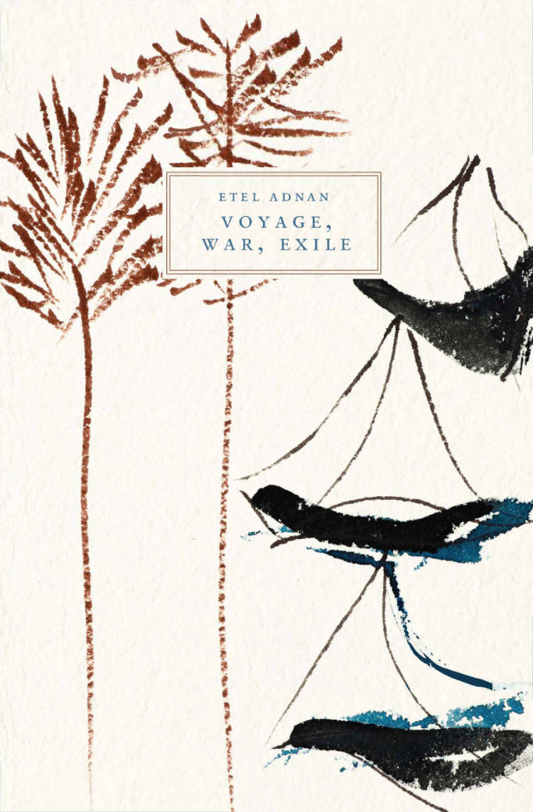
Voyage, War, Exile: Three Essays
Written between 1984 and 1995, this new edition collects three essays by Etel Adnan meditating on a life lived in motion: intellectual, geographic, linguistic and artistic perpetual motion. Published in honor of Adnan’s centennial (2025), these essays are a beacon and remain a piercing and profound model for reckoning with and surviving our times of war and exile.
Voyage, War, and Exile collects three essays by Etel Adnan that present a multilayered meditation on the author’s life within and without Beirut. Adnan reflects upon the intricacies of family, place, and language, asking what it means to be an Arab woman and writer in exile at the end of a century in which “Exile became the existential and metaphysical condition for every Arab.” At once deeply personal to the life of the author and yet ubiquitous in inquiry, Voyage, War, Exile pulls us into the shifting landscape of Lebanon and the United States in the 20th Century through a weaving of philosophical reflection and memory. This volume includes artwork by Simone Fattal.
Praise for Etel Adnan
The work of Etel Adnan—poet, painter, philosopher—is an interrogation of the human experience and a study in worldly engagement…Sorting through decades of memory, loss, and linguistic turns, we drift with her in a sea of thought and expansive meditation. —K.B. Thors, The Lambda Literary Review
Her poetry has the capacity to assemble and discern the ‘sides’ of the self as well as the literature and literary personalities which frame the self of her writing. —Matt Turner, Hyperallergic
Adnan’s receptivity is evident in her fine-tuned attention to detail, at the microscopic and cosmic level alike. Her lens shifts in scale and orientation, defamiliarizing the surroundings we thought we knew and re-introducing us to nature.—Noa Micaela Fields, Medium
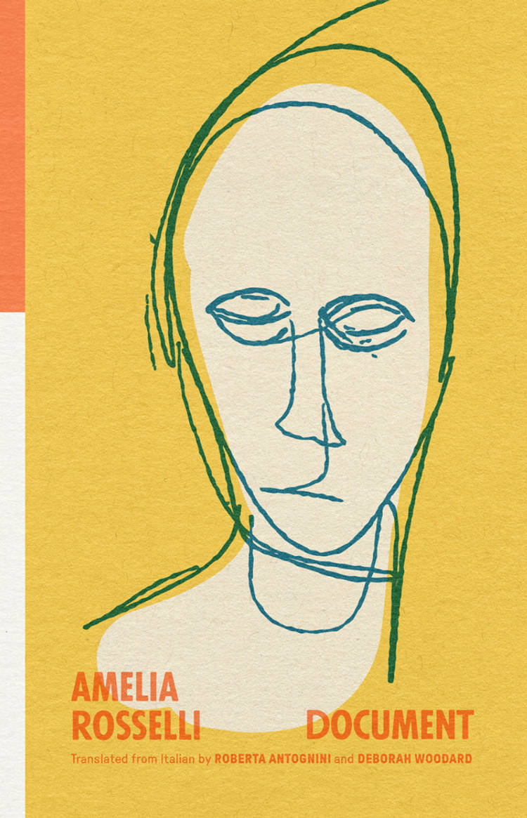
Document
Amelia Rosselli, Roberta Antognini and 1 more
The pivotal 1976 work of one of Italy's most significant post-war voices asks how poetry can document lived experience while dialoguing with the Petrarchan sonnet tradition. Long fascinated by the classical sonnet as an ideal model, Rosselli took on the Petrarchan structure of a canzoniere—a text in which meaning is generated by sequence—to contain the flood of 175 poems for her third collection. Speaking of Document, Rosselli said: “It was hard work; those who do not write poetry cannot imagine to what lengths poets go in order to compose, even if they barely scrape by, and even if it’s still the case that poetry is either inspired or worthless.” This “hard work” conveyed the pain, intensity, and turmoil of her existence and of our own violent chaotic times. Originally published in 1976, Document is the last of her major collections to be translated into English.
I think the great anti-fascist poet Amelia Rosselli has always been in a "lockdown" mode of existence. Document documents Rosselli's internal well, an echo chamber-she orchestrates the signals of global turmoil of war, violence, class struggle, religion, consumerism, financial capitalism. Nothing goes amiss inside her chamber. Rosselli’s oblique, taut, and mocking entries pile up relentlessly—they make up an anti-fascist soliloquy that also echoes the "lockdown" of our current troubled era. — DON MEE CHOI
Amelia Rosselli is one of the towering poets of the twentieth century, so we owe immense gratitude to Roberta Antognini & Deborah Woodard for bringing Documento, Rosselli’s third book, to an anglophone public in full for the first time, in a sharp translation with helpful notes. Less overtly biting and difficult than Rosselli’s previous work-at least at first-these barbed lyrics will initiate new readers into her mind-bending oeuvre. As she writes at the start, "in the end I wrote beautiful things, all of them / for you." Yes: that means you. — BARRY SCHWABSKY
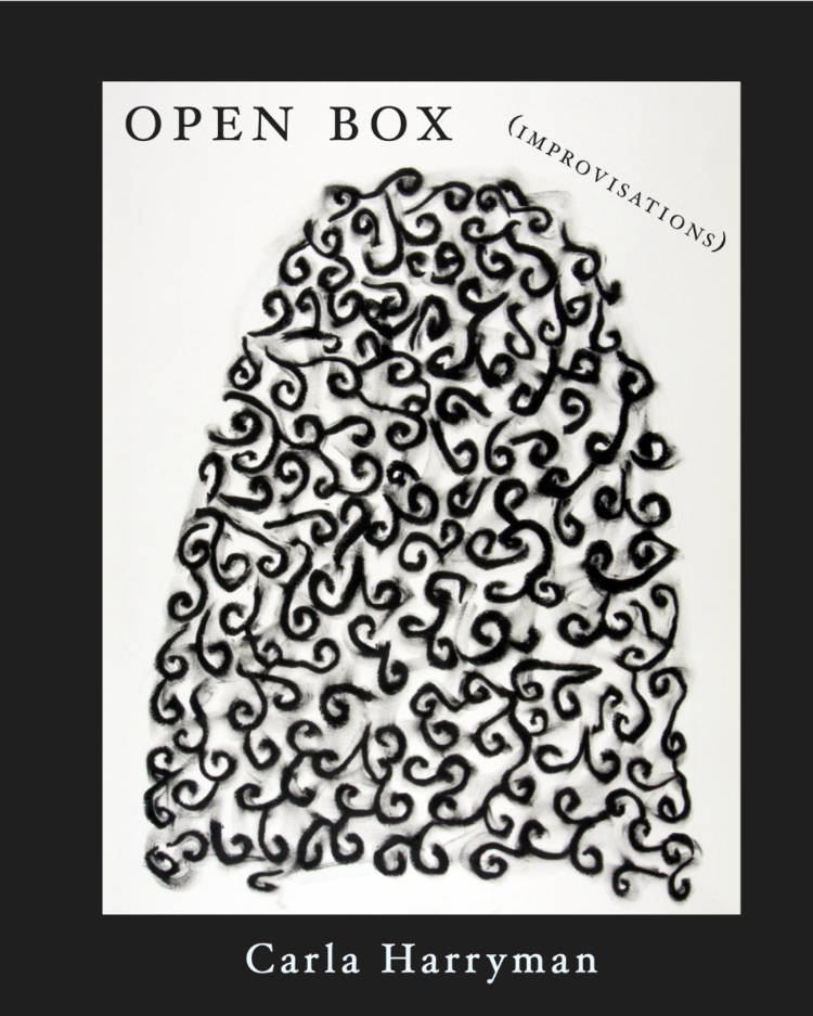
Open Box (IMPROVISATIONS)
This expanded new edition of Carla Harryman's early-'00s classic, OPEN BOX, features a new introduction by Rachel Levitsky and new afterwords by erica kaufman and Carla Harryman.
GRNN alert just in—Joseph Cornell is doing the can-can over the delicious debris organization in Harryman’s OPEN BOX. This dance of demi-characters—half half, semiquaver, three hooks quarter—places (a State) under an obligation not to maintain armed forces. Next up: removing oneself to another place; migration.
—Tina Darragh
Carla Harryman’s Open Box is a meditation-in-process on the possibility of a poetry available to cultural, social and political critique that does not unwittingly reinscribe the political, social and cultural formations (textual and otherwise) against which it is posed. Because Harryman wants to preserve a ‘place,’ if not ‘places,’ for an aesthetic and procedure resistant to reification, she deploys improvisation as writing, as textual practices open to the future and, more ambitiously, to the past, to the written.
—Tyrone Williams
Carla Harryman is an innovator in interdisciplinary performance, poetry, and prose. She has authored seventeen books including W— /M— (2013), Adorno’s Noise (2008), Gardener of Stars (2001), and the multi-authored work The Grand Piano, an Experiment in Autobiography: San Francisco, 1975-1980. Her Poets Theater, interdisciplinary, and bi-lingual performances have been presented nationally and internationally. She has received many grants and awards including from The Foundation for Contemporary Art, Opera America Next Stage, Fund for Poetry, and The Wallace Alexander Gerbode Foundation.
Carla Harryman is also the author of The Wide Road, a collaborative book with Lyn Hejinian (Belladonna*, 2011, reprinted 2026).
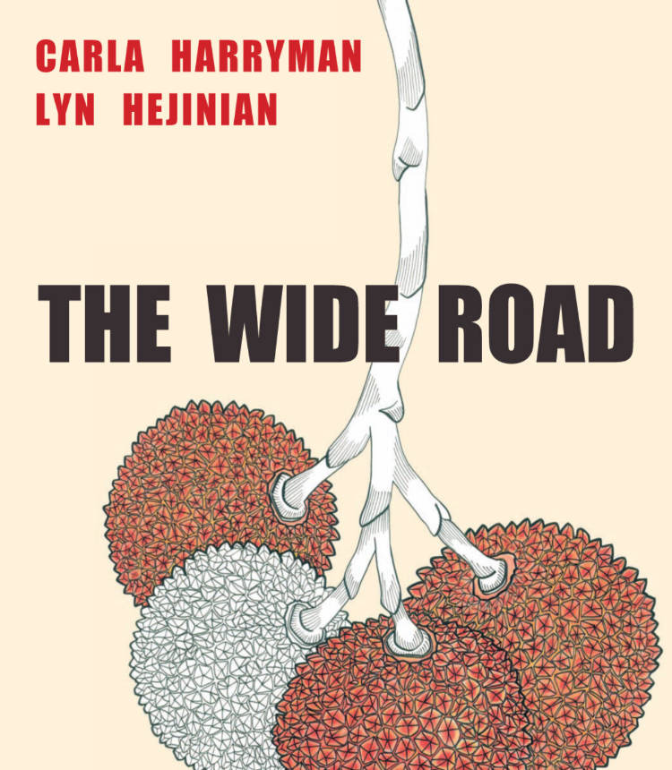
The Wide Road
What would have happened had Thelma and Louise not driven off the cliff but stayed on the road? In Carla Harryman and Lyn Hejinian’s picaresque novella, friendship lives on to follow eros through a polymorphic landscape where their fearless, inquisitive “we” encounters “hunger in two places at once.
The Wide Road is a collaborative investigation of the female body, friendship, writing, community, activism, travel and the nature and possibility of human thinking.
Carla Harryman and Lyn Hejinian, two of the most honored innovators of language, began writing The Wide Road in 1991. Over the following twenty-years, the co-writing occurred in turn by letters, by walking, in cabins, together and apart, and finally together again. The reader of this original and major work will find that it is no longer possible to distinguish who wrote what. Instead, one finds a joyful new feminist voice breaking out new possibilities for the future of writing.
The event of the making-writing of this book is now matched by the event of the making-book object of the book, for which the artist Nancy Blum drew two botanical panels, the fruit and the flower of the strawberry tree. HR Hegnauer, in discussion with editor, Rachel Levitsky and the authors, came up with two designs, and in celebration of the book’s multiple origins, Belladonna* Collaborative printed both!
Aucune personne cis ne lira cet essai
Traduction d'un essai original de Thalia Vacha, publié le 11 mars 2025 sous le titre No Cis Person Will Read This Essay, via son compte Substack @transexile.
Ce texte est rugueux, sinueux, urgent, complexe. Mais ce que nous y avons trouvé en le traduisant dépasse ce potentiel abrasif. Pour son autrice, être trans, c'est surtout une façon de faire relation : la transitude est un désaccord, mais aussi un engagement. Transitionner, c'est-à-dire (entre autres) désavouer un système normatif de genre qui nous enserre et nous sépare, peut se faire et se penser de plein de manières différentes, et toutes ces manières nous distribuent sur un spectre qui, paradoxalement, serait à même de nous rassembler.
C'est un texte propre à dissoudre nos mauvaises fois et réfléchir la politisation de nos identités sous un nouveau jour.
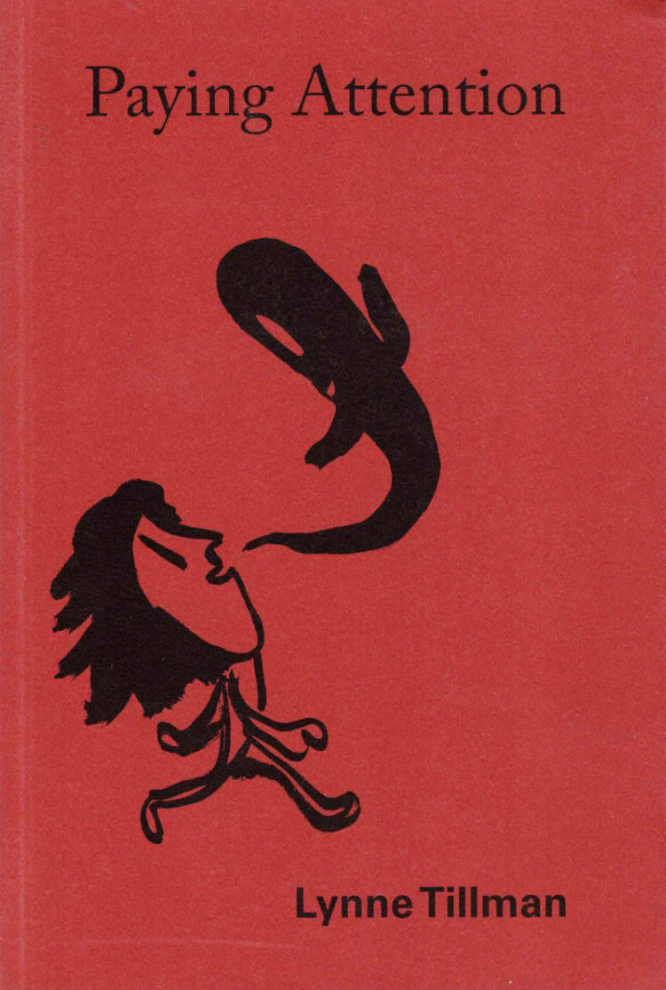
Paying Attention: Essays on Art and Culture
From award-winning novelist and cultural critic Lynne Tillman, Paying Attention is the first collection of essays devoted to her incisive, provocative, and singular reflections on art and culture.
Paying Attention gathers more than fifty of the best and varied examples of Lynne Tillman’s writings in reference to art and culture published over the course of forty years. In essays that operate outside typical categories or genres, Tillman reflects on forms including film, painting, photography, poetry, and fiction, as well as notions of fame, originality, embodied viewing and thinking, collective activity, aging, illness, American identity, cultural politics, modernity, strangeness, and time. Such is the stuff that relates art to life, and life to art.
Collected mainly from museum and gallery catalogues, artists’ books and monographs, her column in Frieze, and magazines including Aperture and Artforum, these meditations on artists and writers, in the broadest sense of these labels, collide as a portrait of our cultural moment. Tillman’s inventive use of language and lateral thought, her ability to evoke conditions of the larger world in often just two thousand words on a specific artwork or individual, make her one of the most significant critics of our time. As she acknowledges, in a piece on the artist Robert Gober, “In writing on art, words reach for other words, phrases, idioms, and through them more images and ideas leap out.” In her introduction, Elizabeth Schambelan notes that a hallmark of Tillman’s writing alongside artists is an “elegant rendering of complexity,” and in approaching Tillman’s body of work and thought, Schambelan herself imbricates the art, voice, and language of criticism.
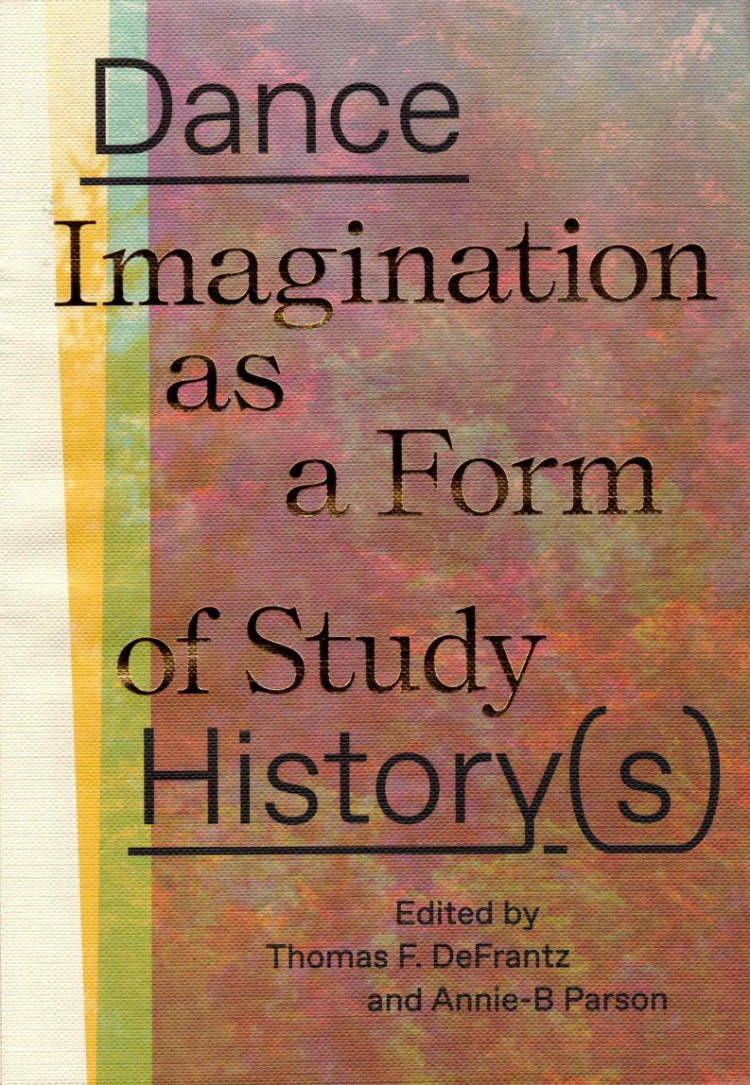
Dance History(s): Imagination as a Form of Study
Annie-B Parson, Thomas F. DeFrantz
Authored by twelve diverse American dance artists in the form of twelve small booklets, Dance History(s): Imagination as a Form of Studyapproaches and celebrates dance history as a subjective, artistic inquiry. It reimagines and radicalizes our understanding of dance throughout human history through the voices of working choreographers. Simultaneously, the project is dedicated to the power of an artist-centric view of history itself, thus placing the dance history back into the body, where it began. Here, history occurs in vertical layers of time and space and moves into the street, the football field, the yard, the screen, the memory, the womb, the sky, and the future.
Text by mayfield brooks, thomas f. defrantz, maura nguyễn donohue, Keith Hennessy, Bebe Miller, Okwui Okpokwasili, Eiko Otake, Annie-B Parson, Javier Stell-Frésquez, Ogemdi Ude, Mariana Valencia, and Andros Zins-Browne
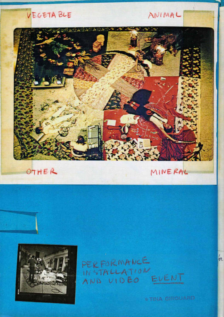
Tina Girouard: Sign-In
From the 1970s until her death, Louisiana-born artist Tina Girouard (1946–2020) was a dedicated experimental artist, collaborator and art worker. Alongside her individual creative endeavors, she nurtured and was a part of numerous influential artist communities and organizations in New York, Louisiana and Haiti, including the Anarchitecture Group, the interdisciplinary cohort of 112 Greene Street, the restaurant Food, the Kitchen, P.S. 1 and the Festival International de la Louisiane. Her acts of upkeep, including domestic labor traditionally associated with “women’s work,” blurred the boundaries between artmaking and what she called life-making. Sign-In is the first comprehensive monograph on her interdisciplinary oeuvre. It gathers documentation of her work in video, performance, drawing, textile, wall works and installation, tracing Girouard’s practice and legacy across genres and geographies.
Edited by Andrea Andersson with Jordan Amirkhani
With new essays by Andrea Andersson, Jordan Amirkhani, Anaïs Duplan, Pamela M. Lee, Aruna D’Souza, and Lumi Tan

Earth, Fire, Water
Born in Beirut, Ali Cherri lives and works between Beirut and Paris. He belongs to this generation of Lebanese artists born during the civil war whose work has been strongly affected by this context of instability.
Through an introduction by the artist, 4 essays and an interview, this first monograph reveals the political, aesthetic and dreamlike dimensions of a work that the artist has been developing for over fifteen years. Ali Cherri's interdisciplinary work explores the myths and classifications of ancient worlds and contemporary societies

It Was Like Watching
Dear ____,
I happened to look for a while out of “my” window on the 17th floor Palliativstation of the Wiener Allgemeinen Krankenhauses last night, where an enormous orange moon was hanging about, consorting with a lick of dark cloud, near to the tiny gaggle of skyscrapers. I didn’t have much to say for myself and so it just sort of looked back at me.
Every day friends and well-wishers come here and as always I want to run to my room and read a book until they’ve left but for the first time in my life my room is also the room they want to visit, and so I can’t. I wrote down yesterday as best as I could the words of my last long conversation with Marina: there might be more, but the words are running away from her now, which only makes you realise how small and insignificant they are, fleeing from something (from someone) who remains exactly who they were even in their absence: like dust falling from the sun.
*
A voyage in the insight which comes as a kiss and follows as a curse, made after you ran out of things to say.——first halting efforts at mutual understanding——love letters from twelve years ago. journal entries from fifteen years before lick at the edges like flames. Opaque coloured shadows, projected in three dimensions——of a——future that——has. never ceased to exist and which——Doesn’t——.——.——arrive to speak about their fears.—— Beginning with a naked bathroom selfie.
An attempt to live nonjudgmentally and without fear, against the desire to be something other than who you were, as a basic form of class hatred, a fear of the common and of everything that happens there, near speechlessness, trailing off, only sometimes coming back to life again, shame dies so that everything else can be saved, and everything else remains present against the background of this absence, beneath the harsh overhead light, as you pull on the pathetic, unassuming string of the pullcord.
Dedicated to one person, written by one another. “Poems written by / different poets / are my nakedness.”
KW Institute for Contemporary Art
Germaine Kruip: Works 1999-2017
Over the past two decades, artist Germaine Kruip has steadily developed a practice, which merges time, space and perception. Like an anthropological stage director, she investigates, simplifies and presents her observations in a subtle manner often through architectural interventions. In each of these interventions, she changes a location into a stage, with the audience as actors in a play of substantive absence. By doing so, she activates both physical and mental awareness.
This publication presents an overview of the Kruip’s practice since 1999, two years prior to her engagement with the art context. Presenting over 40 works, the publication reflects on three periods in the artist’s practice, each accompanied by an essay contributed by Anna Gritz, Eva Wittocx and Stephanie Bailey. The idea of a catalogue raisonné came out of a conversation that followed Kruip’s ambitious project Geometry of the Scattering, which was presented at de Oude Kerk in Amsterdam in 2015 – 2016.
KW Institute for Contemporary Art
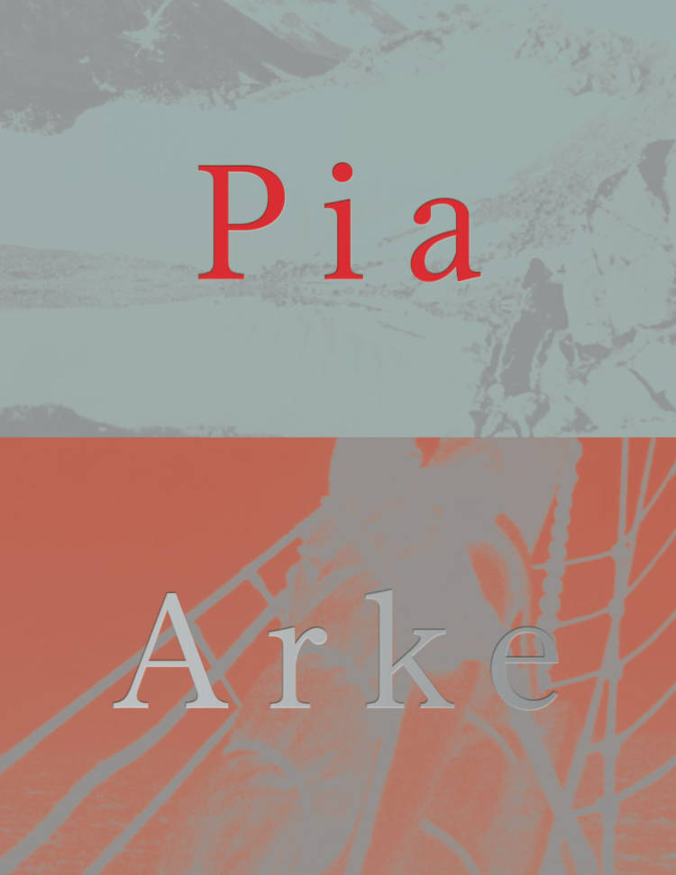
Pia Arke
Pia Arke, Ros Carter and 1 more
Pia Arke (1958–2007) was a Greenlandic Inuk and Danish artist, writer and photographer. She is known for her self-portraits and landscape photographs of Kalaallit Nunaat (Greenland), as well as for her paintings, collages, performative film works and writing. Arke strove to make visible the silence that surrounded the colonial history and complex political and cultural relationship between Greenland and Denmark.
This publication accompanies the first international exhibitions of Arke’s work outside of Greenland and the Nordic countries, happening over the course of 2024 at John Hansard Gallery in Southampton (UK) and at KW Institute for Contemporary Art in Berlin (DE). It reflects on Arke’s ideas and legacy in a wider international context and aims to demonstrate how the work she made and the ideas she expressed connect with current discourse and contemporary thinking.
Texts by Krist Gruijthuijsen, Woodrow Kernohan, Ros Carter, Alice Maude-Roxby, Mette Sandbye, Tiara Roxanne, Sofie Krogh Christensen, Nivi Christensen, Siri Paulsen, Trinh T. Minh-ha
Verlag der Buchhandlung Walther König
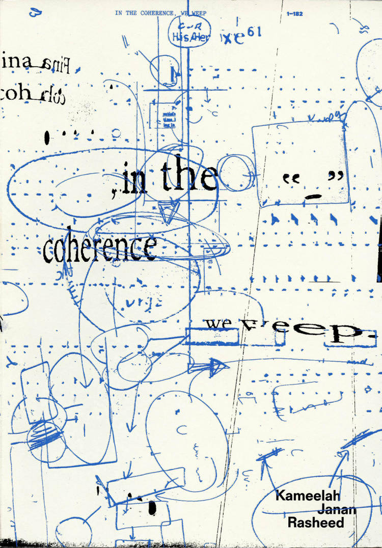
in the coherence, we weep
“in the coherence, we weep is both an artist book and an exhibition. The project is about the critical potential of incoherencies. It is an attempt to map methodology across media, while welcoming glitches that allow for moments of critical self-reflection and knowledge production. Developed in parallel, the book and exhibition critically reflect on each other’s approaches. It looks at strategies for how text can be alive and vibrant across various architectural contexts as well as those used in the artist’s family archive, particularly annotation, redaction, indexing, blurring, and learning through reading and writing.” - KW Institute for Contemporary Art
“Multilayering was in that sense an important aspect, which got translated with the material and the design by choosing papers with differents gradients of transparency, as well as interfering and overlapping text layouts. We also designed the cover with a blue scratch off drawing on top of another artwork, so every book might change a bit over time depending on the use. This reflects the artist‘s idea of including the audience and an ever changing oeuvre, where the relation between pieces become important too.” - Studio Pandan
Texts by Dr. Christina Landbrecht, Krist Gruijthuijsen, Sofie Krogh Christensen, Chang Yuchen, Ladi'Sasha Jones
This artist book is published on the occasion of Kameelah Janan Rasheed’s Schering Stiftung Award for Artistic Research 2022 solo exhibition at KW Institute for Contemporary Art (2023).
Verlag der Buchhandlung Walther König
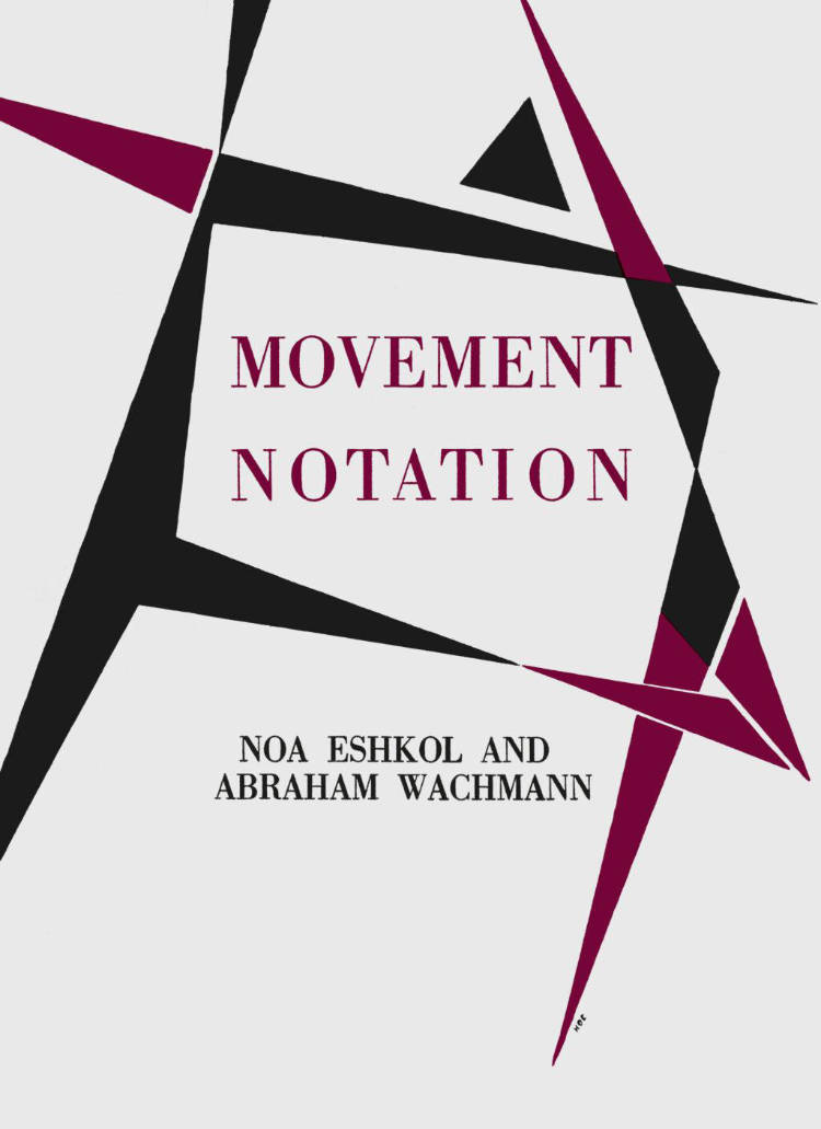
Movement Notation
Eshkol and Wachmann focused dance on its basic element: the movement of the human body. They treated the different parts of the body as separate instruments, similar to the musical instruments of an orchestra–each with its own rules for the movements to be performed. This new edition of the 1958 publication is supplemented by contributions from Eshkol’s companions and further archive material, which contextualizes and supplements the history of the 'EWMN’s‘ origins and embeds it in contemporary discourses on dance and movement.
The publication is published in the context of the performance 'Pause: The Noa Eshkol Chamber Dance Group‘ at KW Institute for Contemporary Art (August 2023), as well as the exhibition 'Noa Eshkol: No Time to Dance‘ at the Georg Kolbe Museum (15 March–25 August 2024). The new edition was developed together with the 'Noa Eshkol Foundation for Movement Notation‘.
Verlag der Buchhandlung Walther König
Ian Burn: Collected Writings 1966–1993
Ian Burn has been described as many things: an activist, a trade-unionist, a journalist, an art critic, a curator and an art historian—or, as he once described himself in a moment of self-deprecating alienation, ‘an ex-conceptual artist’. Born in Geelong in 1939, Burn studied painting in Melbourne and went on to live and work in London and New York. Burn moved back to Australia in 1977 and passed away in 1993 at the age of 53. Burn sought to grapple with how art history intersects and engages with contemporary art and political debate, arguing for a decentred view of the world.
His legacy is international and can be seen in retrospective exhibitions as recent as 2022, and his work remains a key touchstone in art history. Edited by Burn’s friend, frequent collaborator and eminent art historian, Dr Ann Stephen, this volume brings together 49 pieces of Burn’s own agile and expansive writings alongside a vast collection of his artworks. The collection concludes with reflections on Burn’s life and work from prominent figures and past collaborators in the form of memorial lectures.
Ian Burn: COLLECTED WRITINGS 1966–1993 is edited by Ann Stephen and designed by Robert Milne, with contributions by Art & Language, Adrian Piper, Paul Wood, Allan Sekula, and Mel Ramsden.
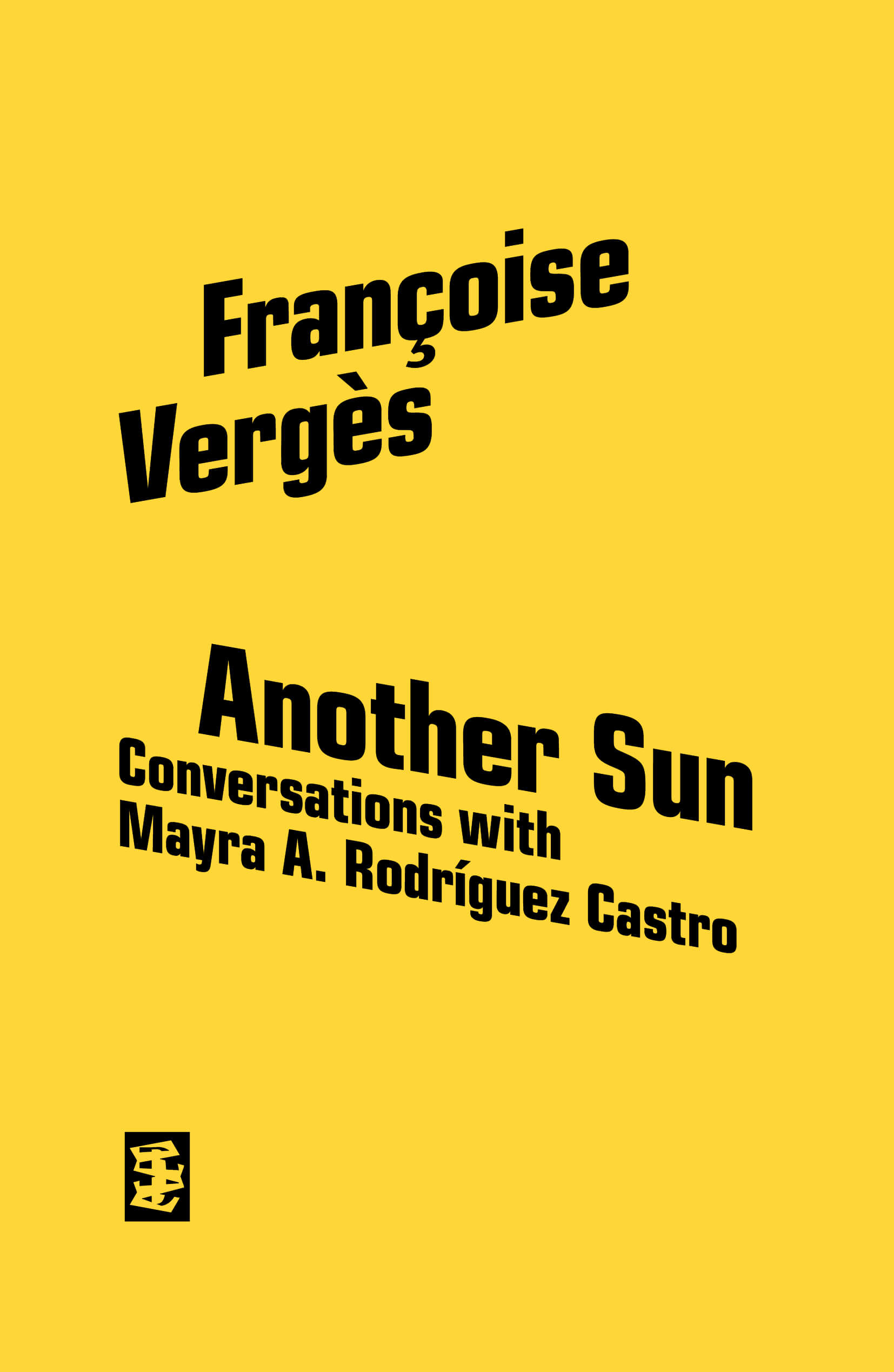
Another Sun
Françoise Vergès, Mayra A. Rodríguez Castro
[Available for preorders. Shipping June 4]
Waiting at Martinique Aimé Césaire International Airport, in the city of Le Lamentin, Mayra A. Rodríguez Castro browses the airport kiosk. Alongside books by Césaire, it offers titles by Frantz Fanon, Maryse Condé and Patrick Chamoiseau. She picks up a copy of Nègre je suis, nègre je resterai, a conversation between Françoise Vergès and Césaire published in 2005, and embarks. In Another Sun, Rodríguez Castro and Vergès revisit that seminal conversation, resulting in an eclectic text shaped by ongoing struggles.
In 2005, Françoise Vergès published a book with Aimé Césaire, in which she recorded – three years before his death – powerful remarks by the poet, as incisive and combative as ever, yet imbued, as always, with the universal humanism to which he had remained committed throughout his life. It is fortunate that, drawing inspiration from this interview, Another Sun allows us to hear, in their intertwining, the voices of Césaire and Vergès herself, conveying a message of emancipation and fraternity/sorority that our world needs to hear today. —Souleymane Bachir Diagne
With poems by Danielle Legros Georges, Wole Soyinka, Ishion Hutchinson, Clarisse Baleja Saïdi, Aimé Césaire and Jean Érian Samson.
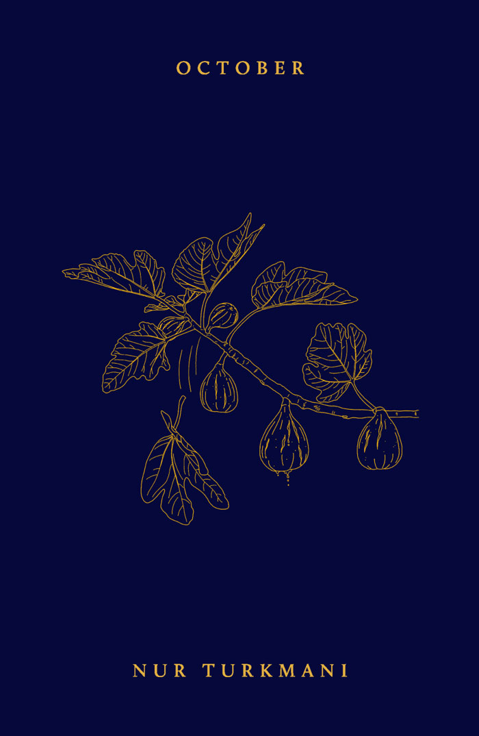
October
What do we carry from one year to the next? What remains after devastation, and what, despite everything, takes root again?
October in Lebanon is heavy with memory. The euphoria of the 2019 revolution feels far away, its anniversaries marked by crisis, war and the genocide in Gaza.
Across multiple Octobers, Nur Turkmani meditates on rupture, transformation and the quiet undoing and remaking of relationships during collective catastrophe. Part archive, part love letter, her debut poetry collection holds the ordinary and the extraordinary in the same breath, spanning balconies and border towns, fig trees and songs for friends, autumn light and the instinct to flee.
Formally spare and emotionally saturated, October refuses both numbness and spectacle. These poems ask what it means to survive the world and still long for it; and how we hold what’s disappearing, or changing too quickly to make sense of.

The Hajar Book of Rage
Rage is not just a feeling—it’s fuel.
The Hajar Book of Rage ignites the first spark in the elements anthology series, harnessing the primordial force of fire as a fury that destroys and transforms. Bringing together fiction, poetry and essays by writers of colour, this Fire-themed collection delves into the fierce, animating power of rage as a catalyst for revolutionary change.
Here, rage teaches. It reveals what we’re fighting against and what we’re fighting for. It mobilises us into action, rouses our ideals and refuses to let us compromise. And it is unruly and consuming—a blaze that resists containment.
This is a searing tribute to the fires of anger that fuel our resistance and burn down the worlds that cannot hold us.
The Hajar Book of Rage is the first book in elements, a series by Hajar Press on the politically transformative power of Fire, Earth, Water and Air.
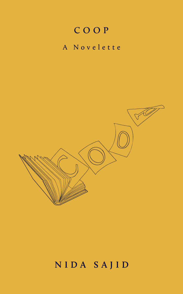
COOP. A Novelette
On work and words, and how they contort the world.
Lena is a part-time bookseller in a bougie design studio in Oxford Circus. In between minimum-wage work under a politically hostile boss and strained communications with her parents, her days are shaped by a fraught relationship with food, ambiguous experiments in creative writing, and mounting pressure to find a ‘proper’ postgraduate job.
In taut, pocket-sized vignettes, COOP reveals a suffocating lattice of language that makes up a precarious London life. But as each word of her story unravels, Lena discovers interstices between them—to find autonomy and escape.

One hundred and six EROTIC short stories
To be erotic is to be alive. In this collection of erotic short stories, desire and imagination meet in stairwells, apartments, bars and glances that linger just a little longer. Commissioned for and first published in Extra Extra magazine, these unique stories range from vibrant encounters of mere minutes to hours of simmering tension.
Carefully curated and unapologetic in its imagination, it’s an invitation into a literary space shaped by lust and longing.
One Hundred and six erotic short stories contains erotic stories by Obe Alkema, Karin Amatmoekrim, Mischa Andriessen, Sarah Arnolds, Simone Atangana Bekono, Gerbrand Bakker, Maria Barnas, Leonieke Baerwaldt, Persis Bekkering, Abdelkader Benali, Hannah van Binsbergen, Marion Bloem, Fiep van Bodegom, Daan Borrel, Charlotte van den Broeck, Saskia de Coster, Eelco Couvreur, Daniël Dee, Nikki Dekker, Maxime Garcia Diaz, Don Duyns, Rob van Essen, Edwin Fagel, Mira Feticu, Moya De Feyter, Andy Fierens, Gamal Fouad, Johan Fretz, Steff Geelen, Maureen Ghazal, Arnon Grunberg, Esha Guy Hadjadj, Thomas Heerma van Voss, Mariken Heitman, Tom Hofland, Philip Huff, Auke Hulst, Nicole Kaandorp, Asha Karami, Maite Karssenberg, Mensje van Keulen, Emy Koopman, Falun Ellie Koos, Willemijn Kranendonk, Selin Kuşçu, Rachida Lamrabet, Jordi Lammers, Wietske Leenders, Sandro van der Leeuw, Sun Li, Gilles van der Loo, Hannah Chris Lomans, Alma Mathijsen, Kiriko Mechanicus, Jens Meijen, Lars Meijer, Carmien Michels, Kaweh Modiri, Roelof ten Napel, Richard de Nooy, Joost Oomen, Jamal Ouariachi, Iduna Paalman, Gustaaf Peek, Elvis Peeters, Froukje van der Ploeg, Marja Pruis, Julius Reynders, Hannah Roels, Astrid H. Roemer, Martin Rombouts, Daniël Rovers, Alfred Schaffer, Marijke Schermer, Koen Sels, Vamba Sherif, Frank Siera, Louise Souvagie, Yentl van Stokkum, Florence Tonk, Elfie Tromp, Joost Vandecasteele, Dominique van Varsseveld, Annelies Verbeke, Peter Verhelst, Wytske Versteeg, Daniël Vis, Dirk Vis, Sven Vitse, Maria Vlaar, Marwin Vos, Nadia de Vries, Niña Weijers, Han van Wieringen, Romy Day Winkel, Maartje Wortel, Pete Wu, Kira Wuck, Mia You, and Ivo Victoria
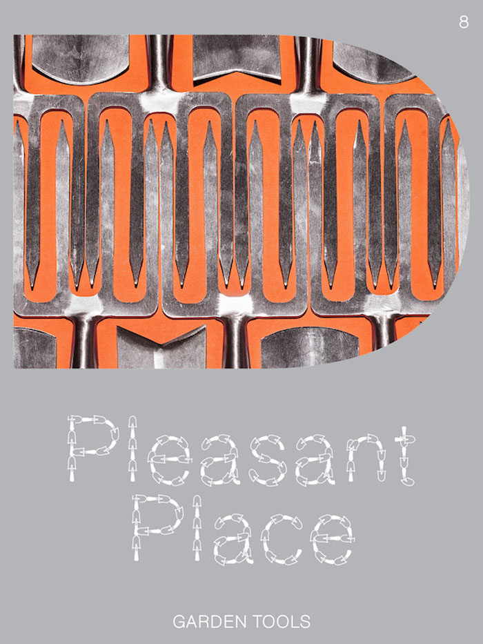
Issue 8: Garden Tools
More than a mere extension of the hands, the garden tool is what helps the gardener materialise their vision. Much like the painter’s brush and the sculptor’s chisel – without it, one would be helpless. This issue of Pleasant Place dives into the world of garden tools, the essential, the practical, and the beautiful.
Including:
Instruments of Care – An introduction by Norbert Peeters with some philosophical remarks on garden tools.
Wardens of Good – A visual essay of the wonderful objects of Garden and Wood, a business selling vintage garden tools and ephemera.
Trusted Tools – Gardeners like Piet Oudolf and Jonny Bruce talk about their favourite tools that are illustrated in detail by artist Floris Tilanus.
Passing the Trowel – A visit to Sneeboer, the Netherlands most famous garden tool company, where the trowel has been passed down for four generations.
Toolmorrow – Artists are challenged to create new types of garden tools, for lazy gardening, stylish gardening and collective gardening.
Cover by Lou-Lou van Staaveren
Inside cover by José Quintanar
Centrefold miniatures by Zilan Zhao
Graphic design is by fanfare
Concept and editing by Guus Kaandorp, Floor Kortman and Lou-Lou van Staaveren
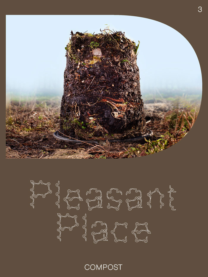
Pleasant Place 3: Compost
Allow us to introduce to you, the meaning of life, Compost Almighty.
Including:
“I’m orange peels, I’m coffee grounds, I’m wisdom” – Marjory the Trash Heap tells the future
Compost: An introduction – what, why and how to compost, with illustrations by Noa Zuidervaart
Comfrey Cocktail – make your own Comfrey Feed
Worms are great and this is why – an ode to worms by Joline van Berkestijn with images by Jaap Scheeren
What to do with a whole lot of poo – Ton Hilhorst and Savitri Groag from Artis, the Amsterdam zoo, about their compost-system that thrives on elephant poo
Digital Compost – composting in Minecraft, the biggest videogame in the world
A set of garden miniatures by Hanna Something
The cover and inside cover are by Lou-Lou van Staaveren and Guus Kaandorp and graphic design is by fanfare