Books
Books
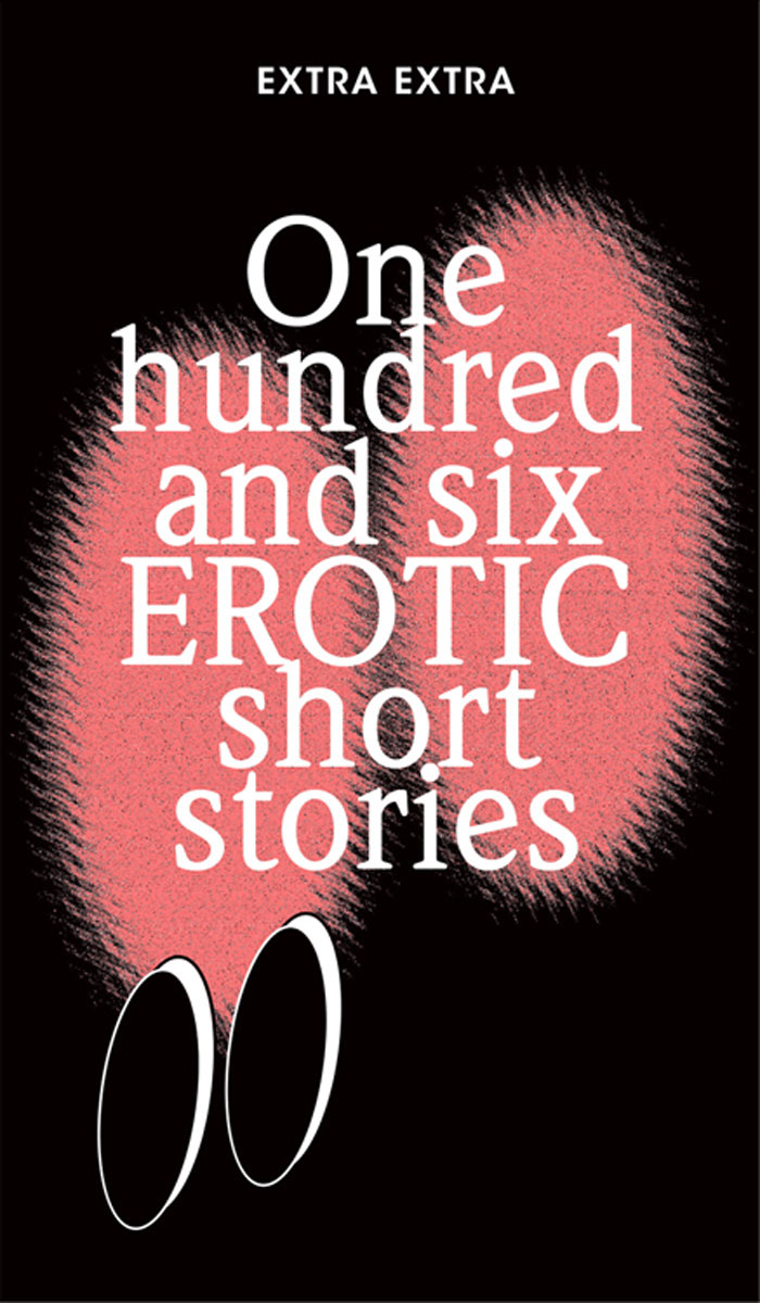
One hundred and six EROTIC short stories
To be erotic is to be alive. In this collection of erotic short stories, desire and imagination meet in stairwells, apartments, bars and glances that linger just a little longer. Commissioned for and first published in Extra Extra magazine, these unique stories range from vibrant encounters of mere minutes to hours of simmering tension.
Carefully curated and unapologetic in its imagination, it’s an invitation into a literary space shaped by lust and longing.
One Hundred and six erotic short stories contains erotic stories by Obe Alkema, Karin Amatmoekrim, Mischa Andriessen, Sarah Arnolds, Simone Atangana Bekono, Gerbrand Bakker, Maria Barnas, Leonieke Baerwaldt, Persis Bekkering, Abdelkader Benali, Hannah van Binsbergen, Marion Bloem, Fiep van Bodegom, Daan Borrel, Charlotte van den Broeck, Saskia de Coster, Eelco Couvreur, Daniël Dee, Nikki Dekker, Maxime Garcia Diaz, Don Duyns, Rob van Essen, Edwin Fagel, Mira Feticu, Moya De Feyter, Andy Fierens, Gamal Fouad, Johan Fretz, Steff Geelen, Maureen Ghazal, Arnon Grunberg, Esha Guy Hadjadj, Thomas Heerma van Voss, Mariken Heitman, Tom Hofland, Philip Huff, Auke Hulst, Nicole Kaandorp, Asha Karami, Maite Karssenberg, Mensje van Keulen, Emy Koopman, Falun Ellie Koos, Willemijn Kranendonk, Selin Kuşçu, Rachida Lamrabet, Jordi Lammers, Wietske Leenders, Sandro van der Leeuw, Sun Li, Gilles van der Loo, Hannah Chris Lomans, Alma Mathijsen, Kiriko Mechanicus, Jens Meijen, Lars Meijer, Carmien Michels, Kaweh Modiri, Roelof ten Napel, Richard de Nooy, Joost Oomen, Jamal Ouariachi, Iduna Paalman, Gustaaf Peek, Elvis Peeters, Froukje van der Ploeg, Marja Pruis, Julius Reynders, Hannah Roels, Astrid H. Roemer, Martin Rombouts, Daniël Rovers, Alfred Schaffer, Marijke Schermer, Koen Sels, Vamba Sherif, Frank Siera, Louise Souvagie, Yentl van Stokkum, Florence Tonk, Elfie Tromp, Joost Vandecasteele, Dominique van Varsseveld, Annelies Verbeke, Peter Verhelst, Wytske Versteeg, Daniël Vis, Dirk Vis, Sven Vitse, Maria Vlaar, Marwin Vos, Nadia de Vries, Niña Weijers, Han van Wieringen, Romy Day Winkel, Maartje Wortel, Pete Wu, Kira Wuck, Mia You, and Ivo Victoria
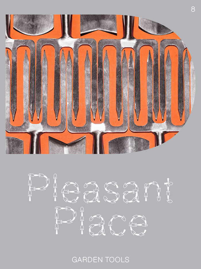
Issue 8: Garden Tools
More than a mere extension of the hands, the garden tool is what helps the gardener materialise their vision. Much like the painter’s brush and the sculptor’s chisel – without it, one would be helpless. This issue of Pleasant Place dives into the world of garden tools, the essential, the practical, and the beautiful.
Including:
Instruments of Care – An introduction by Norbert Peeters with some philosophical remarks on garden tools.
Wardens of Good – A visual essay of the wonderful objects of Garden and Wood, a business selling vintage garden tools and ephemera.
Trusted Tools – Gardeners like Piet Oudolf and Jonny Bruce talk about their favourite tools that are illustrated in detail by artist Floris Tilanus.
Passing the Trowel – A visit to Sneeboer, the Netherlands most famous garden tool company, where the trowel has been passed down for four generations.
Toolmorrow – Artists are challenged to create new types of garden tools, for lazy gardening, stylish gardening and collective gardening.
Cover by Lou-Lou van Staaveren
Inside cover by José Quintanar
Centrefold miniatures by Zilan Zhao
Graphic design is by fanfare
Concept and editing by Guus Kaandorp, Floor Kortman and Lou-Lou van Staaveren
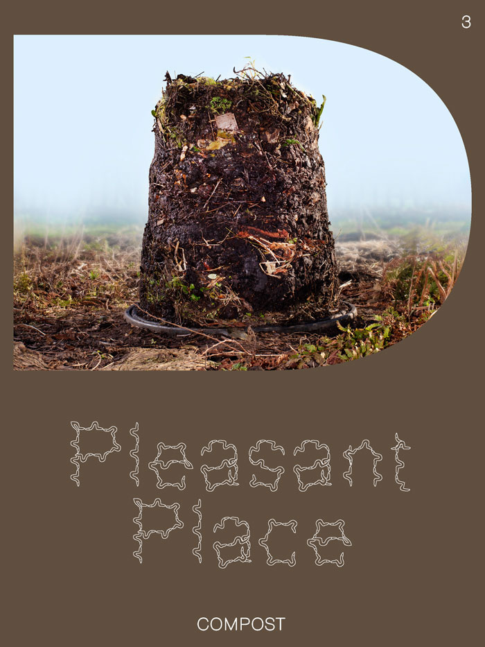
Pleasant Place 3: Compost
Allow us to introduce to you, the meaning of life, Compost Almighty.
Including:
“I’m orange peels, I’m coffee grounds, I’m wisdom” – Marjory the Trash Heap tells the future
Compost: An introduction – what, why and how to compost, with illustrations by Noa Zuidervaart
Comfrey Cocktail – make your own Comfrey Feed
Worms are great and this is why – an ode to worms by Joline van Berkestijn with images by Jaap Scheeren
What to do with a whole lot of poo – Ton Hilhorst and Savitri Groag from Artis, the Amsterdam zoo, about their compost-system that thrives on elephant poo
Digital Compost – composting in Minecraft, the biggest videogame in the world
A set of garden miniatures by Hanna Something
The cover and inside cover are by Lou-Lou van Staaveren and Guus Kaandorp and graphic design is by fanfare

Unbidden Tongues #8: Feelers
Unbidden Tongues #8: Feelers brings together three photographic series by artist and activist Alexis Hunter. In a storyboard-like fashion, her ‘photo narrative sequences’ forensically detail her manhandling of artefacts of patriarchal oppression through the caressing touch of an array of characters: the Marxist's wife, an interventionist secretary and a manicured mechanic. Born in New Zealand, Hunter moved to the United Kingdom in 1972 where, at the age of twenty-four, she joined the Women’s Workshop of the Artists Union and invested devotedly in feminist organising alongside her artistic practice.
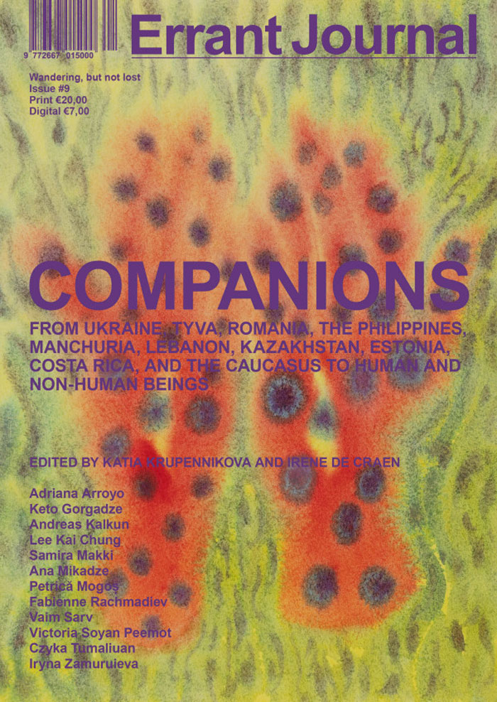
Issue #9: Companions
Irene de Craen, Katia Krupennikova
The editorial/imaginative centre of the ninth issue of Errant Journal is located in the regions that have experienced Russian imperial aggression from where it makes connections across times, geographies, and ontologies to explore the radical potential of companionship. Companionship is understood not as agreement, but as a shared responsibility across unequal histories. It means not being full without the other. While forms of imperial and colonial violence might differ in places and through times, the issue recognizes how colonial mechanisms are sustained, how they present themselves as if they were past while shapeshifting and continuing in new forms and places in the present. By bringing these contexts in relation, this issue aims to show how certain borders, biases, clichés, and power structures travel, mutate, and shape both human and non-human lives and landscapes. Ultimately, companionship is about prioritizing life and about insisting that no oppression is singular.
This issue is a concept by and co-edited with Katia Krupennikova.
Contributors: Adriana Arroyo, Keto Gorgadze, Andreas Kalkun, Chung Kai Lee, Samira Makki, Ana Mikadze, Petrică Mogoș, Fabienne Rachmadiev, Vaim Sarv, Victoria Soyan Peemot, Czyka Tumaliuan, Iryna Zamuruieva, Irene de Craen, Katia Krupennikova
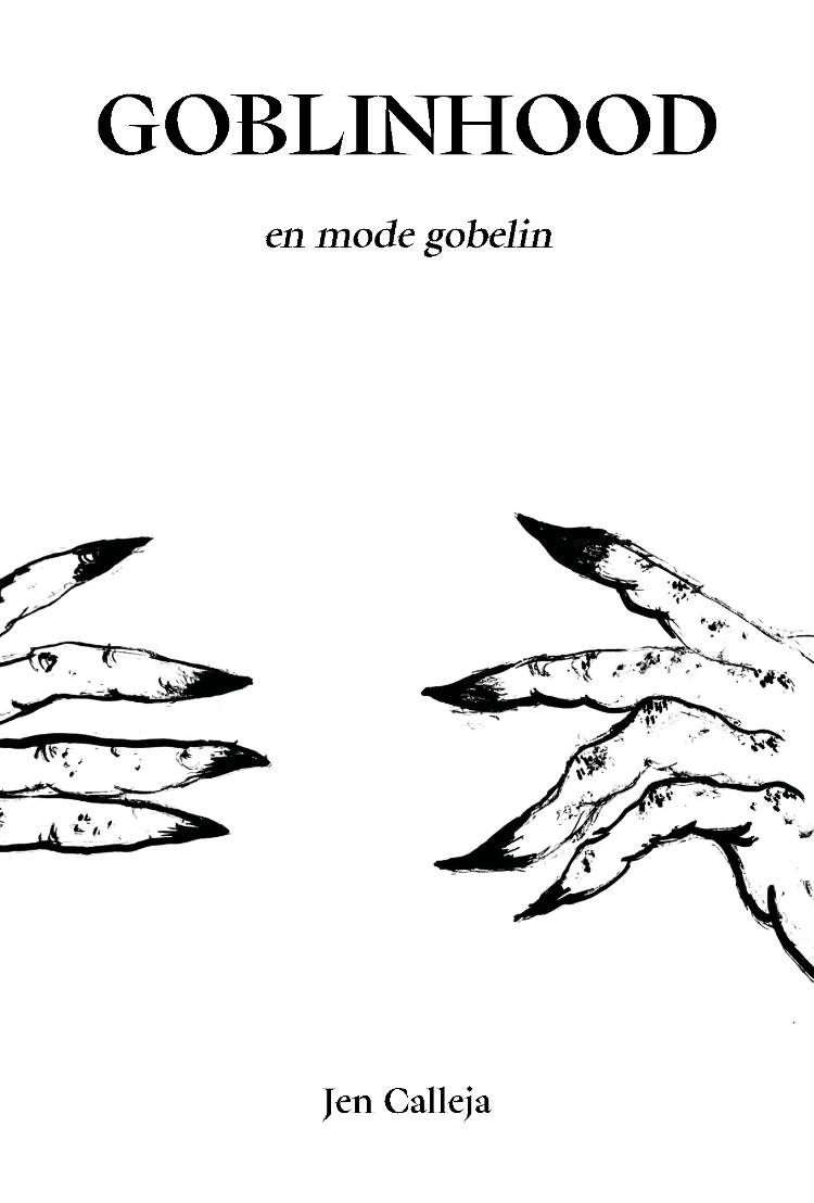
Goblinhood - en mode gobelin !
[Preorder. Available Saturday April 25]
Enfin la traduction en français du best-seller de Jen Calleja, qui sera présente pour une lecture croisée. Repassez vos capes et astiquez vos chaînettes.
La figure du gobelin est espiègle, marginale, répugnante et fascinante et le mode gobelin peut être envisagé comme un mode de vie à part entière.
Jen Calleja, depuis son obsession pour les objets verts et les marionettes, ses souvenirs familiaux, son rapport au corps et au dégoût de soi, au chagrin, au sexe et au deuil, propose avec malice une pensée hybride entre essai, auto-fiction, poésie et théorie de la gobelinité.
En chacunx de nous, suggère-t-elle, sommeille un gobelin qu’il est temps de libérer.
Vrai travail
Le Collectif Occasionnel a organisé en Suisse deux expositions qui présentaient les oeuvres de personnes à la fois artistes et travailleureuses du sexe. Cet ouvrage prolonge leur travail en proposant des textes et des entretiens avec des Tds ou des alliéxes. Permettant l’auto-représentation des personnes interrogées, les entretiens mettent en lumière la pluralité des pratique du travail du sexe, mais aussi l’importance de construire des solidarités travailleuses, des outils pour défaire les stigmates et des perspectives de luttes intersectionnelles.
Affiliation
Mira Mattar, Judith Abensour and 1 more
Affiliation, de Mira Mattar, autrice londonienne issue de la diaspora palestinienne, explore des thèmes tels que le genre, la famille, la religion, la guerre, l’écologie, le colonialisme et l’amour, en lien avec des lieux comme la Jordanie, le Liban, la Palestine et le Royaume-Uni. Interrogeant nos affiliations personnelles et collectives, et la manière dont les systèmes de pouvoir influencent nos désirs et nos identités, le livre s’ouvre sur quatre Lettres d’Amman qui propulsent le texte poétique dans le mouvement du monde et attestent de la dynamique de l’exil palestinien, où l’éclatement, l’effacement et l’appropriation se mêlent avec les effets contemporains de la mondialisation.
La deuxième partie du livre, intitulée Affiliation (pour mon père) est un long poème rétrospectif qui court sur une trentaine de pages. L’écriture à la première personne de Mira Mattar met en tension des contextes politiques, domestiques, intimes, économiques où se déploient des affiliations coloniales, capitalistes, patriarcales, nationalistes. Elle en restitue les violents processus internes, passant du refus de se soumettre à l’impossible échappée. Dans Affiliation, on fait l’expérience d’être en dehors: en dehors de son corps, en dehors d’un pays, en dehors d’une pièce. Il n’y a aucune position stable, et le sujet se construit dans un éclatement constant. Peu de livres articulent aussi finement expérimentation formelle et nécessité de l’expression verbale. Affiliation est un flux de langage dont on peut sentir l’urgence à chaque vers.
Heights of Macchu Picchu
Pablo Neruda’s Alturas de Macchu Picchu is a poem that distrusts solitary authority even as it passes through a single voice, moving from the lyric “I” toward a collective utterance grounded in labor, history, and shared breath.
Producing the first collaborative translation of Alturas de Macchu Picchu is not incidental but consonant with its deepest claims. Attentive to Neruda’s unique lyric pressure, this new English version resists the tradition of singular, authoritative renderings by allowing meaning, rhythm, and decision to emerge through dialogue and negotiation.
In this way, the translation does not merely transmit Neruda’s poem but enacts its insistence that voice is a collective achievement, not a solitary possession.

The Cows
Lydia Davis is mathematician, philosopher, sculptor, jeweler, and scholar of the minute. Few writers map the process of thought as well as she, few perceive with such charged intelligence. The Cows is a close study of the three much-loved cows that live across the road from her. This chapbook, written with understated humor and empathy, is a series of detailed observations of the cows on different days and in different positions, moods, and times of the day.
Nowhere Near
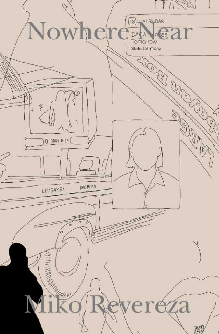
Nowhere Near follows the author’s psychogeographic journey from Los Angeles to Pangasinan to Mexico City after his departure from the United States, where he lived undocumented for twenty-six years. Returning to the Philippines with his grandmother to search for lost land and to confront a “family curse,” Revereza surfaces legacies of Spanish colonialism and US imperialism as they bear out in its continued present. Through film stills, photographs, family archives, and a rapt, first-person narrative, Nowhere Near excavates the amnesias and silences that shape personal and historical memory in the exilic, diasporic impasse.
Miko Revereza's Nowhere Near is the 2021 Open Reading Period Book Prize winner, and was selected by guest judge John Keene.
About the author
Miko Revereza (b. 1988, Manila, Philippines) is an award-winning experimental filmmaker raised in California and currently residing in Oaxaca City. His upbringing as an undocumented immigrant and current exile from the United States informs his relationship to moving images. He has made a series of personal documentaries informed by his experiences with migration and exile: DROGA! (2014), Disintegration 93 – 96 (2017), No Data Plan (2018), Distancing (2019), El Lado Quieto (2021), and Nowhere Near (2023). These works have been screened at festivals and institutions such as Locarno, TIFF, NYFF, and MoMA. No Data Plan is recognized with such honors as the Sheffield Doc Fest Art Award, and was listed in BFI’s Sight & Sound Magazine’s 50 Best Films of 2019, Hyperallergic’s Top 12 Documentary and Experimental Films of 2019, and CNN Philippines’ Best Filipino Films of 2019. Nowhere Near (recipient of Hubert Bals Fund) was among Film Comment’s Best Undistributed Films of 2023 and CNN Philippines’ Best Filipino Films of 2023. Revereza was included in Filmmaker Magazine’s New Faces of Independent Cinema, is a Flaherty Seminar featured filmmaker, and is a recipient of the 2021 Vilcek Prize in Filmmaker. He holds an MFA from Bard College, Milton Avery Graduate School of the Arts. His films are distributed by LUX, London.
Praise
In his powerful and entrancing voice, fueled by irony and critique, Miko Revereza explores neoliberal capitalism, the challenges facing undocumented families, the non-existent “American dream,” and internal and external exile, showing how borders of all kinds (geographical, racial, psychic), though regularly traversed, are policed and criminalized. Nowhere Near is a cri de coeur about twenty-first century American society.
—John Keene
Miko Revereza’s captivating book is a companion to his diaristic 2023 feature of the same title, and it is a pleasure to encounter on the page the resonant literary voice he developed while making that film. Befitting its rich entwining of personal and political histories, Nowhere Near contains a wondrous range of modes and moods: raw and revealing one moment, sharply and humorously observant the next, by turns poetic and plainspoken.
—Dennis Lim
Nowhere Near is a document of lives lived undocumented. Here, form matters: text branches out from image, while dialogue counterpoints an easy, self-reflexive poetic. With the acuity necessitated by a status requiring constant vigilance, negotiating the privatized avenues of America’s dream, Revereza’s words carry a weight that belies their simplicity. Here and now, our attention matters, as America’s icy grip chills us all.
—Alia Syed
Among a Sea of Influences
Mirene Arsanios, Rachel Valinsky
Among a Sea of Influences documents a series of workshops and conversations hosted by Wendy’s Subway and organized by English-Arabic bilingual magazine Makzhin editor Mirene Arsanios on questions of formative literary influences. Three female Arab writers were invited to choose and discuss ten books that shaped their understanding of poetry and translation. Notwithstanding the difficulty of the task, Marwa Helal, Mona Kareem, and Iman Mersal played along, selecting—among a sea of influences—authors and/or translators whose works were key to their own practice, and to their embodied understanding of what it means to write in Arabic from a female perspective. Asking what kind of writings are/were available to them, and which books or translations unseated their understanding of the world, Helal, Kareem, and Mersal discuss writing within the diaspora and across borders, radical publishing and translation networks, cultural and linguistic translation, vernacular language as resistance, and more.
Among a Sea of Influences is co-published by Fully Booked, Makhzin, and Wendy’s Subway on the occasion of Makhzin’s residency at Wendy’s Subway from February 1 to May 31, 2017.
The Joy of Electronic Music
This book is for people who love electronic music, people who probably have a synthesizer or two at home. It’s for people who tell themselves that they should find some time for their passion, who blame themselves for not making enough music. This book is for them.
For decades, I thought that I could be a music producer. But over the years, I have discovered that my contribution to the electronic scene wasn’t exactly the music itself. Although I was lucky enough to produce a few successful tracks in Lithuania, back in the ‘90s, my actual achievement turned out to be raising interest in electronic music, for other young people. I’m still surprised when someone remembers my old tracks, but I’m very proud when someone tells me that listening to me speak on the radio about Berlin techno changed their dreams back in the day. Later, in the 2000s, I was part of the early SoundCloud team. The code we wrote has touched hundreds of millions people around the world. No track or song I would have ever produced would have had such an effect. There is a reason that Brian Eno says the evolution of music is moved by technology as much as it is by artists. The people who created Logic and Ableton, those who code SoundCloud and Spotify, design Korg and Roland synths, they influence the course of music on a massive scale. The development of music technology is the work of many people and I’m happy to call myself one of that gang.
This book is a natural extension of those ideas. It’s not based on scientific or journalistic research, but it’s not a biography, either. I imagine this book sitting on a studio desk, or in a gig bag. In the process, I hope that some young music creators will find answers here, and inspirations, to the questions they’ve been wrestling with for a long time.
Post-Nationalism
Why is post-nationalism so difficult to accept? Why is it that everyone still clings to ideas about their nations and cultures that limit exchange and construction? Why is it that Europe, the post-national project par excellence, is still facing a deficit in commitment compared to national and even local commitments?
In this riveting essay, Rosi Braidotti tackles these questions through a renewed examination of the social imaginary underlying how people understand their communities, cultures and nations. Europeans in particular need to become Europeans just as we became French, Italian or German in the past.
In the contemporary geopolitical context — war, the rise of authoritarian right-wing politics, the return of illiberal, neofascist political movements spreading a climate of gloom and crisis — the unfinished task of becoming post-national has acquired new urgency. The way to make it possible might lie in a renewal of love and solidarity, creative energy and affirmative ethics.
Rosi Braidotti is a philosopher and feminist theorist. A distinguished university professor emerita at Utrecht University and honorary professor at RMIT University, her work is discussed all around the world. She has authored more than 20 books. Her last book in English is Posthuman Feminism (Polity, 2022).
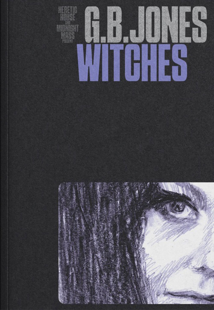
Midnight Mass Press & Heretic House
WITCHES
A collection of portraits by original riot grrrl, filmmaker, and zine queen, G.B. Jones. All of them witches – from the silverscreen, woodlands, and the streets.
Featuring provocative essays by Caroline Azar, Paul P., Leafshimmer, Jenna Danchuk, Blake Baron Ray, and Scott Treleaven – each exploring how witches have been perceived, presented, and portrayed in popular culture. “Realer than real, stranger than fiction.”
PRAISE FOR G.B. JONES WITCHES
Witches by G.B. Jones is a summoning spell posing as a book, a paper potion like the potion Nicky gives Gillian in Bell, Book and Candle. It draws me to it and to what’s in it, Jones’ divine drawings of the witches we both worship, the witches of TV and film and true life. I go to it gladly. I go to it gayly. I pore over it and prize it and purr like Pyewacket.
— Derek McCormack, author of Castle Faggot
G.B. Jones is the original Foxy Genius. Her zines, drawings, music, and Super 8 films inspired both the Queer zine explosion and the Riot Grrrl movement of the 90s. Witches sees G.B. once again crafting her magic.
— Kathleen Hanna, singer, writer, artist, and front-woman of the bands Bikini Kill and Le Tigre
With her illustrated procession of witches, post-punk icon G.B. Jones acts as medium to a dazzling diversity of disrupters from across screen history, as well as a pantheon of real-life hellraisers, from Sybil Leek and Rosaleen Norton to Vali Myers and beyond – all woven through with astute commentary by a host of countercultural collaborators. A captivating book; I was certainly under its spell.
— Kier-La Janisse, author of House of Psychotic Women
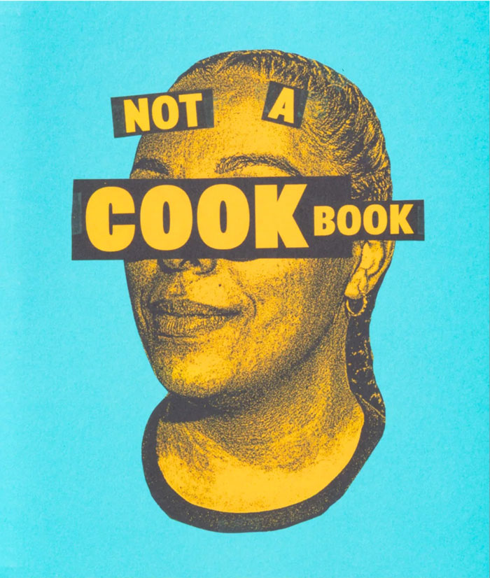
Not A Cookbook
TBW Books is proud to announce the release of Not a Cookbook, the debut book by Canadian filmmaker and artist Robby Reis.
At first glance, Not a Cookbook appears to be just what its title implies—but beneath the surface lies a layered, collage-style portrait of a restaurant and the family that holds it together. Centered on Resto Palme, a Caribbean restaurant in Montreal run by married duo Lee-Anne Millaire Lafleur and Ralph Alerte, the book offers a deeply personal and provocative exploration of kitchen culture, where food becomes a lens through which to examine family, friendship, labor, and resistance.
A longtime friend of the family, Reis takes an embedded, nonlinear approach to storytelling. Through photographs, texts, and contributions from customers and staff, Not a Cookbook captures not just the daily challenges of running a family business, but also the peripheral stories—of racism, activism, and the emotional labor required to build and protect something shared and sacred.
Despite its name, Not a Cookbook does offer some treasured family recipes—however, when it comes to a few key ingredients that make a certain sauce so special, Alerte leaves us simply with, “sorry blood, I can’t give it away.” The result is a new model for the cookbook: a radical kitchen guide rooted in community, resilience, and love. Less about what’s on the plate, and more about everything that makes the plate possible.
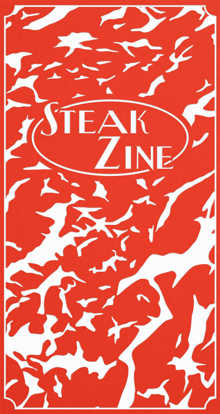
Steak Zine
Steak Zine is the new issue of Cake Zine. Cake Zine is a literary print magazine exploring art, history, and pop culture through food.
For this pocket-sized special issue, Cake Zine is setting off into carnivorous territory. Serving up 208 pages of non-fiction and fiction exploring the cultural impact of red meat, including:
The last days of Acropolis, Portland’s beloved strip club-steakhouse, by Sophia June
A profile on the women going viral by eating raw meat online by Ella Quittner
A night at a fictionalized steakhouse kaleidoscoped through the roles of maître d’, bartender, server, chef, and guest, by Leah Abrams, Isle McElroy, Lillian Fishman, Stephanie Wambugu, and Hannah Kingsley-Ma
Examinations of the enduring escapism of Outback Steakhouse and Fogo de Chão by Ruby Robina Saha and Adam Dalva
A trip through Nebraska to trace how historic stockyard closures in the late 1990s have affected those serving up beef in the Beef State, by Jamal Dauda
A wistful look back at a romance fueled by ribeye and red leather booths, by Emma Specter
NDA-risking testimony from a lab tech at a plant-based food start up who went from vegetarian to carnivore in the noble name of research, by AUTHOR REDACTED
Tracing the roots and uncertain future of Hong Kong’s sizzling steak by Madeline Leung Coleman
Plus the steak heists prompting retailers to put meat behind lock and key, the body horror of cannibalist cinema, revisiting molecular gastronomy’s embrace of meat glue, the social tensions behind ordering well-done meat, the trauma of growing up on an Australian cattle ranch, and much more.
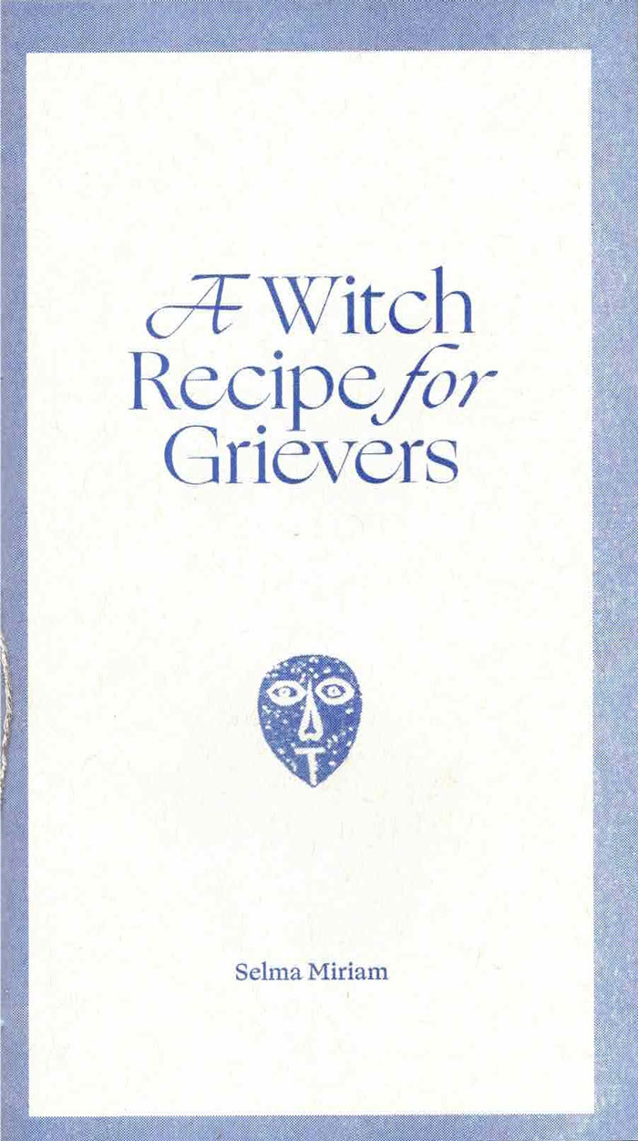
A Witch Recipe for Grievers
"Sometimes nothing can be done to change things, and hurt and anger must be transmuted . . ."
This essay was originally published in 1984 as the last recipe in a Bloodroot Collective feminist vegetarian cookbook (see Our daily lives have to be a satisfaction in themselves which includes this essay as a chapter).
This new version is completely redesigned as a ritual object to be given to a friend in mourning. Hand-sewn, and illustrated with New England gravestone rubbings, the uncut pages are intended to be cut by the recipient as they read the book.
Emily Larned's Alder & Frankia Efemmera Reissue series amplifies, graphically reinterprets, and recirculates historic feminist ephemera. Each issue is different in form. What ideas, strategies, and tactics from the past can we borrow to bring forth a feminist future? A Witch Recipe for Grievers is Efemmera Reissue #5.
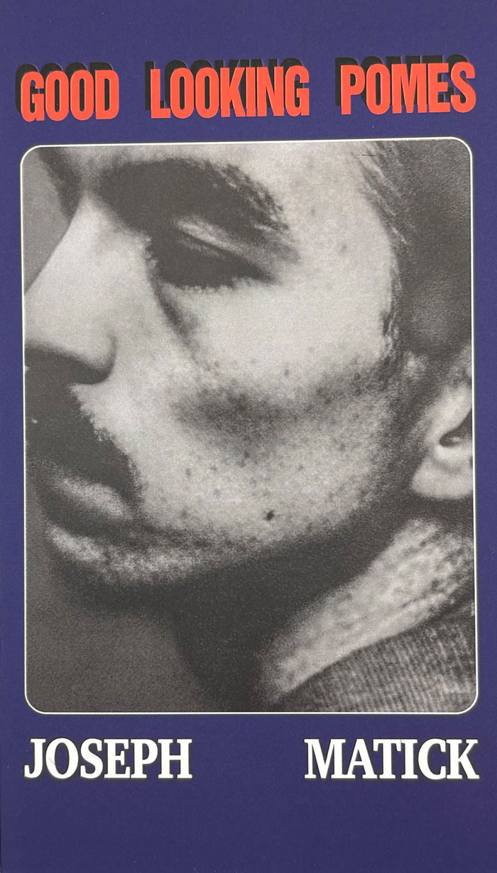
Good Looking Pomes
"Joseph Matick is a former poet, now bird. He flies over pastures and eats chemtrails as his karmic sentence for spending so many years without flying. (You still have time, kids). Remarkably, he wrote this book in Paris with Jack before his transformation into Frank 0' Hara for the front cover. This book is dedicated to his father and his son. And to all the gum chewing geniuses of the lower canal. He wrote this in the 9éme and was inspired by baseball, flowers, and getting money so as not to die. These are his simplest and most penetrating words."
KATE FOR AVEC JACK VERA INTL
Joseph Matick is an American poet and filmmaker based in Paris. He grew up on a farm in small-town America, moved to Chicago, and eventually to Paris, where he stayed. He studied at the Jack Kerouac School of Disembodied Poetics at Naropa University — of which he has said: “that place ripped the rug from under my feet” — and has been writing ever since. He is the author of four books: three published by Far West Press — The Baba Books (New American Babble, Post Meridiem Seasick Fuzz, Animal My Soul), Cherry Wagon, and Good Looking Pomes (March 31, 2026). His work appears in King Kong Magazine and is held in the collection of the American Library in Paris.
Translated to English for the first time.
Transchool: Volume 2
Transchool: Volume 2 is an anthology featuring the multifaceted work — poetry, fiction, nonfiction, screenplays, genre-defying writing — by the second class of Transchool creative writers and their mentors, including Amos Mac, Cameron Awkward-Rich, Sylan Oswald, and torrin a. greathouse, with introduction letters from Chase Strangio and Kyle Lasky of @Transanta, Drew Denny, and Ren Heintz. Allies in Arts founded Transchool to empower the voices of trans and nonbinary writers ages 18-25. This volume of the Transchool anthology includes work that was created by these writers in June, 2024.
“These are the crevices that these writers have found and put to words while much of the world tries to turn us into a soundbite cliché, an emulsified reduction of what cannot be contained. There is a glow to each of these writers, and to the worlds they are bringing us towards.” – Dr. Ren Heintz
Contributors:
Chase Strangio
Kyle Lasky
Ren Heintz
Park Walters
J. Martel
Cassandra R. Flowers
Jo(rdan) Snow
Cameron Awkward-Rich
E.F. Tate
KB
Amos Mac
CL
R. David
Shea S. Davis
Sal Kang
torrin a. greathouse
Elijah Bendiner
Sylvan Oswald
Quinlan Owens
D. Ezra
Shoshana Katz
Dominic Emerson Wing
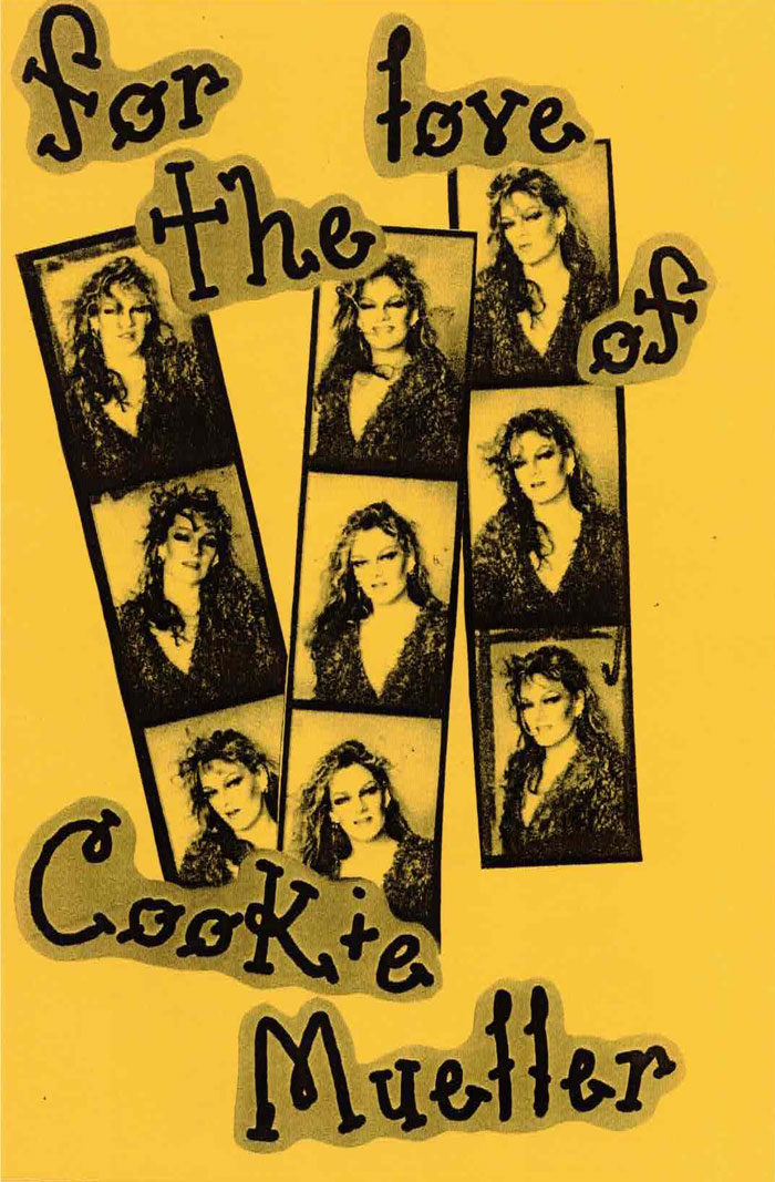
For the Love of Cookie Mueller
For the Love of Cookie Mueller attempts to capture some of our favorite aspects of Cookie Mueller, mostly her good humor and absurdity. A girl who just stumbled onto wildness, Cookie became a counter cultural icon, a writer, a mother, a victim of Governmental negligence but she never let a thing get her down. Cookie Mueller is a guru of the 20th century. In today’s era of war and political instability, her writing feels more important today than ever. This is for hardcore Cookie fans and novices alike.
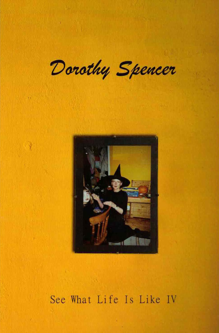
See What Life Is Like IV
Fifteen new poems form the fourth instalment in Dorothy Spencer’s See What Life Is Like poetry series. Newfound motherhood, pollution, tragedy and going fishing are all covered in a series of ethereal and eternal verses, told with acerbic wit.
Crue
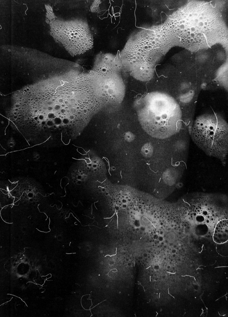
L’Île-de-France a été engloutie. Submergée par de l’eau liquide. C’est à peu près tout ce que l’on sait. Crue est un long poème construit sur un rythme ternaire, une suite de tercets libres entrecoupés de symboles typographiques étranges dont la signification exacte semble avoir été perdue dans l’inondation. Il y a dans le va-et-vient soutenu du texte comme dans celui de la mer, ses gestes répétés, toujours successifs, quelque chose de l’automation ; l’acceptation sans révolte d’une nouvelle nature sous-marine hybride, plus uniquement humaine, à la langue noyée, gorgée de néologismes, méthodique, néanmoins sentimentale. Car ici la cruauté sinistre de la nature fait écho aux émotions du narrateur. Le paysage-état d’âme est désolé, apocalyptique mais comme résigné, nu. Crue sonde les abysses de la civilisation et des comportements humains. Peut-être un des textes les plus personnels de Théo Robine-Langlois.
Sexe 2
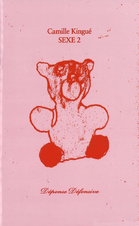
Confession sur le désir (l’action et l’objet du), les liens de mutualité et de résistance, Sexe 2 alterne prose et versification en 27 fragments numérotés à l’adresse plus ou moins dure, plus ou moins sincère, plus ou moins formulée car plus ou moins éloignée du Toi et du Je. Camille Kingué s’attache à révéler, à voir quelque chose à travers son image réelle et virtuelle, agrandie et rétrécie, droite et renversée, déployant une recherche des principes de l’amour (l’amour comme amour, pourquoi est ce qu’il y a de l’amour) où la métaphysique et la compréhension de soi – donc de l’autre – n’ont jamais été aussi sexy.
Claire Star Finch, dans la magnifique préface qu’iel signe au début de l’ouvrage, écrit : « Après avoir lu tous les livres de Kingué, je ne sais pas si je crois en “l’amour”, que ce soit en tant que substantif absolu ou en tant que proto-résidu de tout ce que “le sexe” peut signifier. Mais je crois définitivement qu’il faut l’écrire. » Définitivement.