Books
Books
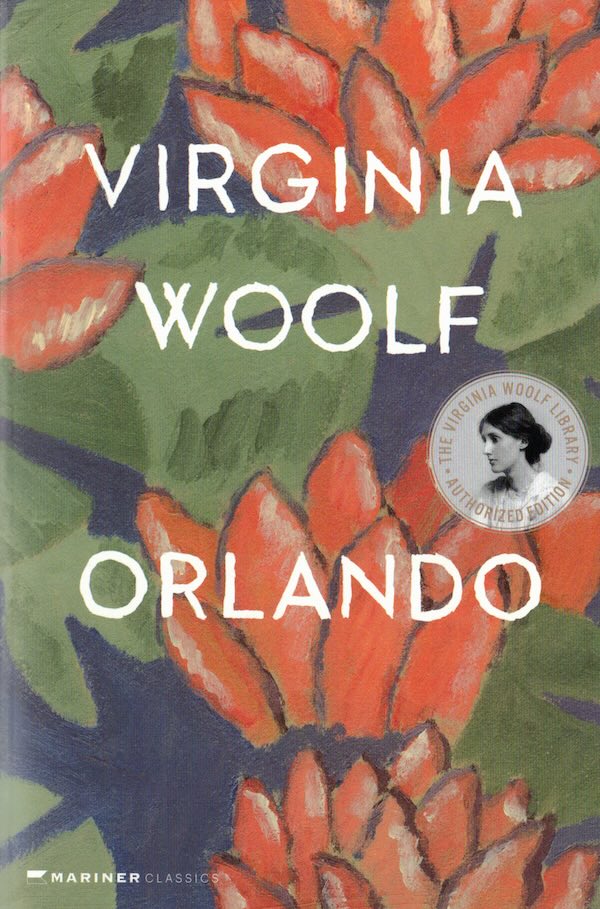
Orlando
"Come, come! I'm sick to death of this particular self. I want another."
Virginia Woolf described "Orlando" as "an escapade, half-laughing, half-serious; with great splashes of exaggeration, " but many think Woolf's escapade is one of the most wickedly imaginative and sharply observed considerations of androgyny that this century will see.
Orlando is, in fact, a character liberated from the restraints of time and sex. Born in the Elizabethan Age to wealth and position, he is a young male aristocrat at the beginning of the story - and a modern woman four centuries later. The hero-heroine sees monarchs come and go, hobnobs with great literary figures, and slips in and out of each new fashion. Woolf presents a brilliant pageant of history, society, and literature as well as subtle appreciation of the interplay between endings and beginnings, past and present, male and female.
Virginia Woolf(1882-1941) was one of the major literary figures of the twentieth century. An admired literary critic, she authored many essays, letters, journals, and short stories in addition to her groundbreaking novels, including Mrs. Dalloway, To The Lighthouse, and Orlando.
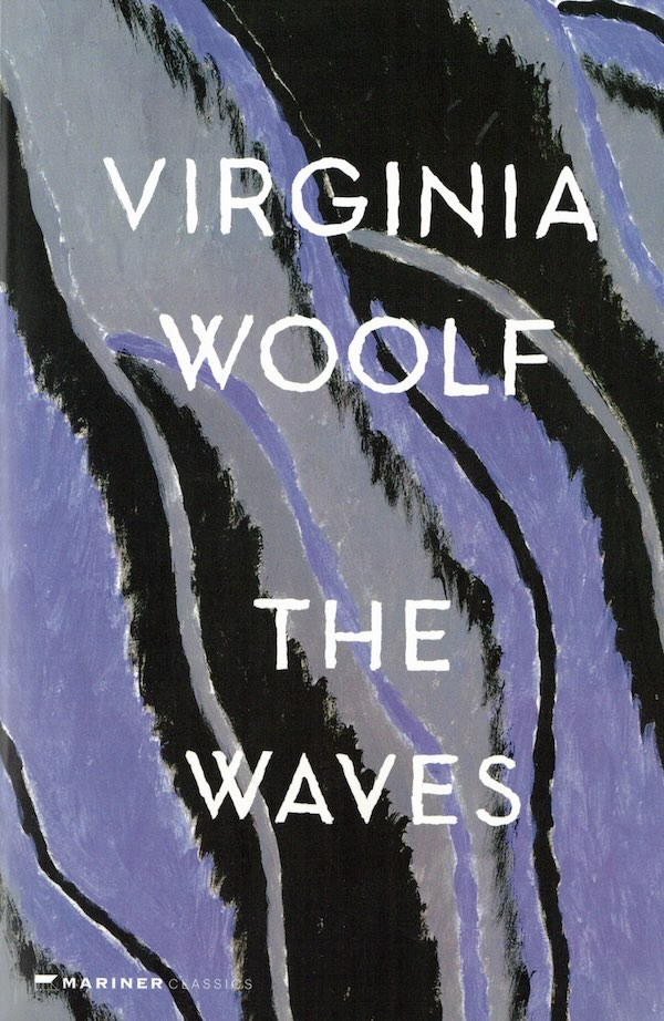
The Waves
"I am made and remade continually. Different people draw different words from me."
Innovative and deeply poetic, The Waves is often regarded as Virginia Woolf's masterpiece. It begins with six children—three boys and three girls—playing in a garden by the sea, and follows their lives as they grow up, experience friendship and love, and grapple with the death of their beloved friend Percival. Instead of describing their outward expressions of grief, Woolf draws her characters from the inside, revealing their inner lives: their aspirations, their triumphs and regrets, their awareness of unity and isolation.
Virginia Woolf (1882-1941) was one of the major literary figures of the twentieth century. An admired literary critic, she authored many essays, letters, journals, and short stories in addition to her groundbreaking novels, including Mrs. Dalloway, To The Lighthouse, and Orlando.
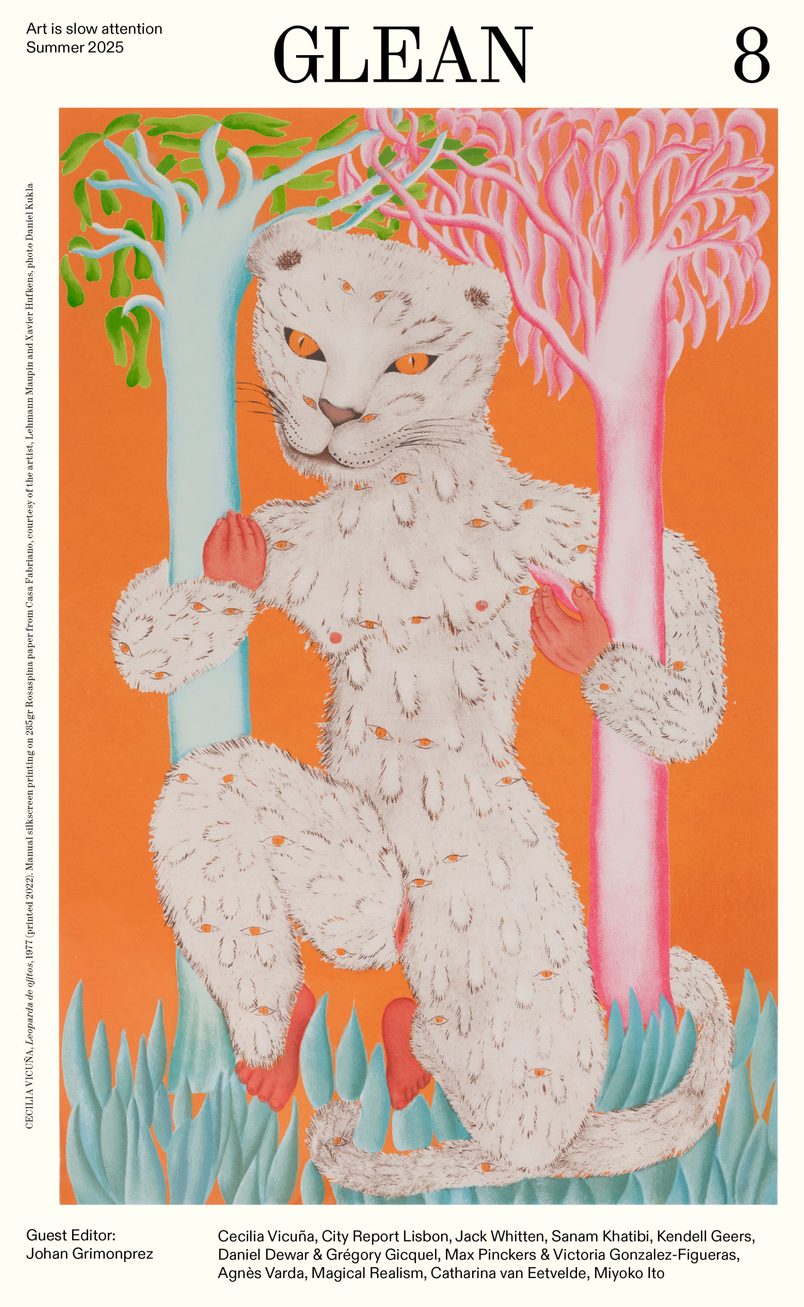
GLEAN 8 - Summer 2025
Contributions by: Cecilia Vicuña, City Report Lisbon, Jack Whitten, Sanam Khatibi, Kendell Geers, Daniel Dewar & Grégory Gicquel, Max Pinckers & Victoria Gonzalez-Figueras, Agnès Varda, Magical Realism, Catharina van Eetvelde, Miyoko Ito.
GLEAN is a Brussels-based magazine for contemporary art with quarterly publications in both English and Dutch.
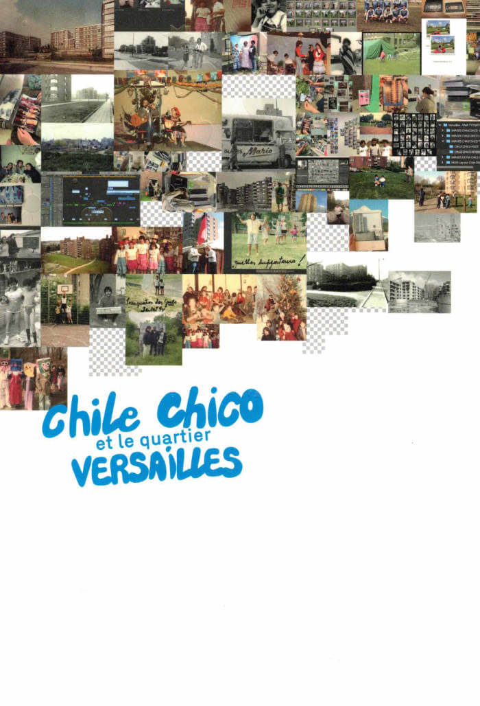
Chile Chico et le quartier Versailles
Chile Chico et le quartier Versailles, c'est une exploration qui inventorie, interroge et révèle les mémoires invisibles en listes et en collections. Une mémoire qui ne soffre pas en bloc, qui résiste, se fragmente, se transforme. A travers cette archive collaborative, nous avons voulu capter ces va-et-vient ď'un passé qui dialogue avec le présent, des images qui oscillent entre Vintime et le collectif.
Le point de départ de cette fabrique visuelle, c'est lexil des Chilien.nes, débarqué.es dans les années 70, qui se tissent une nouvelle vie sur le sol de Neder-Over-Heembeek, dans le quartier Versailles à Bruxelles. Ces trajectoires, arrachées à un ailleurs, s'ancrent dans des espaces rêvés comme de transit pour devenir des lieux d 'appartenance, où lexil se mue et les racines finissent par se déployer. A ces récits se greffent d'autres histoires, d'autres trajectoires. Un quartier comme un carrefour, ou les individualités se rencontrent, où les vies se croisent et s'allient.

Honey Volume 2
Mars Dietz, Opashona Ghosh and 1 more
HONEY is a zine meditating on the experiences of friendship.
Volume 2 was edited by Mars Dietz, Opashona Ghosh and Dylan Spencer-Davidson—each inviting contributions from friends.
Following vol. 1’s optimism about the underappreciated potentials of friendship, vol. 2 marks a noticeable turn towards friendship's messier sides. Letters to deceased friends, childhood social complexities, unrealised sexual desire, pushback against the overfetishisation of queer kinship, and more.
Contributions from Azul De Monte, Ana Božičević, D Mortimer, Adriana Disman, Pelumi Adejumo, Iggy Robinson, Clay AD, To Doan, Edward Herring, marum, Lou Drago, Aisha Mirza, Iga Świeściak, Roya Amirsoleymani, George Lynch, Emily Pope and Kari Rosenfeld.
Original artworks by Opashona Ghosh and Iga Świeściak, and featuring artworks by Azul De Monte and Emily Pope.
Riso printed on recycled paper with Pagemasters (London).
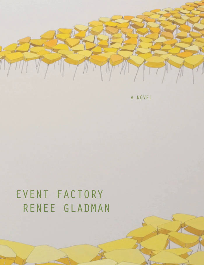
Event Factory
A “linguist-traveler” arrives by plane to Ravicka, a city of yellow air in which an undefined crisis is causing the inhabitants to flee. Although fluent in the native language, she quickly finds herself on the outside of every experience. Things happen to her, events transpire, but it is as if the city itself, the performance of life there, eludes her. Setting out to uncover the source of the city’s erosion, she is beset by this other crisis—an ontological crisis—as she struggles to retain a sense of what is happening.
Event Factory is the first in a series of novels (also available are the second, The Ravickians; the third, Ana Patova Crosses a Bridge; and the fourth, Houses of Ravicka) that Renee Gladman is writing about the invented city-state of Ravicka, a foreign “other” place fraught with the crises of American urban experience, not least the fundamental problem of how to move through the world at all.
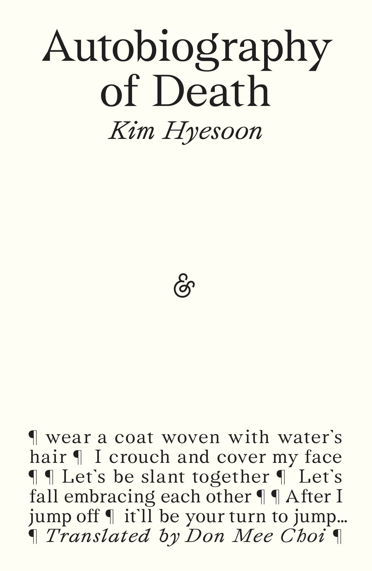
Autobiography of Death
‘I thought to myself that I needed to sing death, perform a rite for death, write death, then bid farewell to it. The way to send death away was to sing with my own death all the death in the sky and on the ground.’
The title section of Kim Hyesoon’s visceral Autobiography of Death consists of forty-nine poems, each poem representing a single day during which the spirit roams after death before it enters the cycle of reincarnation. The poems not only give voice to those who met unjust deaths during Korea’s violent contemporary history, but also unveil what Kim calls ‘the structure of death, that we remain living in’. Autobiography of Death at once re-enacts trauma and narrates death – how we die and how we survive within this cyclical structure. In this sea of mirrors, the plural ‘you’ speaks as a body of multitudes that has been beaten, bombed, and buried many times over by history. The volume concludes on the other side of the mirror with ‘Face of Rhythm’, a poem about individual pain, illness, and meditation.
Winner of the 2019 International Griffin Poetry Prize
Winner of the 2019 Lucien Stryk Asian Translation Prize
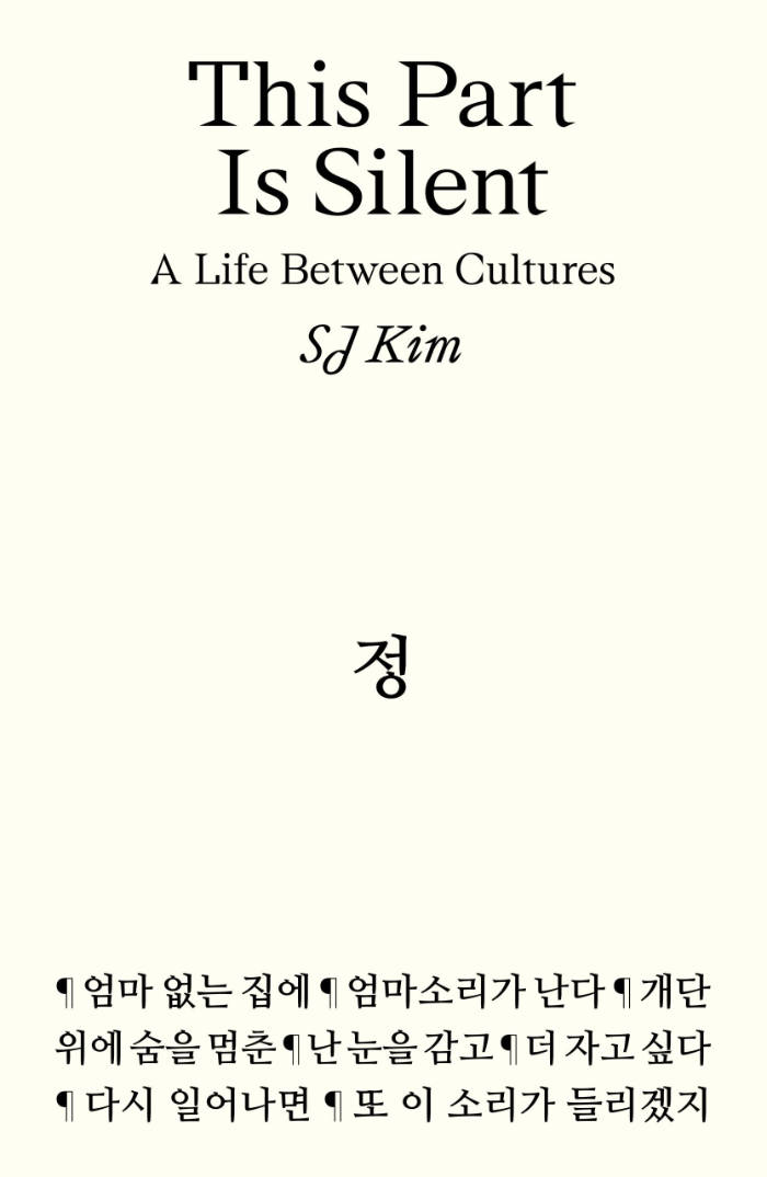
This Part Is Silent: A Life Between Cultures
Born in Korea, raised in the American South, and trying her best to survive British academia, SJ Kim probes her experiences as a writer, scholar, and daughter to confront the silences she finds in the world. With curiosity and sensitivity, she writes letters to the institutions that simultaneously support and fail her, intimate accounts of immigration, and interrogations of rising anti-Black and anti-Asian racism. She considers the silences between generations―especially within the Asian diaspora in the West―as she finds her way back to her own family during the pandemic lockdown. Embracing the possibilities and impossibilities of language, Kim rejoices in the similes of Korean, her mother tongue, and draws inspiration from K-dramas and writers who sustain her, including Yusef Komunyakaa, Don Mee Choi, Toni Morrison, and Theresa Hak Kyung Cha.
Longlisted for the 2025 Andrew Carnegie Medal for Excellence in Nonfiction.
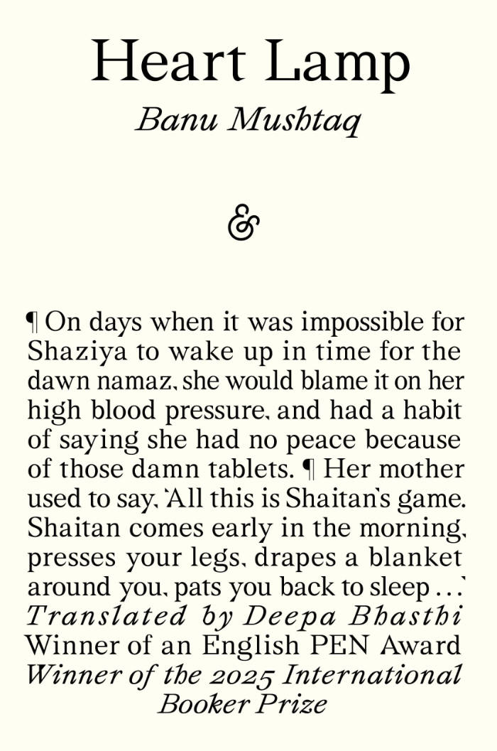
Heart Lamp
In the twelve stories of Heart Lamp, Banu Mushtaq exquisitely captures the everyday lives of women and girls in Muslim communities in southern India. Published originally in the Kannada language between 1990 and 2023, praised for their dry and gentle humour, these portraits of family and community tensions testify to Mushtaq’s years as a journalist and lawyer, in which she tirelessly championed women’s rights and protested all forms of caste and religious oppression. Written in a style at once witty, vivid, colloquial, moving and excoriating, it’s in her characters – the sparky children, the audacious grandmothers, the buffoonish maulvis and thug brothers, the oft-hapless husbands, and the mothers above all, surviving their feelings at great cost – that Mushtaq emerges as an astonishing writer and observer of human nature, building disconcerting emotional heights out of a rich spoken style. Her opus has garnered both censure from conservative quarters as well India’s most prestigious literary awards; this is a collection sure to be read for years to come.
Winner of the 2025 International Booker Prize.

Grandma’s Story
‘May my story be beautiful and unwind like a long thread . . .’, she recites as she begins her story.
The storyteller is the living memory of her time: at once an oracle, weaver, healer, warrior, witch, protectress, teacher and great mother. Her powers are to do with passing on – not only the stories but transmission itself: ‘what grandma began, granddaughter completes and passes on to be further completed.’
In contrast to the idea that a story is ‘just a story’, pioneering postcolonial feminist theorist and filmmaker Trinh T. Minh-ha recodes ideas about truth and fantasy to tell a different story about power, civilisation, history, medicine and magic. Grandma’s Story shows how creative speech is connected to women’s powers of enchantment, drawing upon and speaking with storytellers including Theresa Hak Kyung Cha, Clarice Lispector, Maxine Hong Kingston, Leslie Marmon Silko and Zora Neale Hurston – all who may be known as ‘she who breaks open the spell’.
The story as a cure and a protection is at once musical, historical, poetical, ethical, educational, magical, and religious.
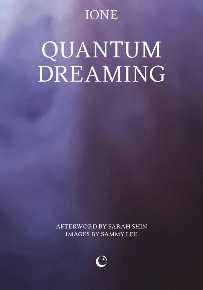
Quantum Dreaming
IONE is a Dream Keeper: a facilitator of dreams. Sharing this intimate part of our being, she believes, can be the start of new ways of being with one another.
Exploring the reality of the dream and the dream of reality over many decades has led IONE to appreciate the quantum nature of dreams. Weaving science and dream traditions from around the world together with her own memories and the dreams of her friends and community members, Quantum Dreaming shows that as we start practising awareness, our consciousness also deepens.
IONE and Pauline Oliveros’s shared vision of a harmonious, self-sustaining network of artists and dreamers led to the founding of the Deep Listening Institute. Quantum Dreaming similarly seeks a radical shift in our collective consciousness, across all states of dreaming and waking.
Afterword by Sarah Shin
Images by Sammy Lee

Famous for my Dinner Parties - Issue 003
After the ‘best-of’ character of issue 001 and the mono-themed ‘food fad issue’ 002, number three is again somewhat more loosely conceived — less of a theme issue than a concept zine that aims to tap into certain elements of the zeitgeist. It consists of ten brand-new pieces in the form of essays, compilations of shorts, a still life series and even fiction — all circling around the anxieties of being alive in the world today and the way they reflect in what and how we eat. With pieces on chef culture, food diplomacy, paranoia about food safety, microwaves, internet urban legends and food crimes, the magazine’s graphic design takes cues from tabloid newspapers to fit the salaciousness and scandal-ridden character of its topics. Issue 003 is famous for my dinner parties’ signature blend of cultural criticism and bold, vibrant imagery at its best.

Disavowal
This book argues that the psychoanalytic concept of disavowal best renders the structure underlying our contemporary social response to traumatic and disturbing events, from climate change to unsettling tectonic shifts in our social tissue. Unlike denialism and negation, disavowal functions by fully acknowledging what we disavow. Zupancic contends that disavowal, which sustains some belief by means of ardently proclaiming the knowledge of the opposite, is becoming a predominant feature of our social and political life. She also shows how the libidinal economy of disavowal is a key element of capitalist economy.
The concept of fetishistic disavowal already exposes the objectified side of the mechanism of the disavowal, which follows the general formula: I know well, but all the same, the object-fetish allows me to disregard this knowledge. Zupancic adds another twist by showing how, in the prevailing structure of disavowal today, the mere act of declaring that we know becomes itself an object-fetish by which we intercept the reality of that very knowledge. This perverse deployment of knowledge deprives it of any reality.
This structure of disavowal can be found not only in the more extreme and dramatic cases of conspiracy theories and re-emerging magical thinking, but even more so in the supposedly sober continuation of business as usual, combined with the call to adapt to the new reality. To disrupt this social embedding of disavowal, it is not enough to change the way we think: things need to change, and hence the way they think for us.

Not One Day
A tour de force of experimental queer feminist writing, Not One Day is renowned Oulipo member Anne Garréta's intimate exploration of the delicate connection between memory, fantasy, love, and desire. Garréta, author of the acclaimed genderless love story Sphinx and experimental novel In Concrete, vows to write every day about a woman from her past. With exquisite elegance, she revisits bygone loves and lusts, capturing memories of her past relationships in a captivating, erotic composition of momentary interactions and lasting impressions, of longing and of loss.
Anne Garréta, author of the groundbreaking novel Sphinx (Deep Vellum, 2015), is a member of the renowned Oulipo literary group. Not One Day won the Prix Médicis in 2002, recognizing Garréta as an author “whose fame does not yet match their talent.” Garréta is also the author of In Concrete, translated by Emma Ramadan (Deep Vellum, 2021).
Emma Ramadan is a literary translator of poetry and prose from France, the Middle East, and North Africa. She is the recipient of a Fulbright, an NEA Translation Fellowship, a PEN/Heim grant, and the 2018 Albertine Prize. Her translations for Deep Vellum include Anne Garréta’s Sphinx and In Concrete, Fouad Laroui's The Curious Case of Dassoukine's Trousers, and Brice Matthieussent's Revenge of the Translator.

Bad Girls
Gritty and unflinching, yet also tender, fantastical, and funny, a trans woman’s coming-of-age tale about finding a community among fellow outcasts.
Born in the small Argentine town of Mina Clavero, Camila is designated male but begins to identify from an early age as a girl. She is well aware that she’s different from other children and reacts to her oppressive, poverty-stricken home life, with a cowed mother and abusive, alcoholic father, by acting out—with swift consequences. Deeply intelligent, she eventually leaves for the city to attend university, slipping into prostitution to make ends meet. And in Sarmiento Park, in the heart of Córdoba, she discovers the strange, wonderful world of the trans sex workers who dwell there.
Taken under the wing of Auntie Encarna, the 178-year-old eternal whose house shelters this unconventional extended family, Camila becomes a part of their stories—of a Headless Man who fled his country’s wars, a mute young woman who transforms into a bird, an abandoned baby boy who brings a twinkle to your eye.
Camila Sosa Villada’s extraordinary first novel is a rich, nuanced portrait of a marginalized community: their romantic relationships, friendships and squabbles, difficulties at work, aspirations and disappointments. It bears witness to these lives constantly haunted by the specter of death—by disease or more violent means at the hands of customers, boyfriends, or the police—yet full of passion, empathy, and insight.

Le mouvement féministe est un complot lesbien
Ce recueil de textes choisis et inédits en français offre une plongée dans le mouvement féministe américain du début des années 1970 et le rôle déterminant qu'y ont joué les lesbiennes. Entre 1969 et 1974, des textes majeurs du mouvement sont écrits par des collectifs comme les Lavender Menace et des autrices comme Martha Shelley, Willyce Kim, Rita Mae Brown, Judy Grahn ou Sue Katz. En problématisant le genre, la classe, la race et leurs multiples intersections, elles ont défendu des positions révolutionnaires. Cet ouvrage donne aussi à voir les formes graphiques prises par ces textes, témoignant de l'intrépidité et de la radicalité de cette jeunesse homosexuelle féministe.

Clarifications
Hourja Bouteldja, Alain Brossat
Alain Brossat est ex-militant de la LCR ancré dans une lecture anti-impérialiste de la politique. Houria Bouteldja est la cofondatrice du QG Décolonial et une figure de l'antiracisme politique. Dans cet entretien exigeant, les deux penseur·ses et militant·es clarifient leurs divergences et leurs convergences autour de la religion, du racisme, de l'État, du fascisme et de l'impérialisme. Alors que ces questions clivent celles et ceux qui luttent pour l'émancipation, rendant parfois les discussions impossibles, les deux auteur·ices reviennent sur leurs parcours politiques et philosophiques, sans pour autant feindre le consensus de leurs héritages politiques. Entretien coordonné par Marianne VL Koplewicz.

Coups de putes
Faut-il cautionner la prostitution pour soutenir les travailleuses du sexe ? Faut-il pénaliser les clients ? La prostituée est-elle le symbole de l'oppression des femmes ? Juno Mac & Molly Smith posent un regard nouveau sur ces questions souvent conflictuelles. Elles rejettent l'alternative entre condamnation et glorification du travail du sexe, et étendent leur propos à des problématiques plus larges : les frontières, l'exploitation, le sexisme et la suprématie blanche. En délaissant les symboles passionnés et en examinant les effets concrets des différents régimes législatifs, elles démontrent que la lutte des travailleuses du sexe est d'une importance capitale pour le mouvement social.

Gaza, un génocide annoncé
La nouvelle catastrophe subie par le peuple palestinien est pire que la Nakba de 1948. C'est le premier génocide perpétré par un État industriel avancé depuis 1945, avec la participation des États-Unis et la soutien de l'Occident, France incluse. Chercheur franco-libanais spécialiste du Moyen-Orient, auteur de nombreux ouvrages traduit en vingt langues et contributeur régulier au Monde diplomatique, Gilbert Achcar dévoile le processus historique qui a mené à ce génocide et mène une réflexion rigoureuse et documentée sur ses conséquences pour le peuple palestinien, les peuples de la région et pour l'ensemble des relations internationales.

Tout un chacun une arme
"Que peut la poésie ?" Un recueil du poète britannique Sean Bonney, qui pratiquait une poétique militante, dont la plupart des textes proviennent de Letters against the Firmament. Ses "lettres" sont autant d'adresses à des ami.es et/ou camarades dans lesquelles il relie la situation politique britannique (conflit de classe, paupérisation et pauvreté de l'expérience quotidienne) à son vécu (la faim, la dépression, la rage) : une cosmologie radicale dans laquelle les fantômes de Thatcher et les émeutes de 2011 trouvent des échos dans le scintillement des étoiles. Ces Lettres sont accompagnées de trois autres textes : "Notes sur la poétique militante", "Notes ultérieures" et "Comètes et Barricades".

Par-delà étrange et familier
Dans cet ouvrage, malheureusement son dernier, Mark Fisher revisite des artefacts culturels familiers afin de cartographier les variétés de l’étrange dont ils sont porteurs. Longtemps sensible aux dimensions bizarre et omineuse qu’il devinait, sans les nommer, entre autres dans les œuvres de Lovecraft, les films de David Lynch ou les albums de The Fall, M. Fisher tente ici la synthèse essentielle d’un questionnement qui l’avait hanté, jusqu’à ce livre.
Avec son regard si particulier, celui du critique culturel tout à la fois pop et moderniste, puisant aux sources de la psychanalyse et du marxisme, Fisher se penche sur des objets sensibles pour y saisir les rapports entre présence et absence, entre ce qui devrait être mais n’est pas, ce qui ne devrait pas se présenter mais survient. C’est en compagnie de ces spectres — du titre d’un autre ouvrage — que nous sommes invités à voyager, pour questionner les formes mêmes de nos existences sociales, jusqu’aux frontières de l’étrange.

Suites décoloniales
Cet ouvrage se compose de « leçons » pour tenter d’anticiper les contre-feux institutionnels et se confronter aux effets qui accompagnent l’offre amoureuse d’une décolonisation de façade. Essayer de comprendre pourquoi ces stratégies trouvent des prises particulières dans le contexte français et montrer comment elles composent le chemin le plus sûr pour la poursuite – et même la nouvelle peau – de l’économie néolibérale.
Olivier Marbœuf est auteur, poète, performeur. Il a été directeur artistique du centre d’art l’Espace Khiasma. À travers ses multiples expériences et sa connaissance des milieux artistiques et culturels, il analyse les chantiers actuels de décolonisation de ces espaces.

Les Matières de la nuit
« Et ensuite quand le calme est revenu, plantez à la place une femme noire qui lève le poing, même un instant, comme pour faire semblant. Une femme noire fera le job, avec le poing levé, c’est mieux, c’est cool. » Écho ou fantôme de Suites décoloniales, ce recueil de poésie prolonge et complète les chemins parcourus par Olivier Marboeuf dans son essai, au moyen de ce que l’auteur appelle une « pratique théorique de la poésie ».
Fragments de mauvaises rencontres, haïkus sur le beat accéléré d’un train, hommages à la banlieue chérie, Olivier Marboeuf se fait conteur polyphonique, poreux au monde et dépositaire des histoires étendues et vues dans de multiples nuits.

Impossible Dreams
Pati Hill's cult novel, available for the first time since 1976.
Impossible Dreams was Pati Hill's last published novel, released in 1976 after it was partially published two years earlier in the Carolina Quarterly under the title "An Angry French Housewife." Hill tells the story of Geneviève, a middle-aged woman whose life is turned upside down when she unexpectedly falls in love with her neighbor, Dolly. Mixing anecdotes with existential thoughts, the novel describes the gradual disruption of the heroine's daily life. Almost every chapter (the length of which varies from a single sentence to no more than three pages) is accompanied by a xerograph of a photograph, selected by Hill with permission from its maker. The resulting combination of text and image constitutes her most ambitious attempt to produce a work in which "the two elements fuse to become something other than either."
This novel is also one of the most incisive examples of Hill's writing—dry and impartial, yet managing to capture the contradictory feelings of her characters. In a letter addressed to the photographer Eva Rubinstein asking for reproduction rights, she writes: "My book is about a woman with a little girl and a husband who falls in love with a woman and a little girl and a husband and loses them all, just like in your mirror. It doesn't sound very cheerful but it is mainly funny."
Daisy, an independent publishing house, releases a facsimile of the out-of-print work that, after almost 50 years since its initial publication, has become a coveted collector's item.
"Impossible Dreams charmed me with its droll and irreverent tone when it was first published. Hill's use of embedded photographs was unexpected and transgressive for its me. Brilliant!"
Anne Turyn, photographer, educator and founding editor, Top Stories
Pati Hill (1921, Ashland, Kentucky – 2014, Sens, France) left behind a litterary and artistic output spanning roughly 60 years . After a short but dazzling career as a model, between 1951 and 1962 she wrote a dozen short stories—several of which were published in George Plimpton's prestigious literary journal, The Paris Review—and five books which earned her real critical recognition. Hill published One Thing I Know in 1962 after giving birth to her first and only daughter. She was then forty-one years old, and would later claim to have decided at that time to "stop writing in favour of housekeeping.''
Edited by Ana Baliza and Baptiste Pinteaux.