rile*books

Search books

Search books by title, author, publisher, keywords...

Cover of CAPS LOCK

Valiz

CAPS LOCK

Ruben Pater

€25.00

Capitalism could not exist without the coins, notes, documents, graphics, interfaces, branding and advertisements; artefacts that have been (partly) created by graphic designers. Even anti-consumerist strategies such as social design and speculative design are being appropriated within capitalist societies to serve economic growth. It seems that design is locked in a system of exploitation and profit, a cycle that fosters inequality and the depletion of natural resources. 

CAPS LOCK uses clear language and striking visual examples to show how graphic design and capitalism are inextricably linked. The book contains many case studies of designed objects related to capitalist societies and cultures, and also examines how the education and professional practice of (graphic) designers supports the market economy and how design practice is caught within that very system.

The content of CAPS LOCK is structured in chapters with titles of professions that designers can occupy (such as Educator; Engineer, Hacker, Futurist, Activist, etc.). These titles respond to the importance of not just how designers make work, but also how they perform daily economic and social roles.

recommendations

Cover of Ornamental Portal

The Palace of Typographic Masonry

Ornamental Portal

Rietlanden Women’s Office

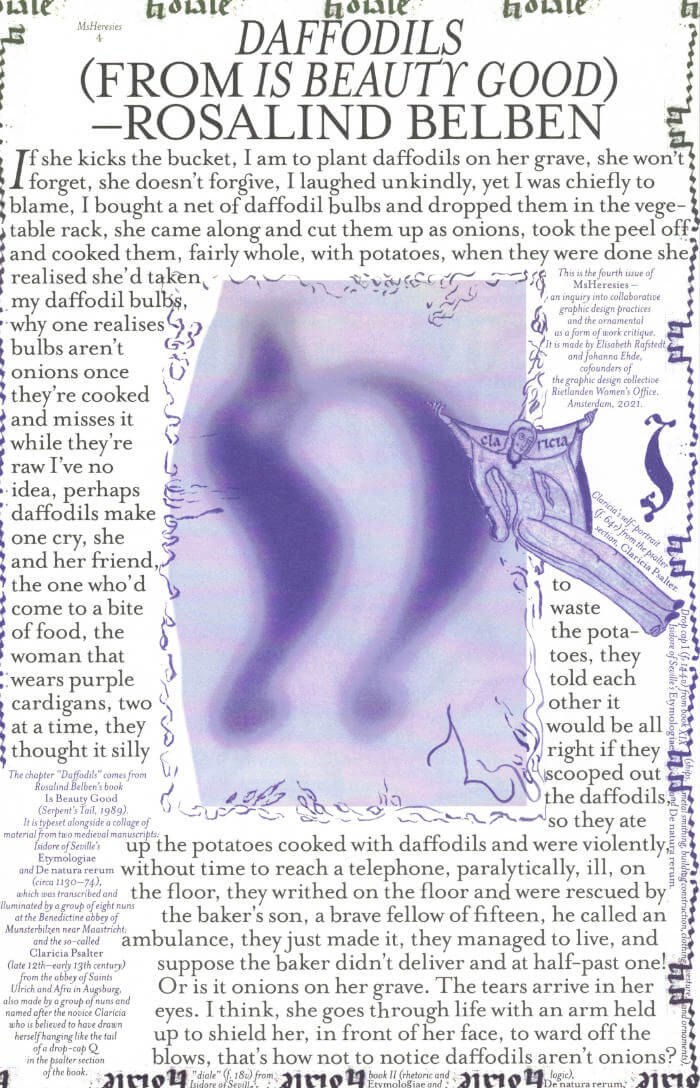
The Palace of Typographic Masonry is an (imaginary) institute for the splendour and variety of visual languages. The Ornamental Portal informs the ornamental attitude of Rietlanden Women’s Office, the collective that designed this folding sheet for Von Wersin’s Kitchen. On the backside ‘The Redemptive Qualities Of Ornament’, a text by Dirk Vis, is printed. This iris printed sheet is send in a specific envelope depicting and describing the updated collection of Von Wersin's Kitchen.

Cover of Beginnings

Ex. Coda

Beginnings

Oliver Boulton, Manon Michèle

Fiction €15.00

What do we start with when telling a story — What tensions activate it — What does it promise — What do we want from it — How do we deliver it — Must it have an end — What about a story which never began — Stories we wish were told — Stories which have always been there — Stories we don’t know how to start.

Beginnings is a collective attempt at questioning protocols and forms of narration, initiated by Manon Michèle. The publication gathers textual and visual works from twenty-nine artists, writers and collectives. With two covers, ninety-six pages, and no end, the publication remains in flux, with no definitive conclusions but the shape of an ongoing question: Where do we start and where might the act of arriving lead.

There’s bodies thrusted through motion, accelerations, collapses, into the folly of life, death, borders and language. There’s following intuition, rabbits, leaders, and the shape of clouds, switching from script to script to escape latched circles and compliance. There’s braiding together clashing dimensions and vital landmarks, processing ghosts to reclaim space, feeding them to trusted spirits. There’s foreseeing new shapes, and believing in what grows. There’s the poetry of saving what can be saved and the pull of letting go. There’s so much to begin with

Contributors
Alice dos Reis, Anaïs Fontanges, Anna Bierler, Auriane Preud’homme, Bravas Graphix, Calli Uzza Layton, Clara Pasteau, Cleo Tsw, D-E-A-L, Elina Birkehag, Eliott Déchamboux, Emilie Pitoiset, Heleen Mineur, Hyo Young Chu, Josefina Anjou, Juliette Lepineau, Kimberley Cosmilla, Manon Michèle, Maria Paris, Marie-Mam Sai Bellier, Mathis Perron, Mia Trabalon, Pablo Bardinet, Pays de Glossolalie, Philip Ullman, Raphaël Massart, Sanae Oujjit, Silvana Mc Nulty, Yunie Chae

Beginnings was edited and designed by Manon Michèle and Oliver Boulton, and published by Ex. Coda, 2025.

Cover of Visualisation. L'interprétation modélisante

Éditions B42

Visualisation. L'interprétation modélisante

Johanna Drucker

Les diagrammes, cartes et visualisations de données ont conquis le domaine de la recherche en arts, lettres et sciences humaines. Pour certains chercheurs, ces formes graphiques consistent à exploiter des données quantitatives jusqu’ici délaissées, pour d’autres, elles offrent la possibilité d’explorer les relations discrètes qu’entretiennent des corpus hétérogènes. Mais sur quels fondements épistémologiques reposent ces opérations techniques et intellectuelles ? Dans le cadre de la production du savoir et de son interprétation en régime numérique, est-il possible de dépasser le simple effet d’affichage des données, certes bluffant au premier abord, et d’envisager autrement les interfaces et les logiciels ?

Considérée aujourd’hui comme l’une des plus importantes théoriciennes des humanités numériques, Johanna Drucker livre dans cet ouvrage, spécialement rédigé pour la collection, une alternative aux formes dominantes de la visualisation de l’information. Héritière de la tradition humaniste, elle propose une approche qui réhabilite l’idée d’un sujet situé et incarné qui expérimente et conceptualise les connaissances par le prisme de la représentation graphique.

Cover of One Shape of the Language: Cyrillic Archives

San Serriffe

One Shape of the Language: Cyrillic Archives

Inna Kochkina

‘One Shape of the Language: Cyrillic Archives’ is an artist’s book documenting Inna Kochkina’s research into the history, style, and politics of traditional Cyrillic.

This research was born from Kochkina’s self-reflective curiosity about the relationship between cultural heritage and typography and evolved into an examination of the socio-political role of traditional Cyrillic. An ancient script, Cyrillic has been used to express various forms of cultural and territorial domination and continues to serve as an imperialist tool, having long been deployed in support of Slavic nationalism both in Russia and in the former USSR territories. 

This publication is the result of Kochkina’s own research into and engagement with archives of typography, as well as conversations with anti-colonial activists, artists, and historians who interrogate traditional Cyrillic and its relationship to colonial power. 

Alongside conducting scholarly research, Kochkina also produced drawings in response to archives of traditional Cyrillic. Making these drawings constituted a form of “studying by making.” With these efforts she has sought to construct an anti-colonial feminist narrative, employing both typographic artifacts and ‘patriarchal’ letterforms.

To make her drawings, Kochkina took samples from these low quality typographic archives, enlarging and transforming them into unexpected graphic shapes that were then recorded in a series of experimental prints. The drawing, collating and contact printing process that she followed allowed her to document and reveal the qualities lent to historical artifacts by digital noise. Through this working method she sought to rethink both the subject of her work as well as traditional approaches to type design practice. This book presents the prints in a roughly chronological sequence, poetically portraying Kochkina’s complex relationship with her native script. Variously precise, messy, and destructive, these works ultimately convey a series of “imaginary” shapes through which to reinterpret traditional Cyrillic of the past and present.

Cover of Font News

Self-Published

Font News

Erkin Karamemet

For the very first time, the newspaper Font News, published together with the supplement Font Menu, showcases the typographic work of Erkin Karamemet from his own label as printed matter. The large format of the newspaper invites the viewer to appreciate the typefaces in large, poster-like sizes. The curated texts by Gerrit Kotsivos reference pop-cultural curiosities and are further enhanced by overlaid spreads with amusing illustrations by the London-based artist Why Ebay. This limited issue, produced as a special artist edition of only 300 copies, is something for typography enthusiasts to collect, explore, and celebrate contemporary type design.