
recommendations

MW Collected Texts (Bootleg)
This bootleg edition collects scanned copies of Monique Wittig's writing. It includes; The Lesbian Body, Les Guérillères, The Opoponax, and Lesbian Peoples: material for a dictionary— In true bootleg style, punk enough to carry the truly radical words of Wittig: scans, a little grainy, with marginalia of unknown origins. Now, we can dress ourselves in the ravishingly erotic, violent splendorous brilliance to become baby Wittigs.
This edition was assembled out of a deep love of Wittig's work by Chloe Chignell.
Monique Wittig was a French author and feminist theorist particularly interested in overcoming gender and the heterosexual contract. She published her first novel, L'opoponax, in 1964. Her second novel, Les Guérillères (1969), was a landmark in lesbian feminism.

Notes on a life not lived
This publication is based on a project by Despina Vassiliadou that ran from 2015-16. It presents a collection of photographs taken during the period, accompanied by fictional short stories.

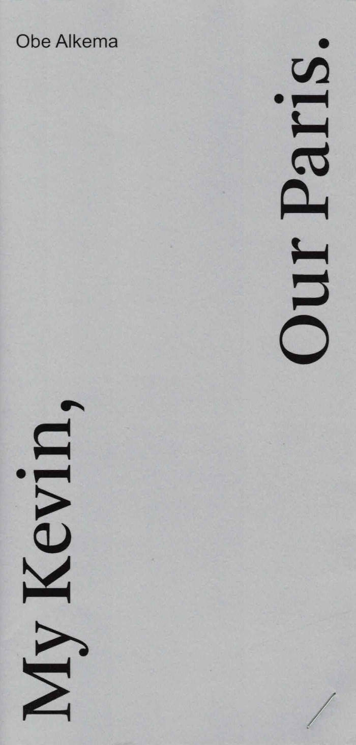
My Kevin, My Paris
In the fall of 2017, Obe Alkema got acquainted with the American poet Kevin Killian, first at the New Narrative conference at UC Berkeley, then at the Poets & Critics Symposium in Paris that was all about his poetry. A year and a half later, Alkema traveled back to Paris, this time as a participant of a writing residency. He was there to research the landscape of memory, but more than he expected and initially realized, Kevin’s death the previous month (June 2019) affected his return. Besides inevitable, mourning and remembering became obsessions for Alkema, as he shows in ‘My Kevin, Our Paris’, a memoir about Kevin Killian (1952–2019), but especially about his Kevin and their Paris.

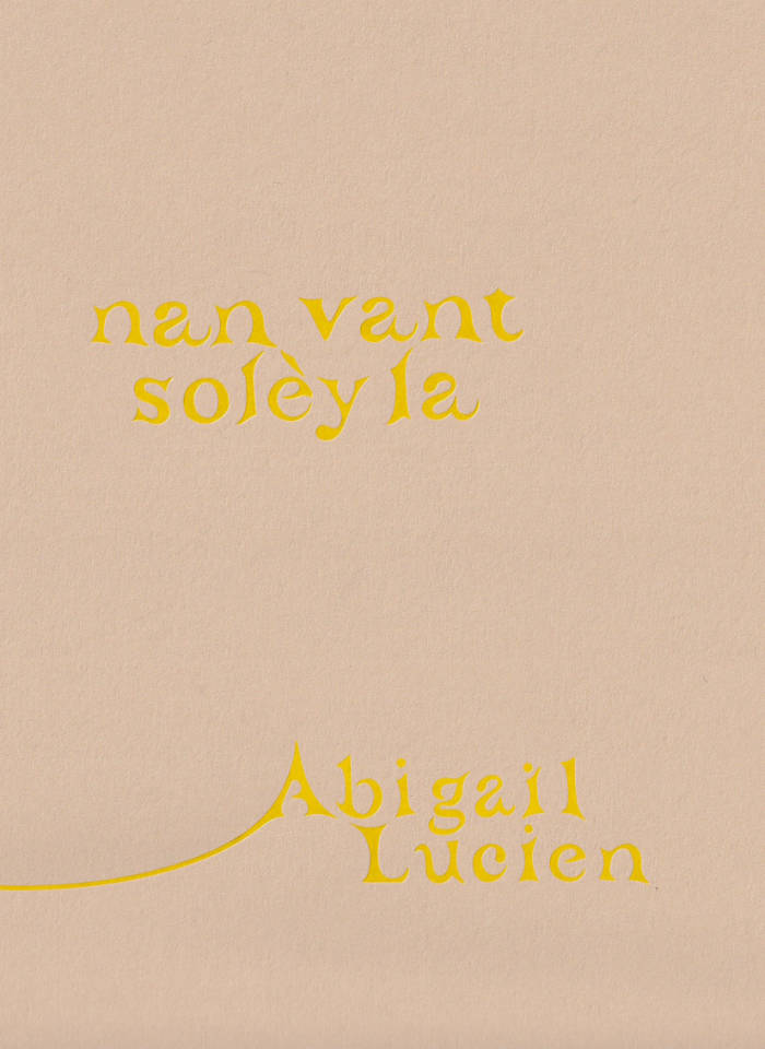
Nan Vant solèy la
Through creative nonfiction, poetry, and the printed image, the publication considers the playful and purposeful self-actualization of a bicultural queer identity while navigating grief as a landscape to address themes of (be)longing, futurity, and place. Alongside a collection of their works and research, Abigail Lucien weaves written and visual offerings by fellow Caribbean and queer artists, including works by Lukaza Branfman-Verissimo, Justin Chance, Cielo Felix-Hernandez, Sucking Salt, and Tamara Santibañez, to create an expanded context for their work rooted in friendship and radical love.
Abigail Lucien (b.1992) is a Haitian-American interdisciplinary artist, educator, auntie, lover, and friend. Working in sculpture, literature, and time-based media, Lucien’s practice addresses themes of (be)longing, futurity, myth, and place by considering our relationship to inherited colonial structures and systems of belief/care. Past exhibitions include SculptureCenter (NY), MoMA PS1 (NY), Deli Gallery (NY), MAC Panamá (Panamá), Frost Art Museum (Miami, FL), Atlanta Contemporary (Atlanta, GA), UICA (Grand Rapids, MI), and The Fabric Workshop and Museum (Philadelphia, PA). Residencies include Amant Studio & Research Residency (NY), Skowhegan School of Painting & Sculpture (Madison, ME), the Eugeniusz Geppert Academy of Fine Arts (Wrocław, Poland), The Luminary (St. Louis, MO), Santa Fe Art Institute (Santa Fe, NM), ACRE (Steuben, WI), and Ox-Bow School of Art & Artist Residency (Saugatuck, MI).
Lucien has taught as a full-time faculty member and professor in the Department of Sculpture & Extended Media at Virginia Commonwealth University and the Interdisciplinary Sculpture Department at the Maryland Institute College of Art. In the fall of 2023, they will join the Department of Art and Art History as an Assistant Professor of Sculpture at Hunter College in NYC. Deli Gallery represents Abigail Lucien.

Archive Dora Diamant #05
A collection of photographs from the archives of the icon of underground and alternative Parisian nights Dora Diamant.
A self-taught photographer, Dora Diamant has left thousands of photos. The Dora Diamant Association, custodian of this archive, and Éditions L'Amazone have joined forces to bring them to life by devoting a series of publications to them. Each volume of the Dora Diamant Archive was created by a different person and is the result of a subjective selection and arrangement specific to its author.
Figurehead of the Parisian underground and queer nights, photographer, DJ, multimedia and polymorphic artist, Dora Diamant was the daughter of Pascal Doury.
Selected by Clara Pacotte and Esmé Planchon.

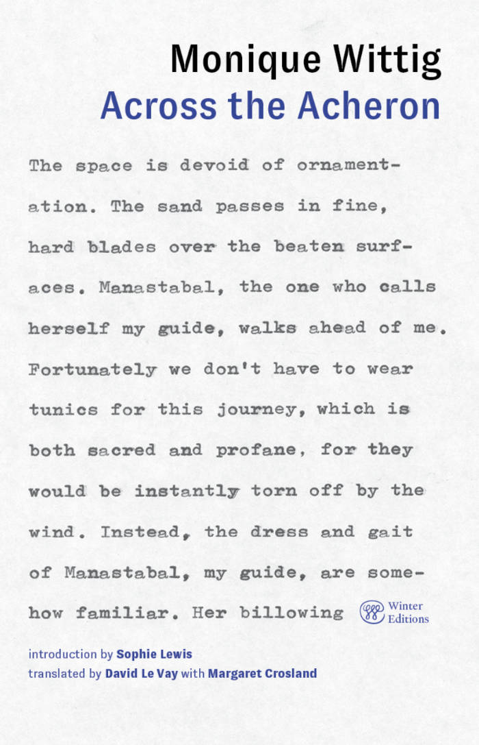
Across the Acheron
In her darkly funny 1985 take on Dante’s Divine Comedy, acclaimed French writer and activist Monique Wittig restages the journey through the circles of hell, limbo, paradise from a lesbian feminist perspective.
Never-before published in the US, Across the Acheron follows the adventures of “Wittig” and her anti-Virgilian guide through laundromats, billiard parlors, dyke bars, and picnic grounds of a 1980s San Francisco populated by hunters and their prey, lost souls, and fantastical beasts, including a robotic eagle and angelic bikers. Wittig reimagines Dante’s epic poem through a feminist and queer lens, subverting his cosmological order and upending gender identities and literary traditions. This edition brings the English translation of Wittig’s final novel back into print for the first time since the early-1990s, revised according to the author's notes, and with a new introduction by Sophie Lewis.
“Across the Acheron is a work of lesbian struggle and triumph across two kinds of hell. The hell of the classic western literary canon—and the hell of San Francisco. Monique Wittig brings all of her writerly powers and political experience to bear here, as witness to the horrors of heterosexual patriarchy and also to the possibility of another world for another life. Her work is a rare combination of deeply felt materialism and radical linguistic freedom. If we're to have another world, we'll need to create another language. She knew that, and she lived it.” — McKenzie Wark
“Even in fiction Monique Wittig’s writing is critical, prescient, brilliant, satirical, searing, and way ahead of its time. I’m so glad this work is back in circulation to revisit and revel in.” — Pamela Sneed
“In this unendurable yet compelling journey through the circles of patriarchal hell, Wittig encounters hordes of tortured women who do not struggle against their oppressors. Their brainwashing is as difficult to witness as their bloodied flesh. Only through communal activism does the seeker’s soul becomes tough enough to enter Paradise, where bare-breasted angels dismount motorcycles and offer baskets of 'cherries, strawberries, raspberries, apricots, peaches, plums, tomatoes, avocados, green melons, cantaloupes, watermelons, lemons, pawpaws, pineapples and coconuts.’ The bounties of Across the Acheron are lush and many.” — Dodie Bellamy
“A Guernica of the human (feminist) condition, a blacker, bleaker, more vengeful Alice’s tea party, this is a novel as graphic as a painting, whose brilliance its translators have creditably preserved.” — Publishers Weekly
Introduction by Sophie Lewis
Translated by David Le Vay with Margaret Crosland

Cough Drop Circus
Josheph Dunkerley, Holly Miles
This collection of 20 poems by young poets Holly Miles and Joseph Dunkerley sheds a glimpse into the bizarre journey of two isolated souls in a time of global crisis. Read along in this 24 page zine as they chart their unique perspectives of the worldwide COVID-19 pandemic!

Minibieb
Infrastructural systems define our ways of seeing and responding to the world around us. Today, our everyday lives and visual cultures have become saturated by digital communications systems whose physical footprint has been rendered largely invisible from the public sphere.
In an age of ever-expanding computation and a foolish believe in AI’s utopian potential, resistance can seem futile. But if we detach our gaze from increasingly narrow realm of digital imaginaries, a new world of radically different infrastructural opportunities opens up in front of our eyes.
Street libraries, or Minibiebs, as they are called in Dutch, are an under-appreciated piece of urban technology. Part manifesto, part research note, this mini publication dives into the radical potential of public book sharing structures and what they might tell us about our broken information ecosystem.
Printing: Risograph, Grafische Werkplaats Den Haag; Research and Photography: Livio Liechti; Design: Apsara Flury.
First print run – May 2025: 35 copies.