rile*books

Search books

Search books by title, author, publisher, keywords...

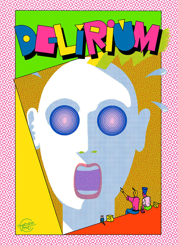
Cover of Delirium

Animal Press

Delirium

Baptiste Virot

€35.00

The humor in Delirium seems a cross between the classic comic strip gags of Ernie Bushmiller and the theatrical absurdity of Monty Python, with a dose of Jim Woodring’s colorful, acid-trip antics thrown in as well.

What makes these strips special is that they achieve things that can only be done in comics; Virot’s mastery of the medium’s fundamental mechanics (timing, composition, closure) is matched only by his unbounded imagination. But for all of its absurdity, Virot captures simple moments of undeniable humor and pure joy with simple punchlines and and unexpected twists.

This makes Delirium a unique and special work that excels on two levels: a formal experiment that pushes the visual language of comics to dazzling and frantic limits, as well as a deeply satisfying and laugh-out-loud compendium of surrealist set-ups and visual one-liners.

Language: English

recommendations

Cover of A New Program for Graphic Design

Inventory Press

A New Program for Graphic Design

David Reinfurt

A New Program for Graphic Design is the first communication-design textbook expressly of and for the 21st century. Three courses—Typography, Gestalt and Interface—provide the foundation of this book.

Through a series of in-depth historical case studies (from Benjamin Franklin to the Macintosh computer) and assignments that progressively build in complexity, A New Program for Graphic Design serves as a practical guide both for designers and for undergraduate students coming from a range of other disciplines.

Synthesizing the pragmatic with the experimental, and drawing on the work of Max Bill, Beatrice Warde, Muriel Cooper and Stewart Brand (among many others), it builds upon mid-to-late 20th-century pedagogical models to convey contemporary design principles in an understandable form for students of all levels—treating graphic design as a liberal art that informs the dissemination of knowledge across all disciplines. For those seeking to understand and shape our increasingly networked world of information, this guide to visual literacy is an indispensable tool.

David Reinfurt (born 1971), a graphic designer, writer and educator, reestablished the Typography Studio at Princeton University and introduced the study of graphic design. Previously, he held positions at Columbia University Graduate School of Architecture, Planning and Preservation, Rhode Island School of Design and Yale University School of Art. As a cofounder of O-R-G inc. (2000), Dexter Sinister (2006) and the Serving Library (2012), Reinfurt has been involved in several studios that have reimagined graphic design, publishing and archiving in the 21st century. He was the lead designer for the New York City MTA Metrocard vending machine interface, still in use today. His work is included in the collections of the Walker Art Center, Whitney Museum of American Art, Cooper Hewitt National Design Museum and the Museum of Modern Art. He is the co-author of Muriel Cooper (MIT Press, 2017), a book about the pioneering designer.

Cover of Archival Textures - Posting

Archival Textures

Archival Textures - Posting

Carolina Valente Pinto, Tabea Nixdorff

The book Posting brings together a selection of feminist posters from Dutch archives to reflect on posting as an activist strategy, holding the potential to create counter-publics to mainstream culture and to fight against the erasure, exoticization, or tokenism of bodies and experiences that deviate from normative preconceptions.

As is the case for many professions, in the history of Dutch graphic design the absence of women, non-binary, queer, Black designers is striking. This doesn’t only point back to systematic processes of exclusion in the first place, but also to the biases at play regarding whose work is remembered and archived. While efforts have been made to add forgotten names to the existing canon, the many posters, flyers and other printed matter shelved in queer and feminist archives remind us to question the notion of single authorship altogether and instead study graphic design as a decisively collaborative and transdisciplinary practice, which is especially true for community-led and volunteer-based projects.

The posters featured in this book point to this rich landscape of feminist organizing, and were found at the International Institute of Social History and the International Archive for the Women’s Movement (IAV-Atria) in Amsterdam.

Cover of Typing...

Estonian Academy of Arts / EKA GD MA

Typing...

Lieven Lahaye

Essays €12.00

The fourth in a series of publications, featuring writing by graphic design students of EKA GD MA. Typing... includes essays, scripts, translations and stories on a wide range of topics: killing vowels and milling fonts, personal knowledge management, shortcuts, tedious/careful/tiring/joyful typesetting, type of Georgianness, typing in 3rab(izi) and typing in all lowercase.

With contributions by Anna Wittenkamp Rich, Archil Tsereteli, Fa(tima)-Ezzahra El Khammas, João (Juca) Pedro Nogueira, Karthik Palepu, Laura Martens, Linnea Lindgren, Rok Ifko Kranjc.

Designed by Fatima-Ezzahra El Khammas and Laura Martens
Cover by Hanafi Gazali

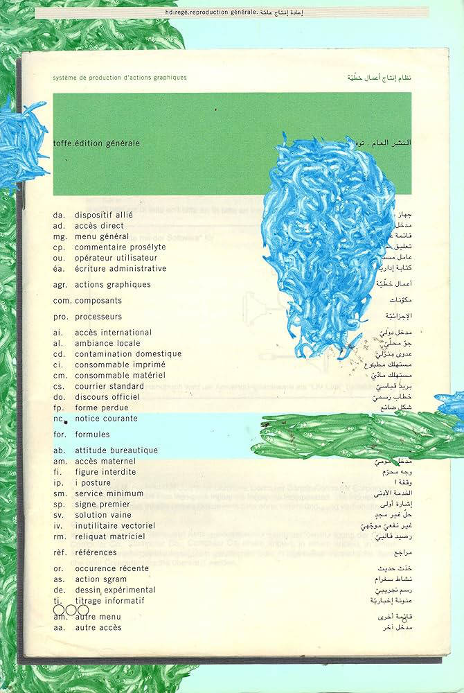
Cover of Radical Media Archive Vol 01

Permanent Files

Radical Media Archive Vol 01

Ramdane Touhami, Émile Shahidi

Do you remember the last time you were looking forward to the future? We're not talking about flying cars or floating screens. We're talking about a credible vision of a better time to come. So when was the last time? How did it look? How did it feel?

Have a glance at page 223, about two-thirds in. This is a portrait of Frantz Fanon by Milton Glaser. One of the biggest names in commercial graphic design of the 20th century, painting the likeness of the giant of anti-colonial thought. Let’s leave aside the question of "who's the Milton Glaser of today?" for now, but if there was one, whose portrait would they be painting?

What we’re attempting, in these few hundred pages, is to track our favorite examples of the visual language of revolt and solidarity in the 1960s and 1970s, put them in dialogue with our most beloved works of graphic design of those decades, and celebrate the heroes who made them. 
Creative currents flowing from Paris to Tokyo, Cuba to Milano, Beirut to New York, Berkeley to London, with innovations and revolutions (both political and artistic) happening every year. Causes supported by incredible talent and inspiring design that activated people, uplifted liberation movements, advanced the struggles for social justice, and created bonds of global solidarity.

Sadly this cross-pollination between commercial art and the political ended around the late 1980s and those two worlds are now completely isolated from one another.
Why do movements not produce beautiful and memorable visuals anymore? Why do the biggest image makers of today not lend their talents to the good fights that need their help? We hope that these will intersect again, and the first step is to study their history.Friends, we are here to tell you that fighting for a better world is, in fact, not only extremely cool, but the coolest thing you can do — and we have the images to prove it!

Ramdane Touhami and Émile Shahidi have spent years researching and traveling to assemble a huge collection of books, rare periodicals and radical art that will soon be available for consultation in person and online, and of which this little book is just a taste.

Cover of Tense (Silver Edition)

Kunstverein Amsterdam

Tense (Silver Edition)

Lucy Lippard

Tense is a never-realised publication, written and composed by Lucy Lippard and Jerry Kearns in 1984, that only now has been released in a very limited run on our imprint. The book accompanied the exhibition Top Stories, which took a closer look at the 29 issues of the prose periodical with the same title, founded in the late 1970s by Anne Turyn.

Top Stories was dedicated to fiction by emerging women artists and writers from that time. Tense was originally intended to become part of the series as well, but never made it to print. It was only recently – during the making of the exhibition at Amsterdam’s Kunstverein – that the original mock-up was retrieved from the editor’s archives and finally sent off to the printer.