rile*books

Search books

Search books by title, author, publisher, keywords...

Cover of The Clip-On Method

Galerie Buchholz

The Clip-On Method

Cady Noland

€90.00

The Clip-On Method is THE book on the work of Cady Noland everybody was waiting for but nobody expected. Two volumes, almost 600 pgs, that gather a minute, specific, documentation of the artist’s works (“often shown within their first installations,” from 1984 onwards) and further unfold the issues and questions that form the core of her practice and structure her engagement in art – without imposing any interpretation, critical perspective, other than the one proposed (suggested) by the artist’s own approach to the book form.

Book 1 gathers documents, essays, sholarly texts and articles regarding capitalism, violence, aircraft industry, racial discrimination in US universities, amongst various issues, interspersed with pictures of the artist’s works.

In Book 2 there are more photographs along with an exciting, impressive collection of writings by Noland (including, of course, “Towards a Metalanguage of Evil”). Most of the texts, and several of the pictures as well, are presented as facsimiles, laying out the work process, and the origins of what forms that sum.

Design by Cady Noland, Will Holder
Published in 2021 ┊ 587 pages ┊ Language: English

recommendations

Cover of Répondeur

Occasional Papers

Répondeur

Slow Reading Club

Performance €25.00

Slow Reading Club (SRC) is a semi-fictional reading group initiated and run by Bryana Fritz and Henry Andersen. Since 2016, in numerous contexts, they have rehearsed alternatives to the kinds of reading they were taught in school, actively suppressing semantic content through strobe lights, strange postures, sociality, and toxins. Operating at the contact zones between reader and text, text and text, reader and reader, they attempt to build a practice from within the unstable space of reading itself.

Répondeur is an extensive account of SRC’s practice in collective reading sessions, exhibitions, and textual bootlegging. Imagined as a scroll, with a rhyme structure and typesetting by Will Holder, the book brings together facsimiles of SRC readers, a wide-ranging interview by Alicja Melzacka, new texts by Joyelle McSweeney and Bill Dietz, and visual work and translations by SRC. These discrete elements are interwoven into a complex, shimmering whole, delighting in the ruptures and elisions of one text’s move into the next.

Cover of F.R. David - With Love

uh books

F.R. David - With Love

Will Holder

Periodicals €15.00

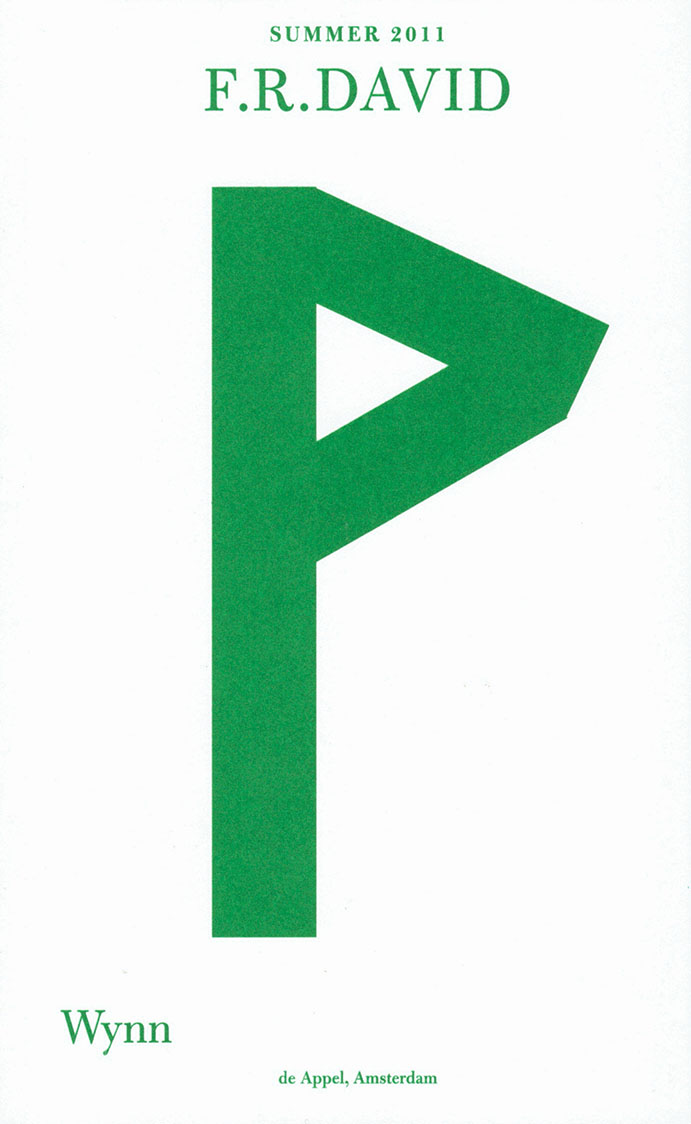
F.R.DAVID is a typographical journal, dealing with the organisation of reading and writing in contemporary art practises.

“With Love,” takes correspondence and calligraphy—or letter-writing—as model for information theory, and adaptive, cybernetic relations.

Cover of F.R. David - "Take, Eat"

uh books

F.R. David - "Take, Eat"

Andrea di Serego Alighieri, Will Holder

Periodicals €15.00

F.R.DAVID is a typographical journal, dealing with the organisation of reading and writing in contemporary art practises. 

The 21st issue, “Take, Eat” is edited by Will Holder, with Andrea di Serego Alighieri. Andrea’s image-heavy talk on word spacing and vocalisation runs all the way through, on the right-hand pages: the opposite pages contain responses from Will. The issue almost stifles the triangulated space of image, context and commentary; and speaks of the moment between words, things, people, images, perception, past, present and future, between Andrea’s pages and Will’s, as where meaning might breathe.

Cover of The Complete Text Would Be Insufferable / Language as Prosthesis

uh books

The Complete Text Would Be Insufferable / Language as Prosthesis

Chloe Chignell

Performance €15.00

We begin with the image of an idea in ruin. A small field of assumptions disassembled. A question no longer in need of its mark. A thought not sure where it began. It starts from the body and language. The debris of these three words, crumbling already at and, did not break apart but congealed the separations once made. We start from a research (project) undone and just beginning. 

Typesetting and design: Will Holder
Produced by: A.pass

Chloe Chignell works across choreography and publication taking the body as the central problem, question and location of the research. She invests in writing as a body building practice, examining the ways in which language makes us up.

Cover of Palimpsest

uh books

Palimpsest

H.D.

Poetry €35.00

“I must explain to you first that the novel is not intended as a work of art—at least, not as it stands. It is a means to an end. I want to clear up an old tangle. Well, I do not put my personal self into my poems. But my personal self [Hilda Doolittle] has got between me and my real self, my real artist personality [H.D.]. And in order to clear the ground, I have tried to write things down––in order to think straight, I have endeavored to write straight. But I hope to come clear and then turn to my real work again. You must remember that writing poetry requires a clarity, a clairvoyance almost. I have been too weak to dare to be clairvoyant. I have tried instead to be merely sensible. I mean in the common sense of that word. In the long run, the clairvoyance is the only sanity for me. But in the novel I am working through a wood, a tangle of bushes and bracken out to a clearing, where I may see clear again.”

H.D., letter to John Cournos, July 9th 1918 (?), Beinecke Rare Book and Manuscript Library, YCAL MSSA24, Box 17, Folder 582 (emphases added). The penultimate word was crossed out by H.D. herself.

This edition of H.D.’s Palimpsest was produced for THE GREEN MAN (Lucy Skaer with Fiona Connor, H.D., Will Holder, Nashashibi/Skaer, Hanneline Visnes); with a sole distribution point – in direct relation to the work of Lucy Skaer – of 500 free* copies, at Talbot Rice Gallery, Edinburgh, UK, from 26 July to 6 October 2018.

Typeset by Will Holder, using Apple’s Enhanced Dictation, reading Palimpsest, Houghton Miflin, 1926. (Letterpress by Henri Darantiere, Paris, for Contact Editions)

Copy-edited by Rosa Aiello reading Palimpsest, Southern Illinois University Press, 1968. (Linotype)

This third edition reproduces the punctuation of the 1926 French typesetting of English text. Certain spellings are maintained with due consideration for an American writer living in 1920s London. Additional suggestions to spelling are inserted between square brackets.

The cover uses a stencil with parts taken from the geometric construction of Roman capitalis quadrata, inherited from the classical Greek alphabet.

This production would not have been realised without Rosa Aiello, Stuart Fallon, Tessa Giblin, Bitsy Knox, Emmie McLuskey, Tiina Poldaru, Lucy Skaer and Christopher Wait.

Palimpsest: Copyright © 1926 by H.D.
Reprinted by permission of New Directions Publishing Corp.

Cover of Seltsame Sterne starren zur Erde

Time has fallen asleep in the afternoon sunshine

Seltsame Sterne starren zur Erde

Sonia Si Ahmed

For the project Time has fallen asleep in the afternoon sunshine a group of people/ performers memorize a book of their choice. Together they form a library collection consisting of living books. After years of learning by heart and reciting for readers, some of the books have now been written down from memory to create new editions, versions resulting from this process. This book is one of those books, chosen by one person, learned by heart and recited many times, and now written down again from memory. This edition is not a re-edition of the original text. It is a re-writing of the text after the process of reading, memorizing and reciting, with all the alterations that might have occured in the course of this process.

Cover of the she

Gevaert Editions

the she

Asger Taiaksev, Sylvie Eyberg

‘the she’ compares texts by Virginia Woolf with their French translation, reproducing parts of the novelles ‘The String Quartet' & ‘Blue and Green’ and the novel ‘The Years’. Of the novellas, she kept only the articles the in English and le, la, les in French, exactly as they appear in the editions. Of the novel, only the pronouns she in English and elle in French remain.

The publication includes identical two booklets, one bound and one unbound, both uncut, referring to old books which were often sold bound but uncut.

Offset printing. Printed by Cultura, Wetteren

Edition of 123 numbered copies

Cover of Dear Friend Catalogue 2019-2022

Lugemik

Dear Friend Catalogue 2019-2022

Ott Kagovere, Sandra Nuut

Dear Friend is a monthly letter format publication covering design events, issues, and ideas. This publication distributed via snail mail is initiated by Sandra Nuut and Ott Kagovere.

The publication edited by Sandra Nuut & Ott Kagovere features all the letters from the Dear Friend publishing project, which they initiated at the Graphic Design Department of the Estonian Academy of Arts in 2018. The book includes contributions by Singapore-based design writer Justin Zhuang, designer and writer Else Lagerspetz, and artist Lieven Lahaye. The book is designed by Ott Kagovere and published by Lugemik and Estonian Academy of Arts.

Texts by Justin Zhuang, Lieven Lahaye, Else Lagerspetz

Letters written by Alicia Ajayi, Stuart Bertolotti-Bailey, Claudia Doms, Nell Donkers, Maarin Ektermann, Rosen Eveleigh, Maryam Fanni, Saara Hannus, Eik Hermann, Paul John, Maria Juur, Ott Kagovere, Maarja Kangro, Arja Karhumaa, Kristina Ketola Bore, Nicole Killian, Rachel Kinbar, Tuomas Kortteinen, Keiu Krikmann, Kadri Laas, Else Lagerspetz, Lieven Lahaye, James Langdon, Jungmyung Lee, Kai Lobjakas, Michelle Millar Fisher, Maria Muuk, Sheere Ng, Sandra Nuut, Laura Pappa, Jack Self, Indrek Sirkel, Paul Soulellis, Triin Tamm, Laura Toots, Alice Twemlow, Loore Viires, Sean Yendrys, Justin Zhuang