rile*books

Search books

Search books by title, author, publisher, keywords...

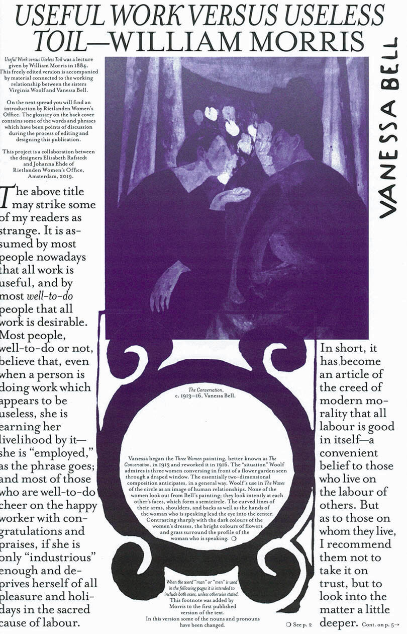
Cover of MsHERESIES 2 — USEFUL WORK VERSUS USELESS TOIL

Rietlanden Women's Office

MsHERESIES 2 — USEFUL WORK VERSUS USELESS TOIL

Elisabeth Rafstedt , Johanna Ehde

€10.00

The second issue of MsHeresies includes collages, paintings, and hommages to the work of sisters Vanessa Bell and Virginia Woolf, whose collaboration defied preconceived ideas of both text/image hierarchies, as well as rivalry at the cost of sisterhood. This visual essay is published alongside William Morris’s lecture Useful Work versus Useless Toil from 1884 which introduces the idea of the ornamental and its relationship to work and rest.

The ornamental can only come about under certain conditions: enough rest, agency, and variation of work. The ornamental is never an outcome or product of these conditions; but something intrinsically intertwined therein.

recommendations

Cover of MsHeresies 6 — A Manager

Rietlanden Women's Office

MsHeresies 6 — A Manager

Caren Beilin

MsHeresies 6 publishes an edited chapter from Caren Beilin’s forthcoming novel Sea, Poison (New Directions, 2025). It is typeset together with reworked material from the archive of the Neapolitan feminist artist collective Le Nemesiache, active between 1969 and 1995.

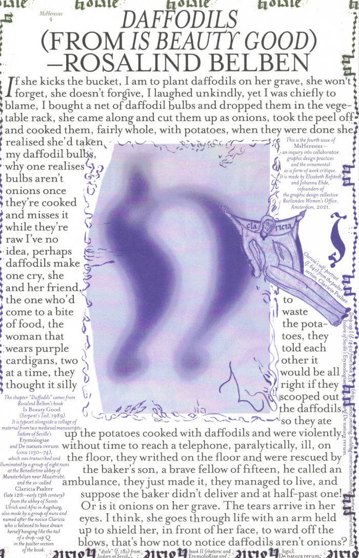
Cover of MsHeresies 4 — Daffodils

Rietlanden Women's Office

MsHeresies 4 — Daffodils

Elisabeth Rafstedt, Johanna Ehde

This fourth issue of MsHeresies republishes the chapter *Daffodils* — a warped monologue about a domestic poisoning — from Rosalind Belben’s book Is Beauty Good (1989).

It is typeset alongside a collage of material from two medieval manuscripts: Isidore of Seville’s Etymologiae and De natura rerum (circa 1130–74), which was illuminated and transcribed by a group of eight nuns at the Benedictine abbey of Munsterbilzen in Maastricht; and the so called Claricia Psalter (late 12th–early 13th century) from the abbey of saints Ulrich and Afra in Augsberg, also made by a group of nuns and named after the novice Claricia who is believed to have drawn herself hanging like the tail of a drop-cap Q in the psalter section of the book.

Cover of And Then Comes the Chorus

Varamo Press

And Then Comes the Chorus

Jon Refsdal Moe

Essays €8.00

In the high-octane essay And Then Comes the Chorus, Jon Refsdal Moe pursues the imagination of theatre opened up by Alfred Jarry when he slipped an ‘r’ into a profanity as he exclaimed ‘Merdre!’ on stage. ‘What matters is that the words became flesh and that this flesh exploded right in the world’s face. What matters is that literature stood up at the Théâtre de l’Œuvre on December 10, 1896 and cried FUCK! and all hell broke loose and the world has never been the same since.’

Jon Refsdal Moe is a writer and dramaturg from Oslo. He has written two novels, one doctoral dissertation, several essays and a lot of criticism. He was artistic director of Black Box teater in Oslo from 2009 to 2016 and is now professor of dramaturgy at Stockholm University of the Arts.

Published by Varamo Press in the essay series Gestures
First edition November 2022
48 pages, 11.0 x 16.5 cm, sewn perfect binding
ISBN: 978-82-691492-8-9
Graphic design by Michaël Bussaer

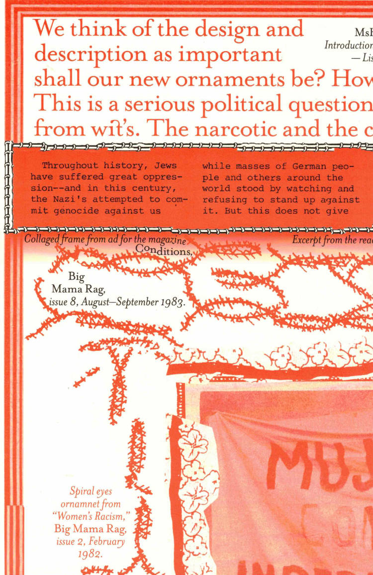
Cover of Ornamental Portal

The Palace of Typographic Masonry

Ornamental Portal

Rietlanden Women’s Office

The Palace of Typographic Masonry is an (imaginary) institute for the splendour and variety of visual languages. The Ornamental Portal informs the ornamental attitude of Rietlanden Women’s Office, the collective that designed this folding sheet for Von Wersin’s Kitchen. On the backside ‘The Redemptive Qualities Of Ornament’, a text by Dirk Vis, is printed. This iris printed sheet is send in a specific envelope depicting and describing the updated collection of Von Wersin's Kitchen.

Cover of A Book for Disappearance

cthulhu books

A Book for Disappearance

Yuri Tuma, Gabriel Alonso and 2 more

Ecology €24.00

A Book for Disappearance explores themes of extinction and ecology through the lens of contemporary technology and using AI and image-generation platforms as collective tools. It grapples with the contradictions of living in this world full of worlds and full of crises, while revindicating processes of nomadic becoming, transcending fixed identities, and collective emergence. While disappearance may seem abstract or esoteric, it has tangible implications for both individual and collective action. In this book, the concept of disappearance emerges as an alternative, including a variety of short poetic and experimental texts on the multiple possibilities that surface from our engagement with AI alter-egos and a collective artistic exercise with image generation technologies.

Texts by Laura Tripaldi, Institute of Queer Ecologies, and Stacy Alaimo provide further food for thought, and invite readers into recondite explorations—of parasitic spaces and ghost bodies through materialist feminisms; of oak archives and the previous lives that forests can narrate to us; of acid oceans and the psychedelic trips they might afford.

Cover of Makulatur – 2010-2016

Bom Dia Books

Makulatur – 2010-2016

Manuel Raeder

A collection of misprinted sheets originating from books designed by graphic designer Manuel Raeder: a “behind the scene” project, which documents the early stage of book production and its conventions.

Makulatur, a German word that derives from lat. maculatura “something stained”, refers to misprinted paper that is discarded at the beginning of the printing process as use- and worthless. In 2010, the graphic designer Manuel Raeder started to collect and preserve misprinted sheets of all the publications he designed not only for his own publishing house Bom Dia Boa Tarde Boa Noite but also for fellow artists and institutions.

This waste paper that shows all difficulties arising in the early stage of production—trails, testy or stains—he combined to a new volume as a compilation of maculae “stains”. Thus, he dissolved the spoiled material from the realm of invisibility and displays it to the public whereby he reveals and reflects on the conventions of a book.

Graphic designer Manuel Raeder lives and works in Berlin.