rile*books

Search books

Search books by title, author, publisher, keywords...

Cover of Language is a map of failures: Messy thoughts on reading, writing and dressing up

Afternoon Editions

Language is a map of failures: Messy thoughts on reading, writing and dressing up

Runa Borch Skolseg

€8.00

Afternoon Editions no. 3: Language is a map of failures. Messy thoughts on reading, writing and dressing up by Runa Borch Skolseg.

In May 2019, Time has fallen asleep in the afternoon sunshine relocated its base to the Oslo Biennale headquarters in Myntgata, with a room of its own and ongoing activities. Runa Borch Skolseg visited the space at several occasions before its final closure, in 2021. Her invitation to write for the Afternoon Editions bridges the move from one room to another, and is a reflection on how fashion can be a world of fantasy, and drama, a language we all communicate through. With a personal narrative she makes readings of clothes, literature and writing, and how they merge and enrich each other.

recommendations

Cover of Afternoon Editions N°4: Certain Things

Afternoon Editions

Afternoon Editions N°4: Certain Things

Claudia la Rocco

A day can be a composition not unlike an essay. Full of possibilities, full of limitations, bound by universal structures and marked by idiosyncratic desires. You go on walks. You read. You do your chores. All the while memory and other forms of imagination keep time with you. Books are strange companions; writing is a lonely thing rich with consolations.

Certain Things is a text by Claudia La Rocco, created with and through ideas such as these.

Published September 2022.

Cover of Reseeding the library, gleaning readership

Afternoon Editions

Reseeding the library, gleaning readership

Jeroen Peeters

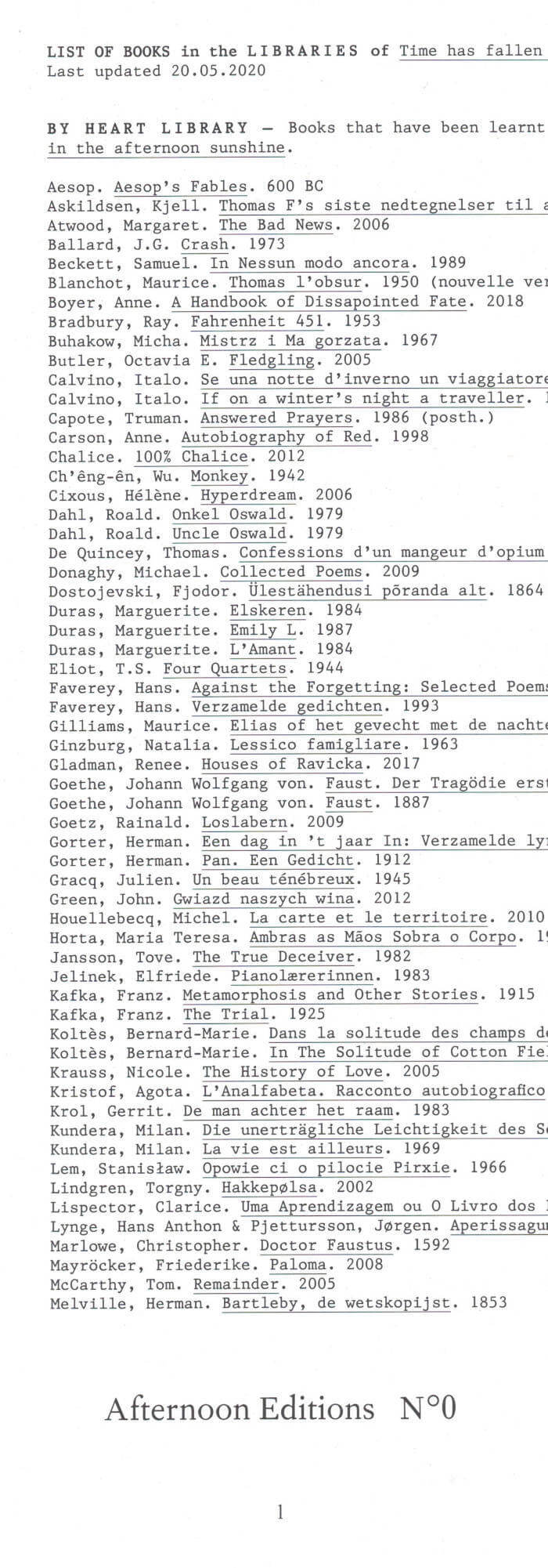
Afternoon Editions no. 1: an essay by Jeroen Peeters titled Reseeding the library, gleaning readership. In May 2017, Time has fallen asleep in the afternoon sunshine settled during three weeks in the Ravenstein Gallery in Brussels as part of the Kunstenfestivaldesarts. Invited as a writer in residence, Jeroen Peeters visited the library of living books on a daily basis and recorded his observations by hand in a notebook, which formed the basis for Afternoon Edition #1. Reseeding the library, gleaning readership is an essay on the seed library, on the dispersion of literature through wind, water and animals, on biodiversity and commoning at the heart of readership. On the cover a drawing by Wouter Krokaert of a Philodendron Xanadu. Published May 2018.

Cover of Bookmarks of sorts

Afternoon Editions

Bookmarks of sorts

Jeroen Peeters

Afternoon Editions no. 5: a collection of found papers annotated by Jeroen Peeters, titled Bookmarks of sorts. During several years Jeroen Peeters collected notes left by readers in library books: faded reader tickets, scraps with notes, a shopping list, train tickets and other little papers used as bookmarks. He noted each time the date and the book in which they were found. Afterwards he wrote commentaries to this collection, an essay on alternative reading practices, marginalia and extra-illustration, on the exchange between readers and the imaginary community lingering in all those library books.

Cover of Koreografi

Self-Published

Koreografi

Ann-Christin Berg Kongsness

Performance €14.00

Koreografi / Choreography is a magazine initiated and edited by Solveig Styve Holte, Runa Borch Skolseg and Ann-Christin Berg Kongsness. The magazine consists of texts written by Nordic artists within the field of dance and choreography.

Cover of I am Welton Santos.

Self-Published

I am Welton Santos.

Sofia Caesar

I am Welton Santos reenacts a dialogue between the Brazilian geo-bio-architect Welton Santos and an Interviewer. The book, which is always read collectively, is used in reading performances by groups of at least 3 people.

Printed on the occasion of an artist residency at PAV, Parco d’Arte Vivente, Turin, July 2016. Texts based on transcripts of interviews with Welton Santos.

Cover of One Shape of the Language: Cyrillic Archives

San Serriffe

One Shape of the Language: Cyrillic Archives

Inna Kochkina

‘One Shape of the Language: Cyrillic Archives’ is an artist’s book documenting Inna Kochkina’s research into the history, style, and politics of traditional Cyrillic.

This research was born from Kochkina’s self-reflective curiosity about the relationship between cultural heritage and typography and evolved into an examination of the socio-political role of traditional Cyrillic. An ancient script, Cyrillic has been used to express various forms of cultural and territorial domination and continues to serve as an imperialist tool, having long been deployed in support of Slavic nationalism both in Russia and in the former USSR territories. 

This publication is the result of Kochkina’s own research into and engagement with archives of typography, as well as conversations with anti-colonial activists, artists, and historians who interrogate traditional Cyrillic and its relationship to colonial power. 

Alongside conducting scholarly research, Kochkina also produced drawings in response to archives of traditional Cyrillic. Making these drawings constituted a form of “studying by making.” With these efforts she has sought to construct an anti-colonial feminist narrative, employing both typographic artifacts and ‘patriarchal’ letterforms.

To make her drawings, Kochkina took samples from these low quality typographic archives, enlarging and transforming them into unexpected graphic shapes that were then recorded in a series of experimental prints. The drawing, collating and contact printing process that she followed allowed her to document and reveal the qualities lent to historical artifacts by digital noise. Through this working method she sought to rethink both the subject of her work as well as traditional approaches to type design practice. This book presents the prints in a roughly chronological sequence, poetically portraying Kochkina’s complex relationship with her native script. Variously precise, messy, and destructive, these works ultimately convey a series of “imaginary” shapes through which to reinterpret traditional Cyrillic of the past and present.

Cover of Writing Out Loud

If I Can't Dance

Writing Out Loud

Jon Mikel Euba

Writing Out Loud is a publication that brings together the transcriptions of eight lectures by the artist Jon Mikel Euba that were live translated from Spanish to English during the course Action unites, words divide (On praxis, an unstated theory) at the DAI. The lectures were delivered across the academic year 2014 – 2015 at the invitation of If I Can’t Dance. They sit within a larger writing-centred project by the artist that he has pursued for almost a decade, through which he aims to define a form of praxis that could evolve into a technical theory.

Cover of Alphabet Magazine #01

Self-Published

Alphabet Magazine #01

Thomas Lenthal, Donatien Grau

Photography €28.00

The first issue of the magazine made by artists, founded by Donatien Grau and Thomas Lenthal. Contributions by Mathias Augustyniak, Naomi Campbell, Théo Casciani, Michael Chow, Pan Daijing, Es Devlin, Claire Fontaine, Edwin Frank, Theaster Gates, Nicolas Godin, Alejandro Jodorowsky, Hedi El Kholti, Michèle Lamy, Paul McCarthy, Ian McEwan, Eileen Myles, Marc Newson, Hans Ulrich Obrist, Diana Widmaier Picasso, Ariana Reines, Barbara Chase-Riboud, Julian Schnabel & Jason Momoa, Hanna Schygulla, Juergen Teller, Iké Udé, McKenzie Wark, Robert Wilson, Yohji Yamamoto.

Alphabet is the artists' magazine. Here, they run the show. They write, they make images, they select their own works, they interview the figures they admire, they tell us what we did not know about them nor could have ever fathomed about life. This magazine is conceived entirely to put them in the driver's seat, and to enable readers to become part of the unique vision of some of today's greatest luminaries.

It is a manifestation of the creative community, coming together from all fields, from all generations and threads of culture. Writers, musicians, designers, painters, sculptors, poets—artistic figures of every kind converse all the time in their lives, but they did not have a shared space for their editorial projects. This is it.

Everyone who finds their way into Alphabet has made a mark on life, art, and culture, in a way that signals their importance to the present. Some of the contributors may be world famous, others well respected, others on the way to becoming the legends they already are. Their relevance to culture is the same, and that is why they all belong here, in the endeavor of the creative community. There is no hierarchy of status, or domain, or apparent impact. Some of the greatest revolutions happen undercover. Some of the most established voices are still breaking ground. The magazine's premise is simple: the old opposition between pop and underground does not make sense anymore. There are many creative communities, each following its own rules, each inventing its own space. Here, wherever they come from, whatever their community, artists can exist together, with the same intention of changing, and improving, what life is; with the same belief that art matters more than anything else.

None of the contributors is here randomly. They keep life thrilling and exhilarating, challenge the perception of everything and anything. Their role in shaping every aspect of life can hardly be overstated. That is why they needed a place to elaborate their own alphabet, their way of ordering and structuring language, the world, and the fabric of life—a place of freedom, where everything would be done to highlight their visions, where the very design would be a shrine to their magic. Even the distribution of the magazine was conceived with artists—each contributor suggesting sites of their liking.

Alphabet is also the magazine of magazines. Here, readers find essays, fictions, poetry, visual projects, DIY methods, recommendations from those who know, even games and astrology—and an artist's alphabet, articulating an entire universe. Anything that has ever formed a section of a magazine could find its way here. Even the cover is conceived by an artist: it was conceived especially by the legendary Robert Wilson. Artists will rejuvenate what magazines are, and magazines will be kept forever young by and with them.

Founded by Donatien Grau and Thomas Lenthal, Alphabet is a bi-yearly art magazine. Not a magazine about art. It's a magazine made by artists. Each contribution like an œuvre, making it the ultimate collector piece. Each cover is designed, with the word Alphabet, by a different artist, initiating a cult series.