Graphic Design
Graphic Design
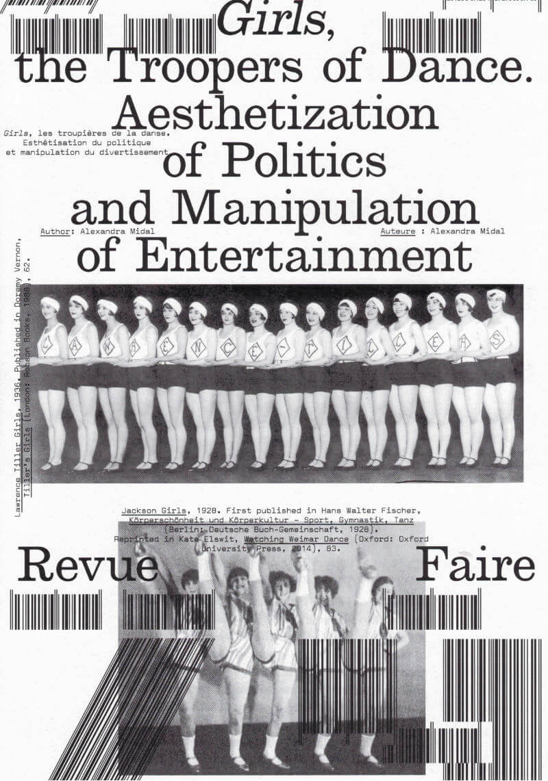
Revue Faire °29: Girls, the Troopers of Dance
The British origins of synchronized dancing—invented in 1880 by John Tiller in a cotton mill—were quickly forgotten in Berlin, where periodicals established themselves as the expression of standardization and American capitalism. The famous Tiller Girls had become the modern figure of the “New Woman”, performing in shows attracting more than four million spectators each year. A seduced Hitler asked for his own troupe: the Hiller Girls. Face to face, both periodicals look like strictly indistinguishable replicas, apart from their opposite messages.
Synchronized dancing revealed the democratic and fascist forms given to the political discourse of the Weimar Republic when the NSDAP seized power. Between the power of forms and forms of power, amid the destruction of cities, decrees banishing the use of Fraktur, and the destruction of degenerate art, those dance shows, undoubtedly because of their popularity, showed that National Socialism was using insidious and invisible strategies to empty forms of their content only to maintain their appearance intact, thus revealing a shadow practice that, in the end, turned out to be just as barbaric as world-wide destruction or the burning of books.
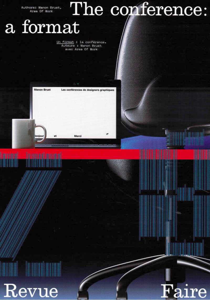
Revue Faire n°28: The Conference: A Format
There are an increasing number of spaces in the field of Graphic Design where work can be promoted. Intermediary platforms between practitioners and the public can come in the form of specific tools (Instagram, for example) or even events that are organized for that purpose (festivals and exhibitions). The conference is one of these platforms. A true ephemeral editorial object, it is highly suited to the explanation and extension of the practices and methodologies of designers. It is, for certain designers, the opportunity to take stock of an approach, an inventory of finished forms, and for others, on the contrary, a pretext for the production of new, sometimes more performative, even experimental forms.
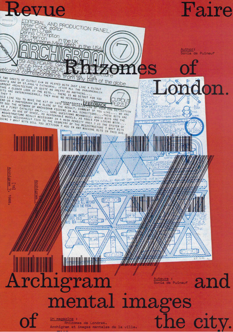
Revue Faire n°27: Rhizomes of London
A mine of images and ideas for architectural and urban-planning practices, the journal Archigram (1961–70) has already been the subject of close reading and analysis by architects, historians, theoreticians, and architecture critics. This study approaches Archigram from a different angle, attempting to interpret it as a successful artifact of graphic design by confronting it with the achievements of its time and other inspirational eras of editorial and environmental graphic design.
It aims to explain the graphical evolution of the journal through the graphical stimuli of London—the city where the Archigram architects worked on a daily basis. It is an attempt to demonstrate that the publication, at first glance confusingly heterogeneous, is akin to a comprehensive mapping of the secret whirrs and the more obvious trends of the English metropolis, where the futuristic utopia of the dynamic city took shape in such a particular way. By identifying London’s potential during the mythical Sixties, the Archigram journal stands out as a rhizomatic image, a living mirror of the urban organism.
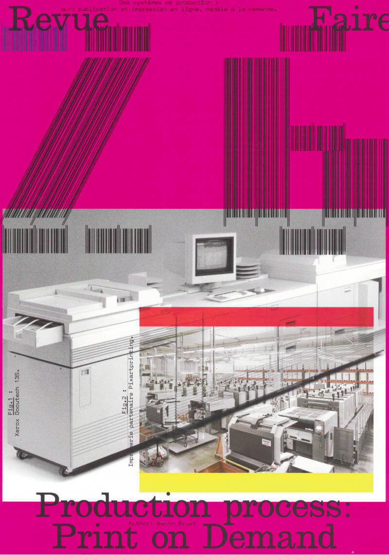
Revue Faire n°26: Production Process
In 2008, English Graphic Designer James Goggin ran a two-day workshop with design students at the Hochschule Darmstadt in Germany. The object which resulted gradually took on the appearance of a photo album, a typeface specimen, and a color chart. On the cover, the phrase “Dear Lulu, Please try and print these line, color, pattern, format, texture and typography tests for us” is clearly addressed to the online print platform for which this book was proposed as a test.
Ten years later, the offer has become more diverse and the success of such online platforms is undeniable—indeed the phenomenon has spread well beyond the field of publishing. While some bemoan unfair competition for printers, others, professionals and amateurs, see in it a freedom to print and distribute relatively well finished objects at low cost.
The possibilities of these systems of production, are multiple but nonetheless limited, and this obviously raises the question of a possible standardization of forms and formats. However, when it comes to Print On Demand, it seems that the issue is not so much the materiality of an object (the choice of format, paper or a particular manufacture) but rather the actual existence of this object itself, outside of usual channels of production and distribution.

Revue Faire n°25: Exhibition Views?
Photographs of works of art in an exhibition or studio setting, enlarged to the size of the wall, have become an essential and increasingly systematic element of contemporary museography. The institutional curator accompanied by his or her set designer, and the independent curator, both use them as much to recontextualize works as for their aesthetic qualities as documentary images that have become immersive and reflexive.
The obviously richer relationship that artists have with these unique images reveals in various ways what is currently at stake in the act of exhibiting.
To create a kind of retrospective of his work, in 2016 Johnathan Monk debuted a series of exhibitions entitled Exhibit Model*, which consisted of covering the walls of the exhibition space with archive photographs that documented his work in different contexts over the last 20 years. Marie J. Jean considers these staged exhibition views as a form of augmented reality: “This manner of considering the exhibition, in other words, of exhibiting the work along with the context of its appearance, reminds us that the work of art “is a place”, “establishes a place”, is “a has taken place**”.
However for Johnathan Monk, who often uses the work of other artists, isn’t it simply a way in which to appropriate his own work?”

Revue Faire n°24: A Theater Identity
Designed by Cornel Windlin (with Gregor Huber), the communications of the Zürich Schauspielhaus for the 2009/10 and 2010/11 seasons appeared just as the collaboration between the designers and the theater ended: with the Grand Prix of the Brno Biennial in 2010, where they won first prize in the international competition, with an exhibition in Chaumont the following year at the same time as the Swiss Federal Design Award, a brief appearance in specialist magazines and on specialist sites, and then nothing at all.
Once again, Cornel Windlin retreated into the shadows, leaving behind work which asserted itself through both its amplitude and completeness in the heavy silence which remained, and through the multifaceted mass of the media imagery that it reactivated. A series of seasonal posters, event posters, annual and monthly programs, booklets dedicated to each piece, invitations, flyers, graphic materials from the program for younger audiences… everything is here, set in a precisely tuned bold Unica77, digitized by the Lineto foundry with the original team of designers (along with Windlin), all coming together in that blindness inherent to times of eclipse, where the black disk chosen by Windlin as the identity of the Schauspielhaus stands out. Now, a decade later, the idea is to propose a meticulously organized reception, informed by Cornel Widlin and placed in a cavalier perspective by the analysis of Thierry Chancogne.
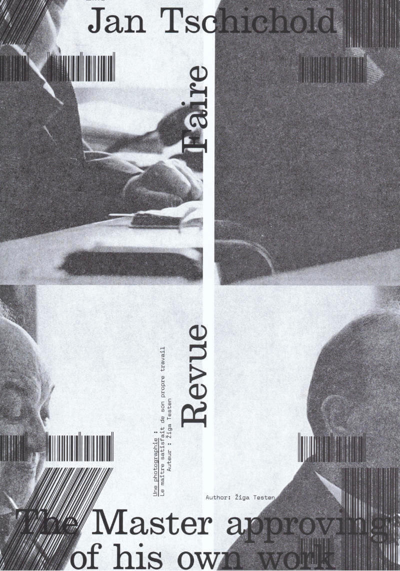
Revue Faire n°23: A Portrait
Design history as an independent discipline and field of study appears to be in trouble. Design historians complain about its diminishing influence within universities due to the ongoing instrumentalisation of higher education. The Eurocentric canon built upon values and methods adopted from art and architecture history has been contested by decolonial theories. And finally, it appears that the trust in the institution of ‘history’ itself and its meta-narratives has eroded.
A discipline that was once considered to provide reflection on what came before and guidance on what could come to be—under the auspice of a grand narrative of continuous progress—has been replaced by modest narratives, social anthropologies, and claims of the ‘end of history’.
In this article, I rummage through the ruins of design history and try to unpack what it was that we once considered design history and our design history canon, how we wrote about it and to what end. In particular, I focus on this one image: a portrait photograph of a well-known historical figure, the designer and typographer Jan Tschichold. How is it used? And what stories do we tell about it?

Design Struggles - Intersecting Histories, Pedagogies, And Perspectives
This publication offers a critical assessment of the complicity of design in creating, perpetuating, and reinforcing social, political, and environmental problems, both today and in the past. It proposes going against the grain by problematising Western notions of design to foster situated, decolonial, and queer-feminist modes of disciplinary self-critique, and looks at design through the intersections of gender, culture, ethnicity, and class. Applying robust scholarly insight with engaging and accessible modes of conveyance and storytelling, an urgent and expansive array of voices and views emerge from those engaged in struggles with, against, or around the field of design.

Tokyo Papers
‘Tokyo Papers’ comprises a collection of 41 monoprints created by Dutch graphic designer and typographer Karel Martens between 2019 and 2020. In 2018, Martens received a package from artist-curator Pierre Leguillon that contained filled-in Japanese forms which he had found at a street market in Tokyo. Martens was intrigued by the collection of thin paper with a rectangular black-blue layer of carbon on the back. In 2019 he started to print on these back sides, but because the overprinting on the carbon layer caused unwanted damage, he switched to printing them on the front sides as well. “The closing image is related to Tokyo in a different way,” he explains.
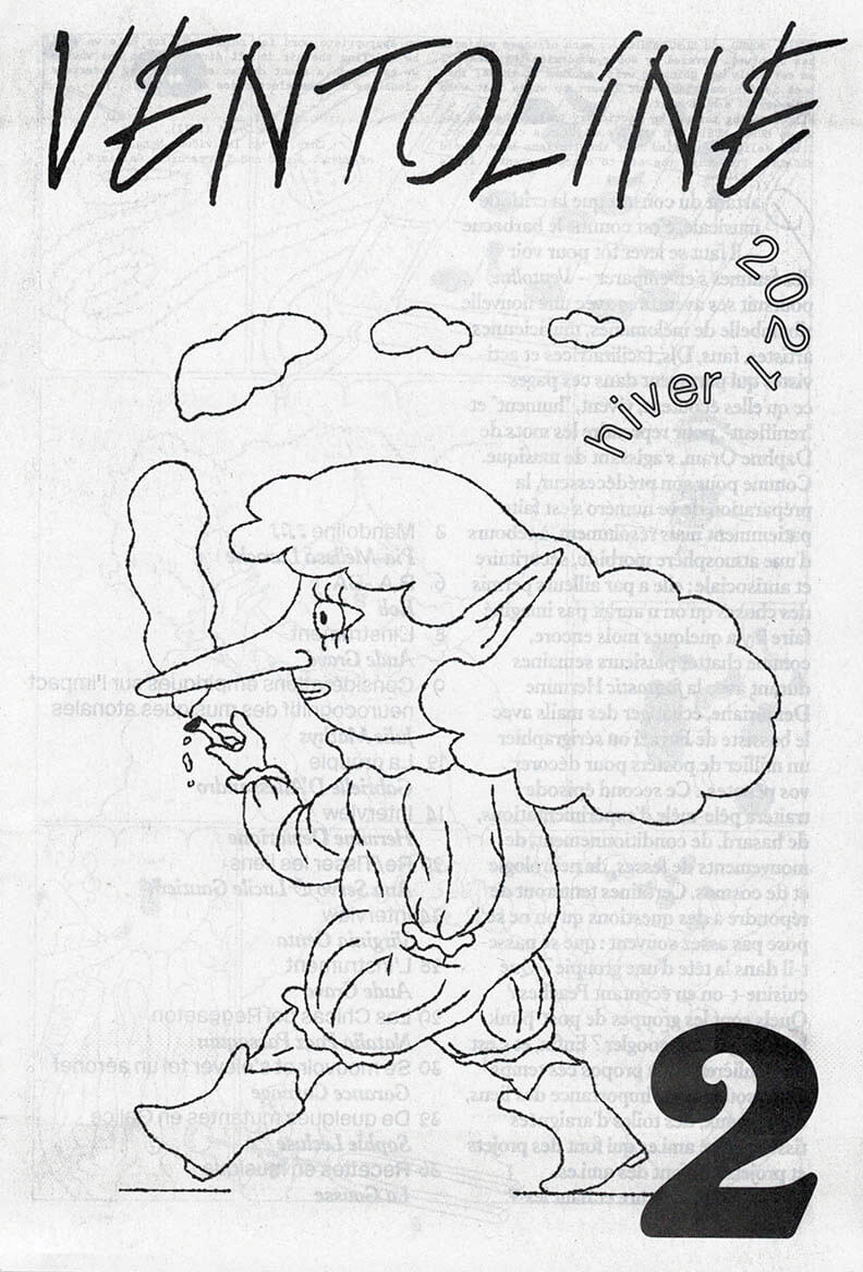
Ventoline #2 – hiver 2021
Partant du constat que la critique musicale, c’est comme le barbecue — il faut se lever tôt pour voir des femmes s’en emparer — Ventoline poursuit ses aventures avec une nouvelle ribambelle de mélomanes, musiciennes, artistes, fans, DJs, facilitatrices et activistes qui partagent dans ces pages ce qu’elles écoutent, vivent, « hument » et « reniflent », pour reprendre les mots de Daphne Oram, s’agissant de musique. Comme pour son prédécesseur, la préparation de ce numéro s’est faite patiemment mais résolument, à rebours d’une atmosphère morbide, sécuritaire et antisociale ; elle a par ailleurs permis des choses qu’on n’aurait pas imaginé faire il y a quelques mois encore, comme chatter plusieurs semaines durant avec la fantastic Hermine Demoriane, échanger des mails avec le bassiste de Fugazi ou sérigraphier un millier de posters pour décorer vos pénates…
Ce second épisode traitera pêle-mêle d’expérimentations, de hasard, de conditionnement, de mouvements de fesses, de neurologie et de cosmos. Certaines tenteront de répondre à des questions qu’on ne se pose pas assez souvent : que se passe-t-il dans la tête d’une groupie ? Que cuisine-t-on en écoutant Peaches ? Quels sont les groupes de post-punk les plus galère à googler ? Enfin, et c’est particulièrement à propos ces temps-ci, on soulignera l’importance des liens, des réseaux, des toiles d’araignées tissées entre ami.es qui font des projets et projets qui font des ami.es…
(ENG)
Ventoline is a French music zine written and illustrated by women only. The second issue includes contributions by Pia-Mélissa Laroche, Bob Siegrist, Julie Mathys, Gabrielle d'Alessandro, Aude Gravé, Ana Servo, Lucile Gautier, Natalia Paez Passaquin, Garance Carnage, Sophie Lecluse, La Gousse, as well as interviews of Hermine Demoriane and Virginia Genta.
17 x 25 cm, 40 pages printed on newspaper by Newspaper Club ; comes with a screen printed poster by Pia-Mélissa Laroche.
1st edition of 1500 copies, jan. 2021
more on https://ventoline.octavie.club

Rush Print 1 - Bad Type
Benjamin McMillan, Dong Bin Han
“May we want to reckon the time of the position ‘student’ not from the progressive aspect of amateur towards pro. Besides the fact that every step of life is an ongoing learning, there’s a clear physical(virtual) circumstance of school and an educational boundary for student, which makes student’s moment independent from any other vocations. Extra time of working on one subject with mistakenly expended deadlines, being experimental and anti-aesthetic by testing its performance, the growth on having own tone of (visual) voice while mumbling and simultaneously thinking the mumbling can be also a kind of voice. There are untamed beauties in this position.”
The inaugural issue of Rush Print focuses on the topic ‘BAD TYPE.’ A loose synonym of bad here is amatuer or ugly which is what contributors deliver as a student. The content ranges from interviews, workshops and anecdotes with 2020 participants of Grafisch Arnhem. The entire publication is typeset in student-made typefaces so the book also functions as a type specimen.
Rush Print is new magazine annually releasing out from the contributors of Grafisch Arnhem. Throughout spreads, it contains graphic design related subjects such as Types, Time, Talks, etc.
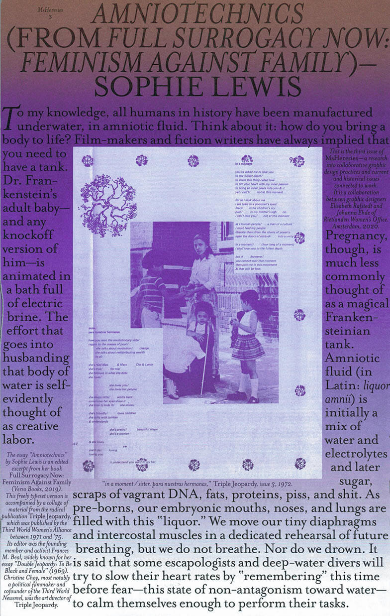
MsHERESIES 3 — AMNIOTECHNICS
Johanna Ehde, Elisabeth Rafstedt
Dedicated to the incredible – and incredibly beautiful – publication Triple Jeopardy (1971–75, by the Third World Women’s Alliance), as well as the ideas in Sophie Lewis’s book Full Surrogacy Now! – Feminism Against Family (Verso, 2019). Ms Heresies 3 is reprinting the book’s final chapter, the essay *Amniotechnics.*
Each spread weaves edited material from Triple Jeopardy with Sophie Lewis’s essay. These intuitive and meticulous compositions are the outcome of looking at Triple Jeopardy through the lens of collaborative graphic design. Reading, typesetting, collaging, painting, and ornamenting became a way of designing together while attempting an homage, a re-reading, and a cross-publication friendship.
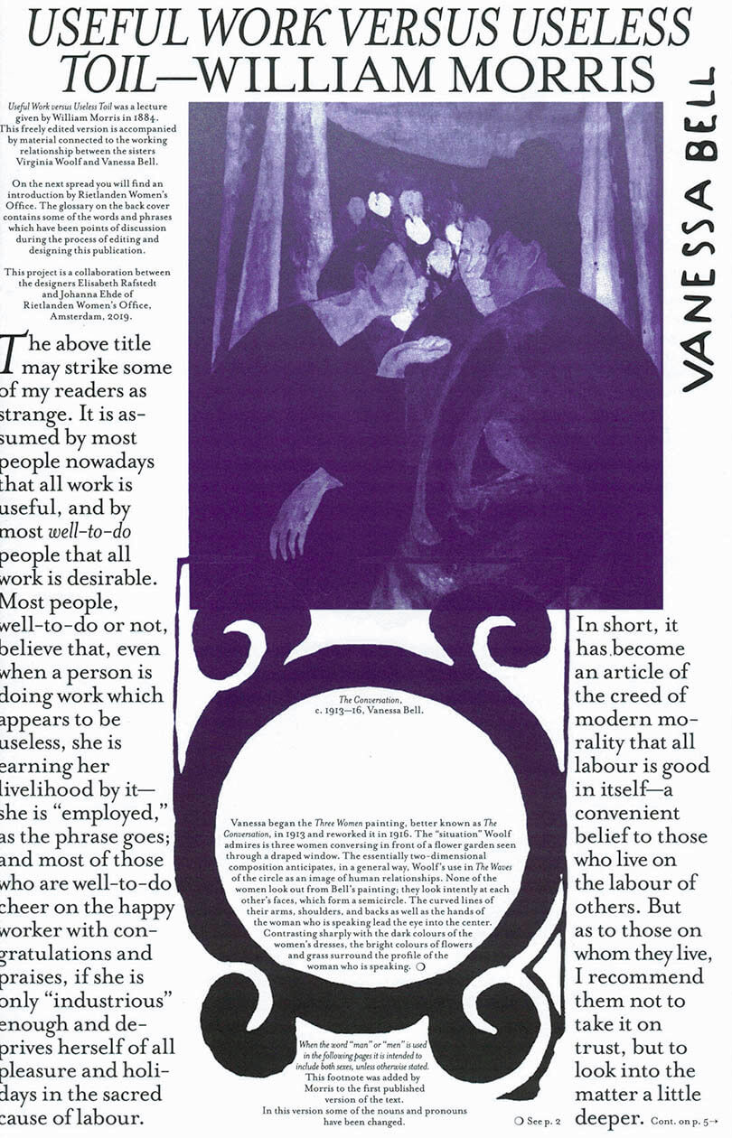
MsHERESIES 2 — USEFUL WORK VERSUS USELESS TOIL
Johanna Ehde, Elisabeth Rafstedt
The second issue of MsHeresies includes collages, paintings, and hommages to the work of sisters Vanessa Bell and Virginia Woolf, whose collaboration defied preconceived ideas of both text/image hierarchies, as well as rivalry at the cost of sisterhood. This visual essay is published alongside William Morris’s lecture Useful Work versus Useless Toil from 1884 which introduces the idea of the ornamental and its relationship to work and rest.
The ornamental can only come about under certain conditions: enough rest, agency, and variation of work. The ornamental is never an outcome or product of these conditions; but something intrinsically intertwined therein.
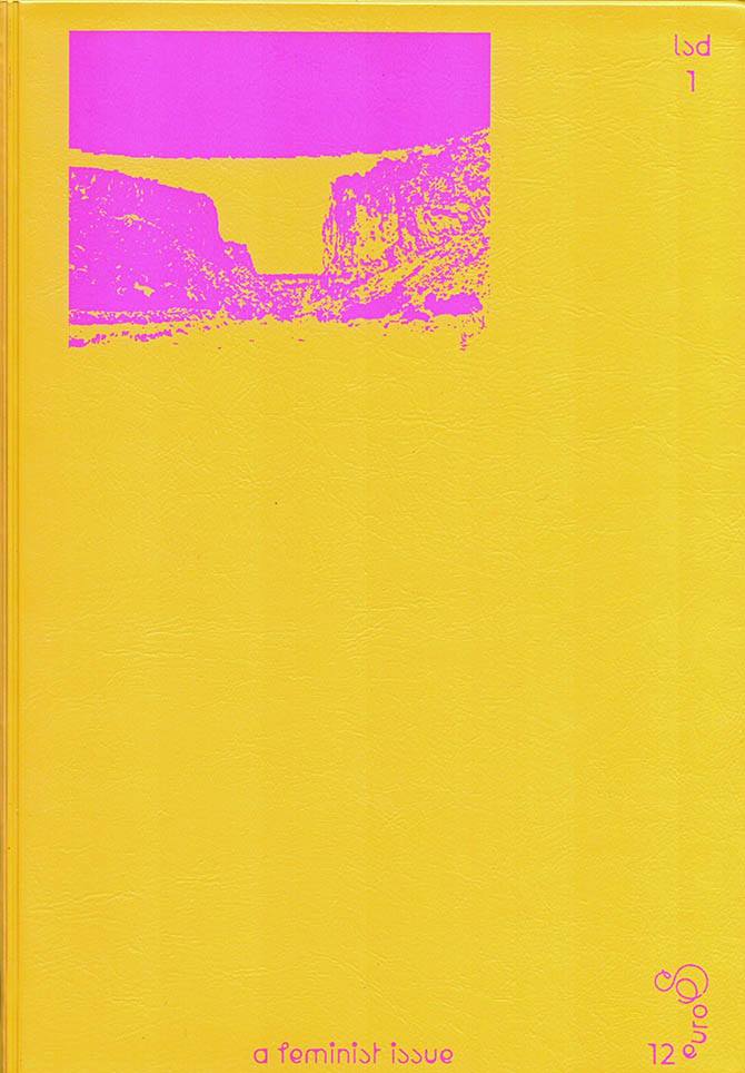
LSD #01 – A Feminist Issue
The first issue of the Cahiers du centre national du graphisme, around the relationship between graphic design and feminism.
Speaking about Chaumont and its festival, Vanna Pinter once wrote rather modestly, “The graphic design faith has remained in dependable legitimate hands, the hands that ensure the transfer of power.” To act outside of those transfers of power, from a co-opting of use, is to run the risk of a possible delegitimization. Acting on the fringe, adopting another vantage point, is therefore not without its risks—in terms of territorial thinking—but must be an absolute in a global context.
At the second iteration of the International Graphic Design Biennial in 2019, we tackled a number of themes, from invisiblization with Silvia Baum, Claudia Scheer and Lea Sievertsen [Not a Muse], and the postcolonial question with Jonathan Castro, to transformations of capital and the repercussion on the economy of a discipline with Tereza Ruller [The Rodina], and the notion of commitment with Teresa Sdralevich. In that context we found many more allies than fans of a “Bingo du Male Tears.”
Opening this first issue of our periodical and titling it “A Feminist Issue” around the figure of Anja Kaiser is about approaching graphic design from a feminist, collaborative and co-constructionist perspective. It is a perspective that a number of others have joined here, including Anna Jehle, Juliane Schickedanz, Fabrice Bourlez, and Loraine Furter. The title of this issue implies another, such as “An other Feminist Issue” coming after “Another Feminist Issue,” for there are many voices and they require us to lend them an ear while being attentive and precise. Le Signe Design [LSD], designed by officeabc, is the periodical of a platform for production, distribution, creative support, dialogue, and mediation between the artistic field of graphic design and the public, what the National Center for Graphic Design is all about. Le Signe Design is not so much a communications forum as a new way to enter a field of study.
Texts by Anja Kaiser, Loraine Furter, Fabrice Bourlez, Anna Jehle, Juliane Schickedanz.
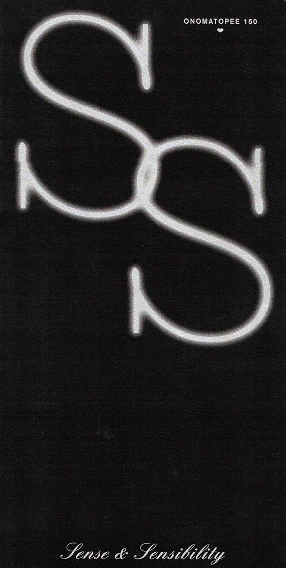
Sense & Sensibility
It’s because feminism has become a fashionable commodity now, that we’re in desperate need of a more inclusive and varied reflection on contemporary girlhood, gender equality struggles, and the relationship between gender, politics and philosophy.
This book documents the production and thought processes of 6 engaging artists and designers regarding the theme, and features a collection of essays by artists and academics, writers and rioteers, curators and journalists.
With contributions by Mandy Roos, Gabriel A. Maher with Roberto Pérez de Gayo and Carly Rose Bedford, Olle Lundin, Janina Frye, Camille Auer, Barbara Bolt, Daantje Bons, Charlotte van Buylaere, Ece Canlı and Luiza Prado de O. Martins, Victoria Ledig, Alicja Melzacka, Nina Power, Barbara Smith for Nasty Women and Aynouk Tan.
Edited and curated by Pernilla Ellens
Graphic design by Virginie Gauthier
Made possible thanks to the municipality of Eindhoven and the province of Noord-Brabant.

Ventoline #1 – été 2020
Ventoline est un fanzine né à la fois d’un enthousiasme quotidien pour ce qui se rapporte à la musique, et d’une véritable lassitude face à la quasi-absence de paroles féminines autour de ce vaste sujet. Commenter, critiquer, prescrire, partager ses histoires, ses goûts, ses dégoûts, en somme, sa culture musicale…
Pourquoi si peu de femmes s’autorisent à le faire? Même lorsqu’elles programment, organisent, sonorisent des concerts, lorsqu’elles mixent tous les week-ends, pogotent au premier rang, lorsqu’elles sortent des disques, dessinent des affiches et récurent les tréfonds de Soulseek. Même lorsqu’elles produisent et consomment de la musique.
Le but de ce fanzine ne sera ni d’émettre des classements, ni de théoriser savamment afin d’être prises au sérieux. La musique nous a construites personnellement et socialement, il s’agira donc de partager nos expériences liées à elle —heureuses comme foireuses—, nos observations, nos fantasmes, nos figures tutélaires.
Ce que ça fait, entre autres, de tourner pendant un mois dans un van, de passer pour la potiche de service ou de se prendre une claque au détour d’une compile. De Portland à Barcelone, en passant par Paris, Marseille, Bruxelles, Lyon et Leipzig, une douzaine de mélomanes polymorphes ont prêté leur voix à ce premier numéro de Ventoline.
(ENG)
Ventoline is a French music zine written and illustrated by women only. The first issue includes contributions by Camille Potte, Louise Bouchu, Anouck Eychenne, Leslie Chanel, Marouchka Payen, Diane Malatesta, Maïssa Daoudi, Hélène Degand, Sarah-Louise Barbett, Inès Di Folco, as well as interviews of Cristina Daura and Aubrey Hornor.
17 x 25 cm, 32 pages printed on newspaper
more on https://ventoline.octavie.club

RISO PARADISO, 33 1/3
Riso Paradiso is a collective of six individuals connected by research and creation in the fields of risography, graphic design, printing techniques, visual communications, photography, illustration and publishing.
The book is continuation of a residency project that was held in January 2020 at the Hiša kulture Pivka gallery. Theme of the residency was inspired by the in-house LP collection of colleague Leon Zuodar who also co-runs the gallery. Through his record collection they recognised the spirit of their generation.
Result of the residency was 6 different screen prints, but the idea was further upgraded as the project proceeded and an art publication in the risography technique was conceived.
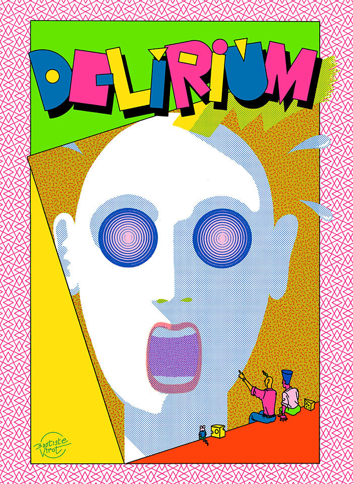
Delirium
The humor in Delirium seems a cross between the classic comic strip gags of Ernie Bushmiller and the theatrical absurdity of Monty Python, with a dose of Jim Woodring’s colorful, acid-trip antics thrown in as well.
What makes these strips special is that they achieve things that can only be done in comics; Virot’s mastery of the medium’s fundamental mechanics (timing, composition, closure) is matched only by his unbounded imagination. But for all of its absurdity, Virot captures simple moments of undeniable humor and pure joy with simple punchlines and and unexpected twists.
This makes Delirium a unique and special work that excels on two levels: a formal experiment that pushes the visual language of comics to dazzling and frantic limits, as well as a deeply satisfying and laugh-out-loud compendium of surrealist set-ups and visual one-liners.

Return To Leptis Magna
Anna Barham’s Return To Leptis Magna is a book which compiles anagrams of the title sentence. We designed the rules which allowed the artist to compose the book, including a typeface which has different letterforms for characters that appear more than once, so that each letter is unique.
Design by Anna Barham & Julia. Typeset in Leptis, designed by Julia.
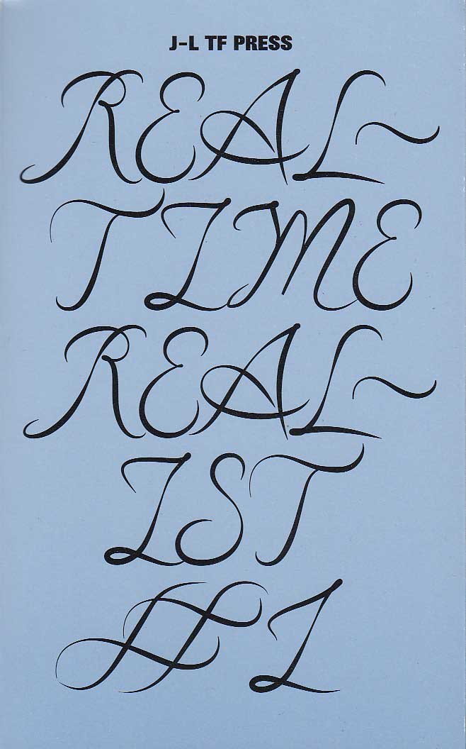
Typefaces have other interests besides words
Charlie Clemoens, Jungmyung Lee
This first issue of Real-Time Realist explores amazement, distraction, surprise and awe (the blue sector of Robert Plutchik's Wheel of Emotions) with contributions from invited artists distilling the aforementioned emotions. [publisher’s note.]
Real-Time Realist gathers contributions by graphic designers, writers, and artists, most of them living in the NL and former students of the Gerrit Rietveld Academie or the Werkplaats Typografie.
Contributors: Jungmyung Lee, Josse Pyl, Carson Lee, Charlie Clemoes, Laura Pappa, Lieven Lahaye, Will Pollard, Mathew Kneebone, Max Gershfield, Rudy Guedj.

NXS #4 Algorithmic Anxiety
NXS #4 Algorithmic Anxiety explores the spectrum of algorithmic authority over our lives (whether perceived or not). The contributors question or reveal the inconspicuous influence of algorithms, in their various forms, on our behavioral patterns, emotions, and self perceptions of our position in the world.

NXS #3 Viral Bodies
NXS issue #3 Viral Bodies investigates the changing concepts of gender and identity norms in the digital space, and open the discussion to many possible speculations and to their real world implications.
Kicking off the issue with a starting piece by Reba Maybury, over 20 fellow contributors explore social conventions, share intimate moments and experiences of pain, love, hate and fear. They delve into authenticity in the non-human sphere, they code accidental bigotry on the internet. Science fiction writer Alan Dean Foster blurs the lines of reality, transmitting what is real and what not in a dystopian society. Political art critic Penny Rafferty unravels the minds of tech giants while artistic researcher Addie Wagenknecht questions the diffusing lines between virtual technology and working bodies in reality.