"From this moment / and hence backwards / a visitation / echoes thru the apparent opening / to the tomb / the narrow passage is the mind's reasoning / in clarity / as she moves like a shadow / having lived her life before " — Joanne Kyger, from Places to Go (Black Sparrow, 1970)
"All processes measured as form are traceable in curved decay. Seemingly unmeasurable, unquenchable, the heart stone harbors its own native entropy. The evolution of organs is not ours to decipher. We’re drawn slanting toward the stone in helices of approaching circles. Our movements throw shadows, our bodies ring haloes." — Michael Cavuto, "Isis Theses"
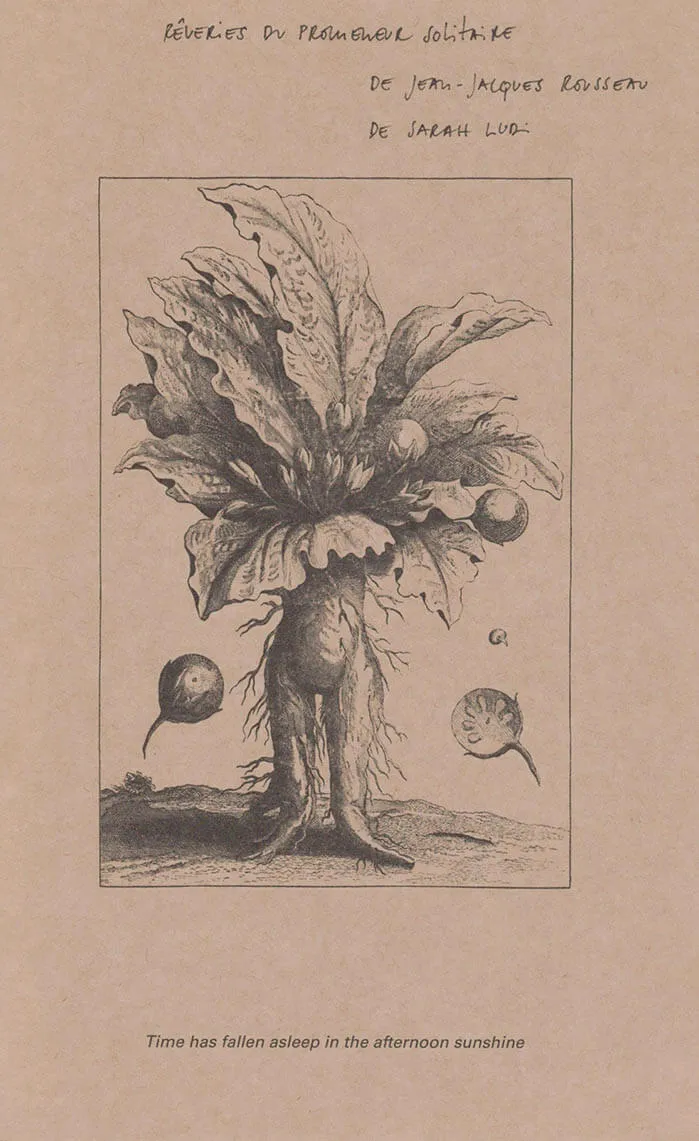
"In the dual work of Isis Theses & Pyre I-V, living, death, language’s work of remembrance, place & poetic lineage all take part in shifting throughlines of recombinant forms, as a spiral spirals back on itself, changed over time. Early on, here, Cavuto writes “There is not enough wood for coffins. There is wood enough for a boat.” a Pyre then is a boat, a burning that is going somewhere, not death-as-end but as an upward & outward movement into collectively shared air, an archeology of connection. “Kyger wrote that memory is a weird dimension carried around invisibly in the ‘mind’’ Cavuto writes, in one of those moments that feels like a key, “Writing, she said, gives history back to you.” But it is not only history that Cavuto is carrying forward in these poems, it is something more spatially complex, enlivened & embodied in the dance of the words, & in the vital breakdown of the words themselves. The poems in Pyre I-V enact their answer to the question ‘what essence is left us when no words are left,’ & leave us, after the ritual process, dazzled with the true sense that something is left, something important of resonance & remembrance, in the atomized language-space; the air around the dis-integrating morphemes shimmering on the page as dissipative, potentiate sparks. —Cody-Rose Clevidence
Michael Cavuto is a poet based in Brooklyn, New York. His books include Country Poems (Knife Fork Book, 2020) and Pyre (Spiral Editions, 2025). With the poets Dale Smith and Hoa Nguyen, he publishes the Slow Poetry in America Newsletter. Along with Tessa Bolsover, he publishes hand-bound poetry books through auric press.
Pyre, Michael Cavuto. Illustrations by Astrid Terrazas. 52p, 8.5" x 6.75", hand sewn with red linen thread. Covers letterpressed on a 1963 Vandercook proof press with Strathmore Premium Grandee paper. Copy text and illustrations printed both offset and digitally on Mohawk felt paper in a first edition of 275. Printed, assembled, and bound in “Kingston, New York,” the unceded and currently occupied lands of the Haudenosaunee, Mohican, Munsee Lenape, and Schaghticoke. With thanks to Vladimir Nahitchevansky and the various friends who helped assemble.