by Benjamin McMillan

Full Auto 3: The Title of This Work is to be Sketched
Benjamin McMillan
Self-Published - 22.00€ -

Part documentation, part drawing tool, fa3 is a publication that contains the work done through full auto foundry, a workshop-based type foundry that explores how processes of automation and tool-assisted sketching can influence the design of typefaces.

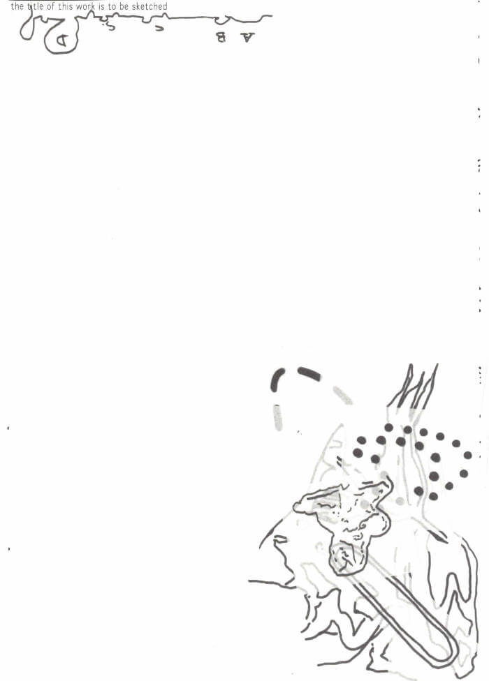
Using analogue tools, participants of the workshops are encouraged to draw letterforms without thinking too much about what the letter should be. Absent-minded drawing and doodling replace thought-out design, leading to alphabets quickly (and sometimes slowly) emerging through the repetition of mark-making. The quality, in a traditional sense, of these letterforms becomes less important than the quantity of them and the marks that were drawn to produce them, this often leads to oddly inconsistent but exciting typefaces. Once the sketches that the participants produce are finished, they are scanned and go through a process of automated digitisation. Each typeface that is produced is available with an open-source license, free to download and free to manipulate.

fa3 is a publication that is both a collection of all the drawing tools that have been designed/used in workshops and a drawing tool itself. Using these pages as a traceable surface the reader/drawer can combine forms and patterns together with the goal of creating letters.

Rush Print 1 - Bad Type
Benjamin McMillan and Dong Bin Han
Self-Published - 20.00€ -  out of stock

“May we want to reckon the time of the position ‘student’ not from the progressive aspect of amateur towards pro. Besides the fact that every step of life is an ongoing learning, there’s a clear physical(virtual) circumstance of school and an educational boundary for student, which makes student’s moment independent from any other vocations. Extra time of working on one subject with mistakenly expended deadlines, being experimental and anti-aesthetic by testing its performance, the growth on having own tone of (visual) voice while mumbling and simultaneously thinking the mumbling can be also a kind of voice. There are untamed beauties in this position.”

The inaugural issue of Rush Print focuses on the topic ‘BAD TYPE.’ A loose synonym of bad here is amatuer or ugly which is what contributors deliver as a student. The content ranges from interviews, workshops and anecdotes with 2020 participants of Grafisch Arnhem. The entire publication is typeset in student-made typefaces so the book also functions as a type specimen.

Rush Print is new magazine annually releasing out from the contributors of Grafisch Arnhem. Throughout spreads, it contains graphic design related subjects such as Types, Time, Talks, etc.

cart (0)