rile*books

Search books

Search books by title, author, publisher, keywords...

Cover of In Perpetuity

Self-Published

In Perpetuity

Ivey Wawn

€11.00

In Perpetuity is part of Ivey Wawn’s project of the same name. With contributions from those involved in the making of what would have been the live performance, it is an accumulation of thoughts, reflections and associated pieces of work that give some idea of what the work could, would, or may in the future come to be. 

In Perpetuity is an ongoing project that has taken a variety of forms, from publication, through video and into live performance.

recommendations

Cover of R.S.V.P. Portrait Series II

Self-Published

R.S.V.P. Portrait Series II

Kristien Daem

Photography €10.00

"Considering their practice within the art world addresses the issue of how art is (re)presented or how art can be seen, I asked Yves Gevaert,Tom Engels, Raimundas Malašauskas, Kasper Bosmans, Felipe Dmab, Dirk Snauwaert, Olivier Vandervliet, Bas Hendrikx and HC (Friedemann Heckel & Lukas Müller) in this second series of the portraits. The profile of these men is very diverse. They work as publisher, curator, critic, gallerist, or artist, thus each of them is dealing in a different and sometimes personal way within the system of the art world. 

The portrayed are sitting in front of a black velour background, a light absorbing surface. High-quality equipment and professional lighting, bring life to the smallest detail in the razor-sharp photographs. The portrait series expresses the objectification of and the fascination for the other, two aspects that are historically linked with portrait photography."

Cover of Kamer I - Oesters

Self-Published

Kamer I - Oesters

Katinka van Gorkum

‘Kamer I - Oesters’ is een kort verhaal geschreven in het kader van het kunstproject Beste Anna,. Hierin fungeert de figuur van de openlijk lesbische Rotterdamse schrijfster Anna Blaman als motor voor vragen, gesprekken en correspondenties rondom feminisme, schrijvende vrouwen en de canon, anders zijn, eenzaamheid en vriendschap.

Ook verkent Katinka met dit onderzoek Anna Blaman als personage voor een toekomstige roman. In ‘Kamer I - Oesters’ betreedt de hoofdpersoon Anna’s met een rolkoffer vol boeken van andere schrijvers, fluistert ze hun woorden in de kieren in Anna’s muren en verleidt ze Anna met een pauwendans.

Anna Blaman (1905-1960) was openlijk lesbisch, in die tijd een groot taboe, maar zag zichzelf niet als voorvechter van een beweging. Een belangrijk thema in haar werk is de vraag of we een ander werkelijk kunnen kennen. De personages in haar romans zijn vaak alleen en verlangen naar een ander, die altijd onbereikbaar blijft. In 1948 publiceerde Blaman de roman Eenzaam Avontuur, die erg veel stof op deed waaien vanwege enkele (homo-)erotische personages die in het boek voorkomen. 

Cover of Poster Edition (bundle)

Self-Published

Poster Edition (bundle)

etaïnn zwer

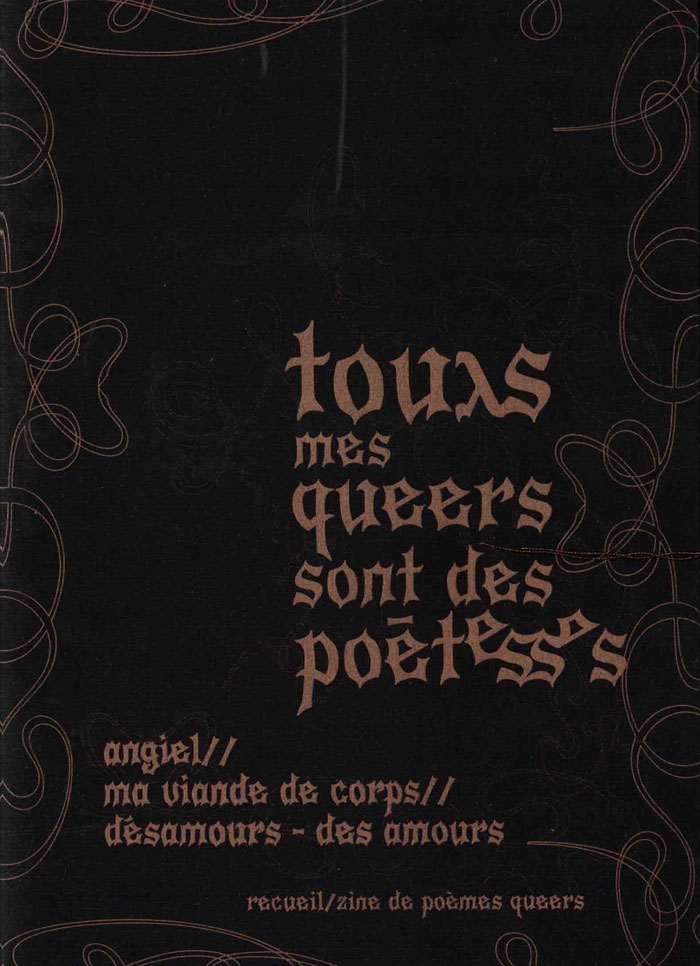
4 poèmes-affiches, format A3, impriméx en risographie au studio Colorama (Berlin), sur papiers variés, tirage à 150 exemplaires

«GASOLINE, Apocalypse 1998», «the category is: phone sex», «zona nudista», «(fête) sentimental-e-s» : étés d'apocalypse, émojis banane, cruising transocéanique, SMS en short, sales coeurs, baraques à frissons et grand-huit sentimental... ces poèmes courent toustes ~ à genoux, à nu ou en solex ~ après la question du désir, après l'amour aussi, avec une tendre obsession

Design graphique signé Auriane Preud’homme, Enz@ Le Garrec, Roxanne Maillet & Martha Salimbeni, avec des dessins de Gaëlle Loth

Cover of poussière de seum

Self-Published

poussière de seum

Ethan Assouline

“the following text was written in July 2024 in St Imier, Switzerland.
it's a fragment of Lettres à Bébé, a book I've been writing for some time in which I - Ethan - find myself helping and communicating by letter with a Marxist Baby whose political project is not to grow up so as not to become a tool of Capital. While he develops his project and tells it to me, I live my life and tell it too, observing and commenting on the ignoble state of the world, its language, its architecture, managing my heartbeat, meeting people, working, fucking, eating (...)”. - Ethan Assouline

Published by La Dépendance, St imier (2024)

Cover of Font News

Self-Published

Font News

Erkin Karamemet

For the very first time, the newspaper Font News, published together with the supplement Font Menu, showcases the typographic work of Erkin Karamemet from his own label as printed matter. The large format of the newspaper invites the viewer to appreciate the typefaces in large, poster-like sizes. The curated texts by Gerrit Kotsivos reference pop-cultural curiosities and are further enhanced by overlaid spreads with amusing illustrations by the London-based artist Why Ebay. This limited issue, produced as a special artist edition of only 300 copies, is something for typography enthusiasts to collect, explore, and celebrate contemporary type design.

Cover of How to Sleep Faster 1

Arcadia Missa

How to Sleep Faster 1

Various

Periodicals €10.00

How to Sleep Faster is published as part of the collaborative discussion that form the critical direction of the gallery. and sits alongside the first two exhibitions – Sleep Faster (February), and How to Carve Totem Poles (March). It has been put together as an open ended continuation of this dialogue through which we seek to understand the contradictions / complexities that define and form our experience, existence and participation in a contemporary digital-analogue creative environment.

Arcadia Missa Publications; Rozsa Farkas, Tom Clark, Jammie Nicholas, Laura Farley (eds).

Cover of Appendix / Appendice #4: Translation / Traduction

Time has fallen asleep in the afternoon sunshine

Appendix / Appendice #4: Translation / Traduction

Mette Edvardsen, Léa Poiré and 1 more

Performance €15.00

The Appendixes #1-4 is an editorial series by Mette Edvardsen, Léa Poiré and Victoria Pérez Royo that came out of the project Time has fallen asleep in the afternoon sunshine. For a two-year residency at Les Laboratoires d'Aubervilliers (2022-23), they came together as a small work group, shaping the work process, hosting presentation formats and making the publication series on paper as four cahiers.

The cahiers comprise a collection of commissioned texts and contributions created for this context, selected documents and traces from work sessions and encounters organized during the residency, texts read together and republished for this occasion, a collection of references, notes in progress, unfinished thoughts and loose fragments - on paper, between pages.

Cover of One Shape of the Language: Cyrillic Archives

San Serriffe

One Shape of the Language: Cyrillic Archives

Inna Kochkina

‘One Shape of the Language: Cyrillic Archives’ is an artist’s book documenting Inna Kochkina’s research into the history, style, and politics of traditional Cyrillic.

This research was born from Kochkina’s self-reflective curiosity about the relationship between cultural heritage and typography and evolved into an examination of the socio-political role of traditional Cyrillic. An ancient script, Cyrillic has been used to express various forms of cultural and territorial domination and continues to serve as an imperialist tool, having long been deployed in support of Slavic nationalism both in Russia and in the former USSR territories. 

This publication is the result of Kochkina’s own research into and engagement with archives of typography, as well as conversations with anti-colonial activists, artists, and historians who interrogate traditional Cyrillic and its relationship to colonial power. 

Alongside conducting scholarly research, Kochkina also produced drawings in response to archives of traditional Cyrillic. Making these drawings constituted a form of “studying by making.” With these efforts she has sought to construct an anti-colonial feminist narrative, employing both typographic artifacts and ‘patriarchal’ letterforms.

To make her drawings, Kochkina took samples from these low quality typographic archives, enlarging and transforming them into unexpected graphic shapes that were then recorded in a series of experimental prints. The drawing, collating and contact printing process that she followed allowed her to document and reveal the qualities lent to historical artifacts by digital noise. Through this working method she sought to rethink both the subject of her work as well as traditional approaches to type design practice. This book presents the prints in a roughly chronological sequence, poetically portraying Kochkina’s complex relationship with her native script. Variously precise, messy, and destructive, these works ultimately convey a series of “imaginary” shapes through which to reinterpret traditional Cyrillic of the past and present.