rile*books

Search books

Search books by title, author, publisher, keywords...

Cover of Graphic Design Is (…) Not Innocent

Valiz

Graphic Design Is (…) Not Innocent

Ingo Offermanns ed.

€25.00

Graphic Design Is (…) Not Innocent questions ingrained approaches, values and assumptions of graphic design in globalized societies. The publication aims to initiate a dialogue between designers, scholars, critics and commissioners, who investigate responsibilities, potentials, politics, limits and risks of designing visual communication. How innocent is graphic design? Whom is it addressing, whom is it in/excluding? What does it bring about? When defining the role and impact of visual communication, what future questions lie ahead?

Contributors: Karo Akpokiere, Christian Bauer, David Bennewith, Friedrich von Borries, Clémentine Deliss, Sandra Doeller, Daniel Martin Feige, Feminist Internet, Annette Geiger, Matthias Görlich, Anna Lena von Helldorff, Martin Ludwig Hofmann, Jianping He, Kay Jun, Anoushka Khandwala, Francisco Laranjo, Degeng Li, Eva Linhart, Madoka Nishi, Ingo Offermanns, Offshore, Sophia Prinz, Konrad Renner (Knoth  & Renner), Conor Rigby (Feminist Internet), Isabel Seiffert (Offshore), In-ah Shin (Feminist Designer Social Club), Pierre Smolarski, Markus Weisbeck
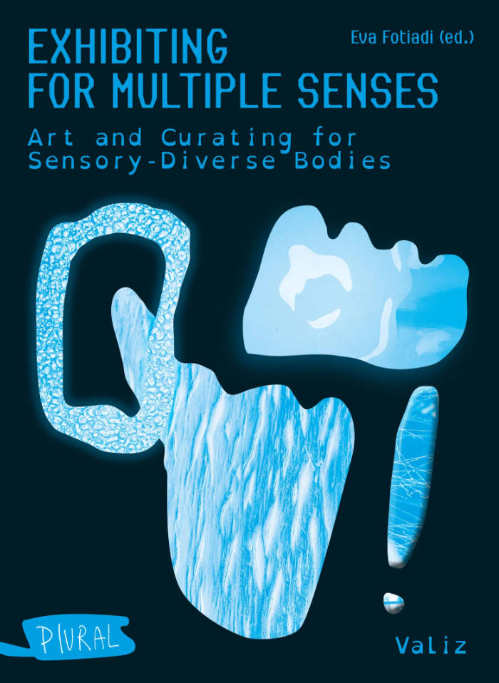
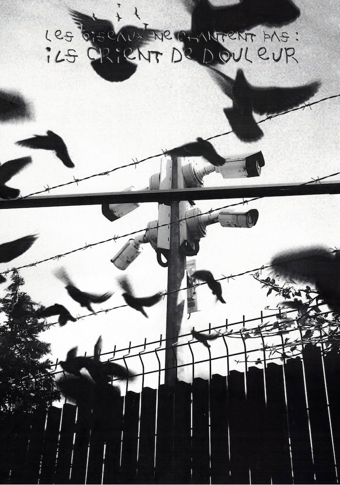
recommendations

Cover of Productive Archiving

Valiz

Productive Archiving

Ernst van Alphen

Non-fiction €25.00

Productive Archiving discusses a variety of problems of archival organizations. It mainly focuses on the following three issues that are usually overlooked: first, the question of inclusion in or exclusion from the archive; second, the loss of individuality in the archive, the danger of homogenization; and third, that archiving may become a form of pigeonholing, boxing specific identities into a confined space.

Avoiding the archive because of these problems is not an option, because archival organization is a basic symbolic mode on the basis of which we organize our lives, the past, the present and the future. What this book suggests is that it is best to explore constructive and creative solutions for these problems. Especially artistic archives seem to be able to develop these possible solutions, because they offer speculative, unexpected ways to order, select, and narrate specific information, and bring about new connections and archival organizations.

Cover of A New Program for Graphic Design

Inventory Press

A New Program for Graphic Design

David Reinfurt

A New Program for Graphic Design is the first communication-design textbook expressly of and for the 21st century. Three courses—Typography, Gestalt and Interface—provide the foundation of this book.

Through a series of in-depth historical case studies (from Benjamin Franklin to the Macintosh computer) and assignments that progressively build in complexity, A New Program for Graphic Design serves as a practical guide both for designers and for undergraduate students coming from a range of other disciplines.

Synthesizing the pragmatic with the experimental, and drawing on the work of Max Bill, Beatrice Warde, Muriel Cooper and Stewart Brand (among many others), it builds upon mid-to-late 20th-century pedagogical models to convey contemporary design principles in an understandable form for students of all levels—treating graphic design as a liberal art that informs the dissemination of knowledge across all disciplines. For those seeking to understand and shape our increasingly networked world of information, this guide to visual literacy is an indispensable tool.

David Reinfurt (born 1971), a graphic designer, writer and educator, reestablished the Typography Studio at Princeton University and introduced the study of graphic design. Previously, he held positions at Columbia University Graduate School of Architecture, Planning and Preservation, Rhode Island School of Design and Yale University School of Art. As a cofounder of O-R-G inc. (2000), Dexter Sinister (2006) and the Serving Library (2012), Reinfurt has been involved in several studios that have reimagined graphic design, publishing and archiving in the 21st century. He was the lead designer for the New York City MTA Metrocard vending machine interface, still in use today. His work is included in the collections of the Walker Art Center, Whitney Museum of American Art, Cooper Hewitt National Design Museum and the Museum of Modern Art. He is the co-author of Muriel Cooper (MIT Press, 2017), a book about the pioneering designer.

Cover of Makulatur – 2010-2016

Bom Dia Books

Makulatur – 2010-2016

Manuel Raeder

A collection of misprinted sheets originating from books designed by graphic designer Manuel Raeder: a “behind the scene” project, which documents the early stage of book production and its conventions.

Makulatur, a German word that derives from lat. maculatura “something stained”, refers to misprinted paper that is discarded at the beginning of the printing process as use- and worthless. In 2010, the graphic designer Manuel Raeder started to collect and preserve misprinted sheets of all the publications he designed not only for his own publishing house Bom Dia Boa Tarde Boa Noite but also for fellow artists and institutions.

This waste paper that shows all difficulties arising in the early stage of production—trails, testy or stains—he combined to a new volume as a compilation of maculae “stains”. Thus, he dissolved the spoiled material from the realm of invisibility and displays it to the public whereby he reveals and reflects on the conventions of a book.

Graphic designer Manuel Raeder lives and works in Berlin.

Cover of Visualisation. L'interprétation modélisante

Éditions B42

Visualisation. L'interprétation modélisante

Johanna Drucker

Les diagrammes, cartes et visualisations de données ont conquis le domaine de la recherche en arts, lettres et sciences humaines. Pour certains chercheurs, ces formes graphiques consistent à exploiter des données quantitatives jusqu’ici délaissées, pour d’autres, elles offrent la possibilité d’explorer les relations discrètes qu’entretiennent des corpus hétérogènes. Mais sur quels fondements épistémologiques reposent ces opérations techniques et intellectuelles ? Dans le cadre de la production du savoir et de son interprétation en régime numérique, est-il possible de dépasser le simple effet d’affichage des données, certes bluffant au premier abord, et d’envisager autrement les interfaces et les logiciels ?

Considérée aujourd’hui comme l’une des plus importantes théoriciennes des humanités numériques, Johanna Drucker livre dans cet ouvrage, spécialement rédigé pour la collection, une alternative aux formes dominantes de la visualisation de l’information. Héritière de la tradition humaniste, elle propose une approche qui réhabilite l’idée d’un sujet situé et incarné qui expérimente et conceptualise les connaissances par le prisme de la représentation graphique.

Cover of One Shape of the Language: Cyrillic Archives

San Serriffe

One Shape of the Language: Cyrillic Archives

Inna Kochkina

‘One Shape of the Language: Cyrillic Archives’ is an artist’s book documenting Inna Kochkina’s research into the history, style, and politics of traditional Cyrillic.

This research was born from Kochkina’s self-reflective curiosity about the relationship between cultural heritage and typography and evolved into an examination of the socio-political role of traditional Cyrillic. An ancient script, Cyrillic has been used to express various forms of cultural and territorial domination and continues to serve as an imperialist tool, having long been deployed in support of Slavic nationalism both in Russia and in the former USSR territories. 

This publication is the result of Kochkina’s own research into and engagement with archives of typography, as well as conversations with anti-colonial activists, artists, and historians who interrogate traditional Cyrillic and its relationship to colonial power. 

Alongside conducting scholarly research, Kochkina also produced drawings in response to archives of traditional Cyrillic. Making these drawings constituted a form of “studying by making.” With these efforts she has sought to construct an anti-colonial feminist narrative, employing both typographic artifacts and ‘patriarchal’ letterforms.

To make her drawings, Kochkina took samples from these low quality typographic archives, enlarging and transforming them into unexpected graphic shapes that were then recorded in a series of experimental prints. The drawing, collating and contact printing process that she followed allowed her to document and reveal the qualities lent to historical artifacts by digital noise. Through this working method she sought to rethink both the subject of her work as well as traditional approaches to type design practice. This book presents the prints in a roughly chronological sequence, poetically portraying Kochkina’s complex relationship with her native script. Variously precise, messy, and destructive, these works ultimately convey a series of “imaginary” shapes through which to reinterpret traditional Cyrillic of the past and present.

Cover of Font News

Self-Published

Font News

Erkin Karamemet

For the very first time, the newspaper Font News, published together with the supplement Font Menu, showcases the typographic work of Erkin Karamemet from his own label as printed matter. The large format of the newspaper invites the viewer to appreciate the typefaces in large, poster-like sizes. The curated texts by Gerrit Kotsivos reference pop-cultural curiosities and are further enhanced by overlaid spreads with amusing illustrations by the London-based artist Why Ebay. This limited issue, produced as a special artist edition of only 300 copies, is something for typography enthusiasts to collect, explore, and celebrate contemporary type design.