rile*books

Search books

Search books by title, author, publisher, keywords...

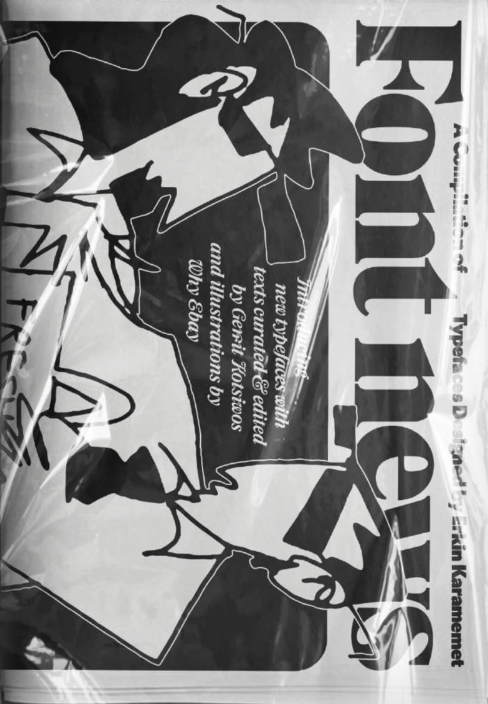
Cover of Font News

Self-Published

Font News

Erkin Karamemet

€18.00

For the very first time, the newspaper Font News, published together with the supplement Font Menu, showcases the typographic work of Erkin Karamemet from his own label as printed matter. The large format of the newspaper invites the viewer to appreciate the typefaces in large, poster-like sizes. The curated texts by Gerrit Kotsivos reference pop-cultural curiosities and are further enhanced by overlaid spreads with amusing illustrations by the London-based artist Why Ebay. This limited issue, produced as a special artist edition of only 300 copies, is something for typography enthusiasts to collect, explore, and celebrate contemporary type design.

recommendations

Cover of Tot Zines #1

Self-Published

Tot Zines #1

Sarah Mayer

TOT ZINES collaborates with local artists in Antwerp, Belgium. Initiated by Sarah Stone in 2024, who invited digital creator Sarah Mayer to publish her set of paintings zing that she created in 2017. This is the first publication for TOT ZINES, RISO-printed by SO-RI in Antwerp.

Cover of Bruch - 1: KLITTERN (aesopica)

Self-Published

Bruch - 1: KLITTERN (aesopica)

Bruch

KLITTERN (aesopica) works through the fable ‘A Wolf and a Kid’, ascribed to the ancient poet and slave Aesop. Borrowing from and dressing up in the idioms of others, the play assembles tactics and gestures of resistance for situations where no recourse to institutionalised forms of power seems advisable. Figurations of non-participation and withdrawal appear on the scene: strategies of camouflage, practices of friendship, promises of radical change, aestheticist compensations, apocalyptic fantasies and mystical transformations.

Cover of The Poeticians

Self-Published

The Poeticians

Pontus Pettersson

Poetry €5.00
The Poeticians is a publication of the performance of the collection of clothes and poetry called Writing Wounds To Heal by Swedish choreographer Pontus Pettersson. Made in velvet silk with the poetry burned out in the fabric exposing the texts, the poetry exposes both itself and the skin of the performer. Throughout the durational piece the performers are doing Pontus Petterssons cat practice and is one of the main ingredients of the project as well as the clothes/poems. The Poeticans is also a choreo-curational event that hosts different choreographic proposals inside of it. It is seen as module or installation where pieces, objects, performers can be inserted rather than a performance that executes and performs the same over and over. It was created as an extension of Pontus interest in poetry and choreography where hospitality and proximity is seen as key concepts in the development and execution of the event.
Cover of Evol/Love

Self-Published

Evol/Love

Nibor Traaw

Evol/Love is a project in three parts: a billboard series, installation and publication connecting 160 subtitled movie stills that all contain the word Love.

A collage of voices and definitions arranged in alphabetical order, from ‘Love is where you find it’ (A: A Date with Judy, US 1948, 00:22:37) to ‘But even if it’s a little late, love has a way of coming back to you’(Y: Yeonae/Love is a Crazy Thing, KR 2005, 01:38:02), but read backwards to sound like its antonym: evil.

Self-published: Stichting Mei, Amstelveen, NL 2020
19,6 x 19,6 x 2,3 cm
200 pages, 160 images
Japanese bound, buckram cover with flaps
Offset on pink paper (interior), screenprinted buckram (cover)

Graphic Design Vilmantas Žumbys, Vilnius

Edition of 666 copies

Cover of sex and place vol 2

Self-Published

sex and place vol 2

Adriano Wilfert Jensen, Andrea Zavala Folache

sex and place is a series of workshops and publications exploring score-based and semi-anonymous writing as a tool for articulating shared concerns.

Vol 2 ‘discores’ is written by Kexin Hao, Luca Soudant, HaYoung, Andrea Zavala Folache & Adriano Wilfert Jensen. Five strangers are stuck in changing boots next to each other and decide to embark on an intimate conversation starting from the question: “What is troubling your sexuality at the moment?”.

The ‘sex and place’ series is part Domestic Anarchism, a project devoted to coalition-building beyond biological, chosen, or national conceptions of family. Dance serves as a set of tools and knowledge that can be applied beyond “the spectacle” to collectively study, write, and move. 

Andrea Zavala Folache and Adriano Wilfert Jensen are choreographers and they co-parent three-year-old Penélope Cleo. Andrea and Adriano use dance and choreography to think about the distribution of care and solidarity beyond ‘the family’, and in turn consider how such a distribution could inform their dance practice. Inevitably themes like sex, economy, gender, and class get activated. But also notions such as prefiguration, anarchism, clitoridian* thinking, zones of non-domination and coalition building. They see dance as a knowledge that can be applied to different practices. Some of these include: co-habitations, score based writing and dancing, self-organised study groups and publications, workshops and dance performances. 

Cover of MsHeresies 4 — Daffodils

Rietlanden Women's Office

MsHeresies 4 — Daffodils

Elisabeth Rafstedt, Johanna Ehde

This fourth issue of MsHeresies republishes the chapter *Daffodils* — a warped monologue about a domestic poisoning — from Rosalind Belben’s book Is Beauty Good (1989).

It is typeset alongside a collage of material from two medieval manuscripts: Isidore of Seville’s Etymologiae and De natura rerum (circa 1130–74), which was illuminated and transcribed by a group of eight nuns at the Benedictine abbey of Munsterbilzen in Maastricht; and the so called Claricia Psalter (late 12th–early 13th century) from the abbey of saints Ulrich and Afra in Augsberg, also made by a group of nuns and named after the novice Claricia who is believed to have drawn herself hanging like the tail of a drop-cap Q in the psalter section of the book.

Cover of Handwerk

Rollo Press

Handwerk

David Schatz, Philipp Herrmann and 1 more

Handwerk revives Berthold Wolpe’s early type design, originally called Wolpe Kursiv and cut in metal by Paul Koch in 1932. It first appeared in a 1936 craft symbol book featuring unique blackletter capitals. Due to persecution as a Jewish designer under the Nazi regime, Wolpe’s work faced delays and alterations and was finally released in 1952 in a modified form. Handwerk captures the original hand-lettered feel and includes stylistic sets that reference both the 1952 release and the original blackletter capitals, providing a historical perspective on Wolpe’s type design.

This Handwerk specimen is edited by Hammer (David Schatz & Sereina Rothenberger) with Philipp Herrmann and designed by Rietlanden Women’s Office. It accompanies the release of the same name font on www.outofthedark.swiss.

Cover of One And Many Mirrors: Perspectives On Graphic Design Education

Occasional Papers

One And Many Mirrors: Perspectives On Graphic Design Education

Brad Haylock, Luke Wood

Design €25.00

This ambitious book brings together a wide international selection of new and recent writing by educators and practitioners who question the rules and hierarchies of graphic design education today. It holds a vivid mirror up to the ways in which graphic design is imagined, taught, received, and reproduced. Edited by two designer-educators (Brad Haylock and Luke Wood), 'One and Many Mirrors' provides an urgent overview of the field of contemporary graphic design education for all those concerned with its past, present, and possible futures.