rile*books

Search books

Search books by title, author, publisher, keywords...

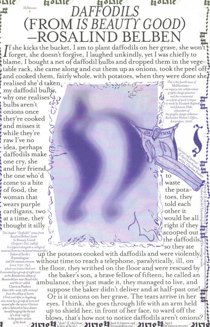
Cover of MsHeresies 4 — Daffodils

Rietlanden Women's Office

MsHeresies 4 — Daffodils

Elisabeth Rafstedt , Johanna Ehde

€10.00

This fourth issue of MsHeresies republishes the chapter *Daffodils* — a warped monologue about a domestic poisoning — from Rosalind Belben’s book Is Beauty Good (1989).

It is typeset alongside a collage of material from two medieval manuscripts: Isidore of Seville’s Etymologiae and De natura rerum (circa 1130–74), which was illuminated and transcribed by a group of eight nuns at the Benedictine abbey of Munsterbilzen in Maastricht; and the so called Claricia Psalter (late 12th–early 13th century) from the abbey of saints Ulrich and Afra in Augsberg, also made by a group of nuns and named after the novice Claricia who is believed to have drawn herself hanging like the tail of a drop-cap Q in the psalter section of the book.
recommendations

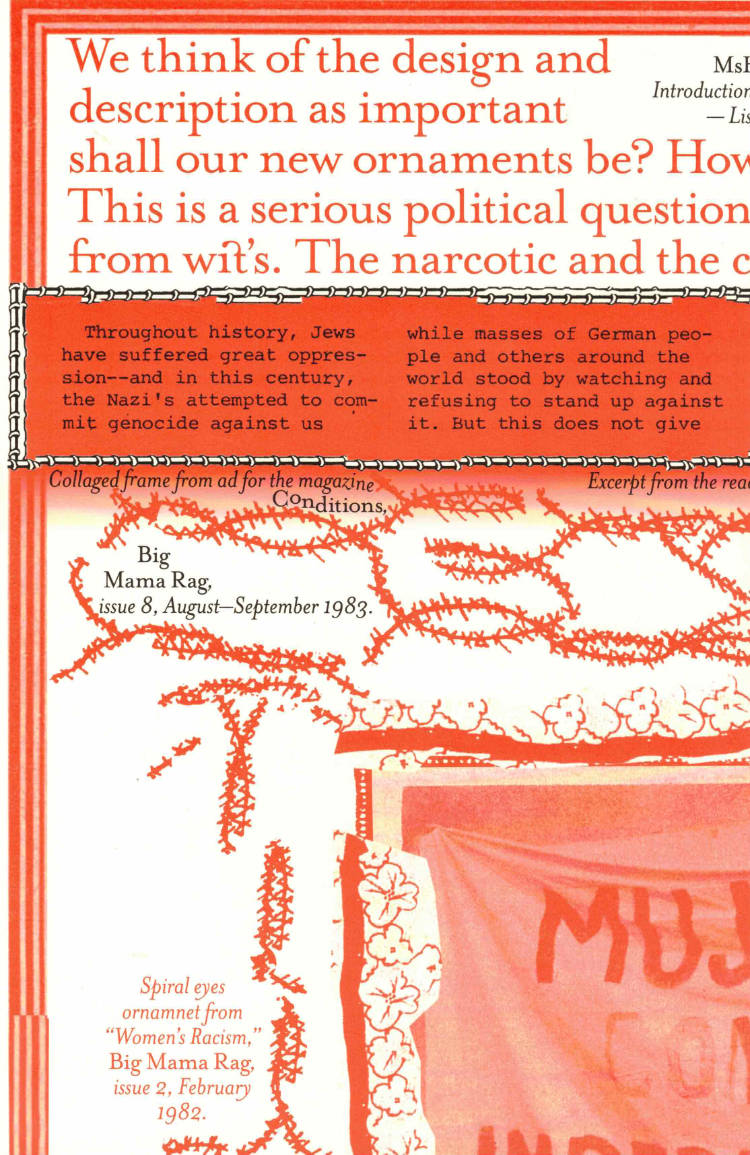
Cover of MsHeresies 6 — A Manager

Rietlanden Women's Office

MsHeresies 6 — A Manager

Caren Beilin

MsHeresies 6 publishes an edited chapter from Caren Beilin’s forthcoming novel Sea, Poison (New Directions, 2025). It is typeset together with reworked material from the archive of the Neapolitan feminist artist collective Le Nemesiache, active between 1969 and 1995.

Cover of Archival Textures - Posting

Archival Textures

Archival Textures - Posting

Carolina Valente Pinto, Tabea Nixdorff

The book Posting brings together a selection of feminist posters from Dutch archives to reflect on posting as an activist strategy, holding the potential to create counter-publics to mainstream culture and to fight against the erasure, exoticization, or tokenism of bodies and experiences that deviate from normative preconceptions.

As is the case for many professions, in the history of Dutch graphic design the absence of women, non-binary, queer, Black designers is striking. This doesn’t only point back to systematic processes of exclusion in the first place, but also to the biases at play regarding whose work is remembered and archived. While efforts have been made to add forgotten names to the existing canon, the many posters, flyers and other printed matter shelved in queer and feminist archives remind us to question the notion of single authorship altogether and instead study graphic design as a decisively collaborative and transdisciplinary practice, which is especially true for community-led and volunteer-based projects.

The posters featured in this book point to this rich landscape of feminist organizing, and were found at the International Institute of Social History and the International Archive for the Women’s Movement (IAV-Atria) in Amsterdam.

Cover of Dear Friend Catalogue 2019-2022

Lugemik

Dear Friend Catalogue 2019-2022

Ott Kagovere, Sandra Nuut

Dear Friend is a monthly letter format publication covering design events, issues, and ideas. This publication distributed via snail mail is initiated by Sandra Nuut and Ott Kagovere.

The publication edited by Sandra Nuut & Ott Kagovere features all the letters from the Dear Friend publishing project, which they initiated at the Graphic Design Department of the Estonian Academy of Arts in 2018. The book includes contributions by Singapore-based design writer Justin Zhuang, designer and writer Else Lagerspetz, and artist Lieven Lahaye. The book is designed by Ott Kagovere and published by Lugemik and Estonian Academy of Arts.

Texts by Justin Zhuang, Lieven Lahaye, Else Lagerspetz

Letters written by Alicia Ajayi, Stuart Bertolotti-Bailey, Claudia Doms, Nell Donkers, Maarin Ektermann, Rosen Eveleigh, Maryam Fanni, Saara Hannus, Eik Hermann, Paul John, Maria Juur, Ott Kagovere, Maarja Kangro, Arja Karhumaa, Kristina Ketola Bore, Nicole Killian, Rachel Kinbar, Tuomas Kortteinen, Keiu Krikmann, Kadri Laas, Else Lagerspetz, Lieven Lahaye, James Langdon, Jungmyung Lee, Kai Lobjakas, Michelle Millar Fisher, Maria Muuk, Sheere Ng, Sandra Nuut, Laura Pappa, Jack Self, Indrek Sirkel, Paul Soulellis, Triin Tamm, Laura Toots, Alice Twemlow, Loore Viires, Sean Yendrys, Justin Zhuang

Cover of Handwerk

Rollo Press

Handwerk

David Schatz, Philipp Herrmann and 1 more

Handwerk revives Berthold Wolpe’s early type design, originally called Wolpe Kursiv and cut in metal by Paul Koch in 1932. It first appeared in a 1936 craft symbol book featuring unique blackletter capitals. Due to persecution as a Jewish designer under the Nazi regime, Wolpe’s work faced delays and alterations and was finally released in 1952 in a modified form. Handwerk captures the original hand-lettered feel and includes stylistic sets that reference both the 1952 release and the original blackletter capitals, providing a historical perspective on Wolpe’s type design.

This Handwerk specimen is edited by Hammer (David Schatz & Sereina Rothenberger) with Philipp Herrmann and designed by Rietlanden Women’s Office. It accompanies the release of the same name font on www.outofthedark.swiss.

Cover of Girls Like Us #6 - Secrets

Girls Like Us

Girls Like Us #6 - Secrets

Jessica Geysel, Sara Kaaman and 2 more

A secret can be a private space for self-creation – or a shared site of pleasure.

We explore secrets in a plethora of forms and contexts. From layered accounts of mediaeval ecstasy to the unexplored sensory experience of smell. From camouflaged play to queer readings of astrological charts and the hidden history of house music. From a very analog point of view to the outskirts of the internet.

Cover of Every Day is A New Day: Calendar 2023

Verlag der Buchhandlung Walther König

Every Day is A New Day: Calendar 2023

Karel Martens

Dutch graphic designer Karel Martens (born 1939) has been an influential figure in the visual culture of the Netherlands for many decades. Alongside his commissioned projects, Martens has maintained a commitment to this personal and iterative way of printing, which shows how creative practice often spans perceived disciplinary boundaries.

For each day of this elegant 2023 calendar, Martens has created a unique abstracted form to serve as a number—originally constructed using his signature method of printing letterpress monoprints from found metal forms, which are then digitized to comprise 365 compositions in total. The piece’s reference to the daily practice of art expresses Martens’ own approach as a designer and educator: “every day is a new day.”