rile*books

Search books

Search books by title, author, publisher, keywords...

Cover of Unbound

Roma Publications

Unbound

Karel Martens

€39.00

‘Unbound’ accompanies Karel Martens’ first solo exhibition at the Stedelijk Museum Amsterdam, bringing together a wide-ranging body of work Martens made and collected over the entire span of his decades long career. Containing works from the show, collaged, overprinted, and juxtaposed with elements found around his studio, the book balances between being an artist book and a catalogue. This publication, thoughtfully designed by Jordi de Vetten and Susu Lee in close collaboration with Martens himself, functions as a handbook to his work. But it’s an unconventional one: unstructured, non-hierarchical, playful, personal, and associative.

Published in 2025 ┊ 216 pages ┊ Language: English

recommendations

Cover of 24 European Ethnographic Museums

Roma Publications

24 European Ethnographic Museums

Sara Sejin Chang

With the series '24 European Ethnographic Museums' Van der Heide questions the construction and identity of the ethnographic museum today. Here, the project becomes a collection of artefacts in and upon itself and by recording the names of these institutions Van der Heide places the viewer in front of the dilemma: who is authorized to decide what is an artefact, and what should be collected and for what reason? In the 19th century, with the birth of the current European nations, museums openly referred to their colonial past. Today the museums bare more euphemistic names like: ‘Museum der Kulturen’ or ‘World Museum’ but still place the West as the self-acclaimed center of the world.  The existence of the ethnographic museum, which is intertwined with the complicated and loaded colonial past, has been subject to contemporary criticism. While some of the European ethnographic institutions have attempted to come to terms with the past of their collections and their heritage, Van der Heide focuses upon how language continues to reflect the political present of the institutions.

Cover of Handwerk

Rollo Press

Handwerk

David Schatz, Philipp Herrmann and 1 more

Handwerk revives Berthold Wolpe’s early type design, originally called Wolpe Kursiv and cut in metal by Paul Koch in 1932. It first appeared in a 1936 craft symbol book featuring unique blackletter capitals. Due to persecution as a Jewish designer under the Nazi regime, Wolpe’s work faced delays and alterations and was finally released in 1952 in a modified form. Handwerk captures the original hand-lettered feel and includes stylistic sets that reference both the 1952 release and the original blackletter capitals, providing a historical perspective on Wolpe’s type design.

This Handwerk specimen is edited by Hammer (David Schatz & Sereina Rothenberger) with Philipp Herrmann and designed by Rietlanden Women’s Office. It accompanies the release of the same name font on www.outofthedark.swiss.

Cover of One Shape of the Language: Cyrillic Archives

San Serriffe

One Shape of the Language: Cyrillic Archives

Inna Kochkina

‘One Shape of the Language: Cyrillic Archives’ is an artist’s book documenting Inna Kochkina’s research into the history, style, and politics of traditional Cyrillic.

This research was born from Kochkina’s self-reflective curiosity about the relationship between cultural heritage and typography and evolved into an examination of the socio-political role of traditional Cyrillic. An ancient script, Cyrillic has been used to express various forms of cultural and territorial domination and continues to serve as an imperialist tool, having long been deployed in support of Slavic nationalism both in Russia and in the former USSR territories. 

This publication is the result of Kochkina’s own research into and engagement with archives of typography, as well as conversations with anti-colonial activists, artists, and historians who interrogate traditional Cyrillic and its relationship to colonial power. 

Alongside conducting scholarly research, Kochkina also produced drawings in response to archives of traditional Cyrillic. Making these drawings constituted a form of “studying by making.” With these efforts she has sought to construct an anti-colonial feminist narrative, employing both typographic artifacts and ‘patriarchal’ letterforms.

To make her drawings, Kochkina took samples from these low quality typographic archives, enlarging and transforming them into unexpected graphic shapes that were then recorded in a series of experimental prints. The drawing, collating and contact printing process that she followed allowed her to document and reveal the qualities lent to historical artifacts by digital noise. Through this working method she sought to rethink both the subject of her work as well as traditional approaches to type design practice. This book presents the prints in a roughly chronological sequence, poetically portraying Kochkina’s complex relationship with her native script. Variously precise, messy, and destructive, these works ultimately convey a series of “imaginary” shapes through which to reinterpret traditional Cyrillic of the past and present.

Cover of MsHeresies 4 — Daffodils

Rietlanden Women's Office

MsHeresies 4 — Daffodils

Elisabeth Rafstedt, Johanna Ehde

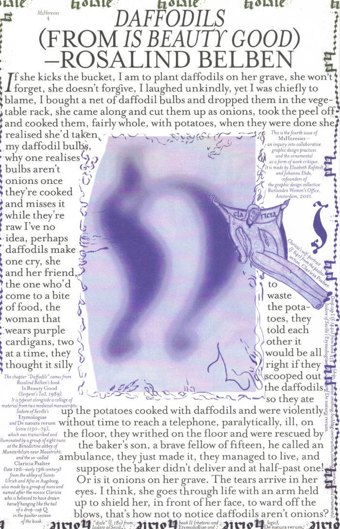
This fourth issue of MsHeresies republishes the chapter *Daffodils* — a warped monologue about a domestic poisoning — from Rosalind Belben’s book Is Beauty Good (1989).

It is typeset alongside a collage of material from two medieval manuscripts: Isidore of Seville’s Etymologiae and De natura rerum (circa 1130–74), which was illuminated and transcribed by a group of eight nuns at the Benedictine abbey of Munsterbilzen in Maastricht; and the so called Claricia Psalter (late 12th–early 13th century) from the abbey of saints Ulrich and Afra in Augsberg, also made by a group of nuns and named after the novice Claricia who is believed to have drawn herself hanging like the tail of a drop-cap Q in the psalter section of the book.

Cover of Radical Media Archive Vol 01

Permanent Files

Radical Media Archive Vol 01

Ramdane Touhami, Émile Shahidi

Do you remember the last time you were looking forward to the future? We're not talking about flying cars or floating screens. We're talking about a credible vision of a better time to come. So when was the last time? How did it look? How did it feel?

Have a glance at page 223, about two-thirds in. This is a portrait of Frantz Fanon by Milton Glaser. One of the biggest names in commercial graphic design of the 20th century, painting the likeness of the giant of anti-colonial thought. Let’s leave aside the question of "who's the Milton Glaser of today?" for now, but if there was one, whose portrait would they be painting?

What we’re attempting, in these few hundred pages, is to track our favorite examples of the visual language of revolt and solidarity in the 1960s and 1970s, put them in dialogue with our most beloved works of graphic design of those decades, and celebrate the heroes who made them. 
Creative currents flowing from Paris to Tokyo, Cuba to Milano, Beirut to New York, Berkeley to London, with innovations and revolutions (both political and artistic) happening every year. Causes supported by incredible talent and inspiring design that activated people, uplifted liberation movements, advanced the struggles for social justice, and created bonds of global solidarity.

Sadly this cross-pollination between commercial art and the political ended around the late 1980s and those two worlds are now completely isolated from one another.
Why do movements not produce beautiful and memorable visuals anymore? Why do the biggest image makers of today not lend their talents to the good fights that need their help? We hope that these will intersect again, and the first step is to study their history.Friends, we are here to tell you that fighting for a better world is, in fact, not only extremely cool, but the coolest thing you can do — and we have the images to prove it!

Ramdane Touhami and Émile Shahidi have spent years researching and traveling to assemble a huge collection of books, rare periodicals and radical art that will soon be available for consultation in person and online, and of which this little book is just a taste.

Cover of Image RIP: After Printing, Work & Planet Earth

Source Type

Image RIP: After Printing, Work & Planet Earth

Geoff Han

Image RIP, the first publication from Source Type, is centered around New York graphic designer Geoff Han’s investigation into the Shenzen-based printer Artron and explores subjects ranging from design, production, work, and the environment in the post-industrial economy. The book gathers essays by Danielle Aubert, David Bennewith, Geoff Han, Ming Lin, Shanzhai Lyric, David Reinfurt, Mindy Seu, and Dena Yago, and features images by Ann Woo. Image RIP reflects a consistent theme in Han’s practice of the manipulation of image reproduction, printing, production, code, and other techniques to affect the process of viewing and reading.