rile*books

Search books

Search books by title, author, publisher, keywords...

Cover of One And Many Mirrors: Perspectives On Graphic Design Education

Occasional Papers

One And Many Mirrors: Perspectives On Graphic Design Education

Brad Haylock ed. , Luke Wood ed.

€25.00

This ambitious book brings together a wide international selection of new and recent writing by educators and practitioners who question the rules and hierarchies of graphic design education today. It holds a vivid mirror up to the ways in which graphic design is imagined, taught, received, and reproduced. Edited by two designer-educators (Brad Haylock and Luke Wood), 'One and Many Mirrors' provides an urgent overview of the field of contemporary graphic design education for all those concerned with its past, present, and possible futures.

recommendations

Cover of Natural Enemies Of Books: A Messy History Of Women In Printing And Typography

Occasional Papers

Natural Enemies Of Books: A Messy History Of Women In Printing And Typography

Sara Kaaman, Maryam Fanni and 1 more

Natural Enemies of Books is a response to the groundbreaking 1937 publication 'Bookmaking on the Distaff Side', which brought together contributions by women printers, illustrators, authors, typographers, and typesetters, highlighting the print industry’s inequalities and proposing a takeover of the history of the book. Edited by feminist graphic design collective MMS, the publication includes newly commissioned essays and poems, conversations with former typesetters Inger Humlesjö, Ingegärd Waaranperä, Gail Cartmail, and Megan Downey, and reprints of the original book and other publications.

Cover of Import – Export, Friperie

Occasional Papers

Import – Export, Friperie

Mekhitar Garabedian

This book brings together a selection of photographs by artist Mekhitar Garabedian, documenting the warehouse of his late father’s company, Melantex, which exported second-hand clothing from Belgium to the Middle East, Asia, and Africa. The images inspired a one-year sculptural intervention by Garabedian, commissioned by the Antwerp Public Art Collection.

Import—Export, Friperie tells a compelling personal and collective story of how displacement can be turned into economic livelihood while creating connections between old and new homes, languages, and textiles.

The photographs are accompanied by an in-depth conversation between Garabedian and curator Samuel Saelemakers about the relationship between photography and sculpture, public representation, and diasporic thinking.

Cover of MsHeresies 4 — Daffodils

Rietlanden Women's Office

MsHeresies 4 — Daffodils

Elisabeth Rafstedt, Johanna Ehde

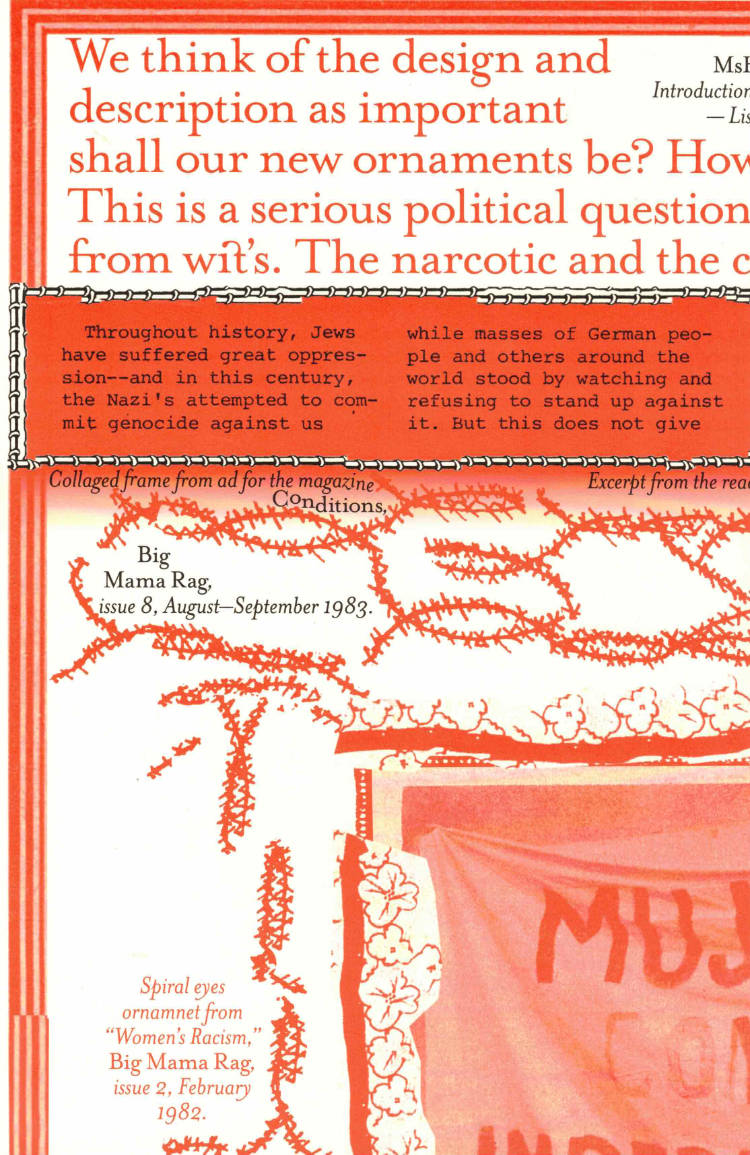
This fourth issue of MsHeresies republishes the chapter *Daffodils* — a warped monologue about a domestic poisoning — from Rosalind Belben’s book Is Beauty Good (1989).

It is typeset alongside a collage of material from two medieval manuscripts: Isidore of Seville’s Etymologiae and De natura rerum (circa 1130–74), which was illuminated and transcribed by a group of eight nuns at the Benedictine abbey of Munsterbilzen in Maastricht; and the so called Claricia Psalter (late 12th–early 13th century) from the abbey of saints Ulrich and Afra in Augsberg, also made by a group of nuns and named after the novice Claricia who is believed to have drawn herself hanging like the tail of a drop-cap Q in the psalter section of the book.

Cover of Ornamental Portal

The Palace of Typographic Masonry

Ornamental Portal

Rietlanden Women’s Office

The Palace of Typographic Masonry is an (imaginary) institute for the splendour and variety of visual languages. The Ornamental Portal informs the ornamental attitude of Rietlanden Women’s Office, the collective that designed this folding sheet for Von Wersin’s Kitchen. On the backside ‘The Redemptive Qualities Of Ornament’, a text by Dirk Vis, is printed. This iris printed sheet is send in a specific envelope depicting and describing the updated collection of Von Wersin's Kitchen.

Cover of Designing History - Documents and the Design Imperative to Immutability

Set Margins

Designing History - Documents and the Design Imperative to Immutability

Chris Lee

Essays €23.00

Moving beyond the usual genres of form in graphic design’s canonical history, ‘Designing History’ proposes a model centred on bureaucratic instruments of identity, ownership, value, and permission: money, passports, certificates, property deeds, etc. It considers the implications of a design history of the document, where the designer shifts from being a practitioner of conventional design histories to become subject and agency of bureaucratic authority. The book is a revised edition of ‘Immutable: Designing History’ (2022) and includes an extended essay that contextualizes the project as a remapping of graphic design’s historical, pedagogical, and practical assumptions.

Cover of Makulatur – 2010-2016

Bom Dia Books

Makulatur – 2010-2016

Manuel Raeder

A collection of misprinted sheets originating from books designed by graphic designer Manuel Raeder: a “behind the scene” project, which documents the early stage of book production and its conventions.

Makulatur, a German word that derives from lat. maculatura “something stained”, refers to misprinted paper that is discarded at the beginning of the printing process as use- and worthless. In 2010, the graphic designer Manuel Raeder started to collect and preserve misprinted sheets of all the publications he designed not only for his own publishing house Bom Dia Boa Tarde Boa Noite but also for fellow artists and institutions.

This waste paper that shows all difficulties arising in the early stage of production—trails, testy or stains—he combined to a new volume as a compilation of maculae “stains”. Thus, he dissolved the spoiled material from the realm of invisibility and displays it to the public whereby he reveals and reflects on the conventions of a book.

Graphic designer Manuel Raeder lives and works in Berlin.