rile*books

Search books

Search books by title, author, publisher, keywords...

Cover of Worry Thumb

Nieves

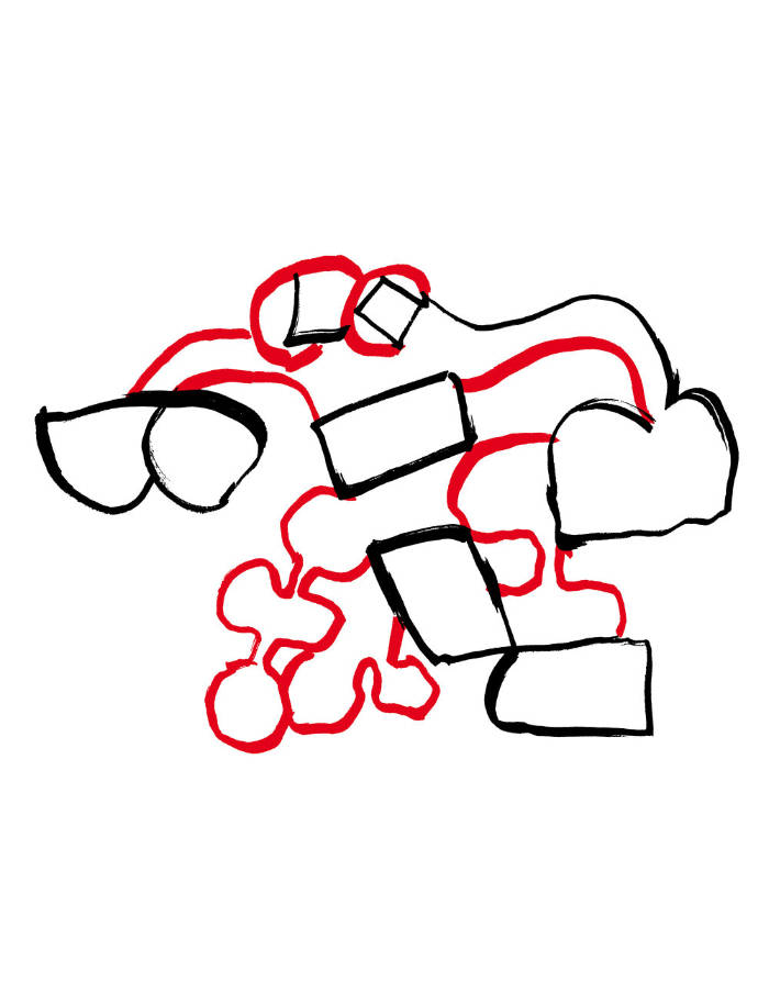
Worry Thumb

Espen Friberg , Marianne Røthe Arnesen

€16.00

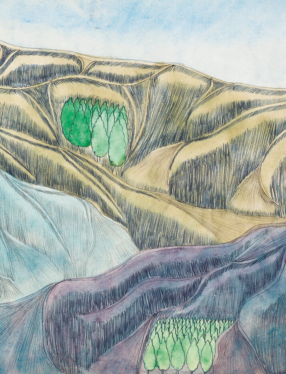
A glimpse into the garden—where worry, a lonely bird and others live—of EF+MRA, a collaborative drawing project that Norwegian artists Espen Friberg and Marianne Røthe Arnesen started together in 2014.

Espen Friberg (born 1981) is an artist and musician based in Hvitsten, Norway. He co-founded with Aslak Gurholt Rønsen the design studio Yokoland in the early 2000's.

Marianne Røthe Arnesen (born 1986) is a painter and illustrator based in Hvitsten, Norway. She is also 1/2 of EF+MRA, a collaborative drawing practice with Espen Friberg.

recommendations

Cover of Bodies in Scattered Light

Nieves

Bodies in Scattered Light

Andriu Deplazes

New series of paintings by the Swiss artist, that examine the role of humankind in nature and within its social fabric on a philosophical-anthropological level.

"I asked Andriu Deplazes if he had always wished to be a painter. No, he said. For a time, he had trained to be a classical musician, but turned away from music because there was something repellent about the need to demonstrate virtuosity. To be a virtuoso, as the moral world depicted in these paintings clearly shows, is not the same as having virtue. And yet, at the same time, there are still traces of virtuosity in Deplazes' practice: in the idealised landscapes that he renders, and in the easy depiction of animal life. It is only humans that he will not denigrate with such perfection. Their overpainted faces do not allow them to be captured as things, but rather present them as subjects. They elude categorisation because they are responding, in real time, to what they see in us." Adam Jasper

Born 1993 in Zurich, Andriu Deplazes lives and works in Zurich, Brussels and Marseille. His paintings create a kind of parallel cosmos that questions the habitual ways of seeing and expectations of the beholder. Wide landscapes in colourfully powerful large format are the setting for curious characters who sometimes melt into the vegetation around them or appear strangely remote from it. His work has been exhibited throughout Europe since 2015.

Cover of Pictograms

Nieves

Pictograms

Warja Honegger-Lavater

A previously unpublished collection of 60 ink pictograms, drawn between 1976 and 1996, originally printed individually as A2 plane prints.

An early progenitor of the artist's book genre, Warja Honegger-Lavater was born in Winterthur, Switzerland in 1913. She worked as an illustrator for the magazine Jeunesse from 1944-1958, and moved to New York shortly thereafter where she began a wonderful series of artist's books. 
These books were published between 1962 and 1971, an exceptionally ripe time for artists to turn to the bookform, a time when the most often cited "first" artist's book also appeared, Twentysix Gasoline Stations (1962) by Ed Ruscha.

All of Honegger-Lavater's books are made using the accordion-fold binding. Her aesthetic has been aptly described as "very clean, very Swiss." Each book tells a story, sequentially, like traditional books, but varying from them by rarely using words. Instead she chooses a symbol to represent, for example, a character, as in the red dot standing in for Red Riding Hood in Little Red Riding Hood.

Cover of Aube

Nieves

Aube

Caroline Bachmann

Painting €10.00

Caroline Bachmann's dawn paintings.

Caroline Bachmann's paintings owe as much to turn-of-last-century Symbolism—in their attempt to depict an infinite stillness, whose synthetic depiction of nature could be mistaken for that of eternity—as to plein air painting. The artist lives and works on the shore of Lake Geneva, where she spends hours contemplating the scenery, recording with a lead pencil on paper minute details of atmospheric events, making notes in the margins of subtle colour changes—not unlike comic book colourists of the pre-digital age, whose job it was to pass on to engravers written codes corresponding to the 64 possible combinations of percentages of cyan, magenta, yellow and black at their disposal. Back in the studio, the paintings are then built up over a lengthy period of time with translucent glazes of oil paint.

Cover of Mille Feuilles

Nieves

Mille Feuilles

Ingo Giezendanner

Ingo Giezendanner's wild herbarium.

Density in the foliage, branching of the tree, structure in the bark: this book is entirely dedicated to organic, wild-growing greenery, mostly in black and white, but patterns emerge, the leaves become a frenzy, and grimaces from the thicket smile at us. The volume is deliberately overwhelming, making it impossible to get an overview. Rather this thick paperback serves as a reference for untamable, rampant, sprawling kraut.

Since 1998, Ingo Giezendanner, alias GRRRR, has been documenting the urban spaces in which he has travelled and lived. Apart from his native city of Zurich, his travels have taken him to diverse cities from New York and New Orleans to Cairo, Nairobi, Karachi and Colombo. Everywhere he travels, he captures his surroundings on location with pen on paper. His drawings have been presented in numerous magazines, books and animated films as well as in spacious installations and wallpaintings.

Cover of poussière de seum

Self-Published

poussière de seum

Ethan Assouline

“the following text was written in July 2024 in St Imier, Switzerland.
it's a fragment of Lettres à Bébé, a book I've been writing for some time in which I - Ethan - find myself helping and communicating by letter with a Marxist Baby whose political project is not to grow up so as not to become a tool of Capital. While he develops his project and tells it to me, I live my life and tell it too, observing and commenting on the ignoble state of the world, its language, its architecture, managing my heartbeat, meeting people, working, fucking, eating (...)”. - Ethan Assouline

Published by La Dépendance, St imier (2024)

Cover of 4 Basic Kinds of Lines & Colour

Printed Matter

4 Basic Kinds of Lines & Colour

Sol Lewitt

On occasion of the Book as System exhibition, we are thrilled to publish a facsimile reprint of Sol LeWitt’s iconic Four Basic Kinds of Lines & Colour, co-published Printed Matter, Inc. & Primary Information.

Published in 1977 by Lisson Gallery, Studio International, and Paul David Press, the 34 page staple-bound book is an early example of LeWitt’s rigorous, algorithmic process in which a set of rules is run through its permutations to generate corresponding images. First in overview and then in detail, the publication sets down all possible combinations in overlaying four basic lines (vertical, horizontal, right-facing diagonal, left-facing diagonal) followed by a distinct combinatory system of four basic colors (yellow, black, red, blue).

Each spread is composed of these two parallel systems played out one at a time, with escalating line combinations on the left hand side and corresponding color combinations on the right. LeWitt’s Four Basic Kinds of Lines & Colour (1977) followed the publication of Four Basic Kinds of Straight Lines (Studio International, 1969) and Four Basic Colours and their Combinations (Lisson Gallery, 1971), and serves as a kind of synthesis of the two systems described in those earlier volumes.

Published by Printed Matter, Primary Information, 34 pgs, 20 × 20 cm, Softcover

Cover of Human Pelvis, Bitter Radish

Reliable Copy

Human Pelvis, Bitter Radish

Leone Contini

This publication features a project by Leone Contini looking into the canned food available during the war of Caporetto in 1917 and especially its iconography. It brings together an essay by the artist along with reproductions of a selection of his drawings.

Leone Contini (born 1976 in Florence) studied philosophy and cultural anthropology at the University of Siena. His research unrolls at the intersection of anthropology, aesthetics and politics and his mediums include lecture-performances, collective interventions in public spaces, textual and visual narratives, drawings. His research is focused on intercultural frictions, conflict and power relations, displacement, migrations and diasporas, aiming to investigate, to question and to re-shape identity patterns and power relations.

Cover of What does an oracle look like?

Leaky Press

What does an oracle look like?

Perri MacKenzie

What does an oracle look like? gathers essays and drawings made by Perri MacKenzie between 2020 and 2024, themed loosely around pottery painting and vocal expression. The drawings, rendered in splashy India ink and collage, range from expressive sketches to theatrical still lives and experimental bandes dessinées. The book presents for the first time the essay Cathedral. Part memoir, part literary/sonic investigation, it meditates on the vocal texture of a Hollywood actor.

Designed by Ilke Gers.