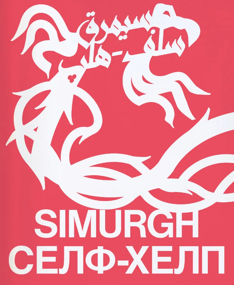
rile*books

Search books

Search books by title, author, publisher, keywords...

Cover of Oei

Posture Editions

Oei

Guy Rombouts

€36.00

‘Oei’ is the title of a notebook that Guy Rombouts (b. 1949) filled from front to back with the word ‘oei’, during a week in the month of July in the year 1976. 
(‘oei’ [uj] is a Dutch-language interjection uttered to express a spontaneous reaction to an unexpected occurrence. [The closest English equivalent would be ‘ouch’.])
Weaving this word as one long stream of thought through the pages of the book under ever-changing guises creates a primal litany in which mistakes are sung over and over again in all their impossibility.
The facsimile of the notebook ‘oei’ is published in full and full size as Posture Pockets N° 3.

‘Oei’ is also the title of the one-room exhibition at Ghent’s S.M.A.K. (31.03-14.05.2023) in which the artist bridges the early beginnings of his practice and transforms this wondrous word into a total installation.

According to Rombouts, direct communication is not possible through our language and consequently some feelings cannot be expressed. Therefore, from the 1960s onwards, he started looking for systems in which form and content could coincide as much as possible. 
At the beginning of the 1980s, the acrophonic (the sound of the initial letter) Rombouts font was put on paper, where words could literally take shape again. In 1986, he and his life companion and artistic partner Monica Droste (1958-1998) renamed the intersectionless Rombouts script AZART, among other things an old French spelling of the word ‘hazard’ and also a reference to the Russian word ‘azart’ that stands for ‘in the fire of the game’.

Language: English

recommendations

Cover of sawing a plank is like going for a walk

Posture Editions

sawing a plank is like going for a walk

Kato Six

With texts by Phillip Van den Bossche, Filarowska and a conversation between Eva Wittocx and the artist (NL/EN)


Nº 48 / October 2022

sawing a plank is like going for a walk by Kato Six (b. 1986) is published on the occasion of Kato’s solo exhibition at M Leuven this autumn. This book encapsulates 10 years of her quest as an artist.


The work of Kato Six (b. 1986) balances between abstract and figurative art. She works on different themes which she develops into series or ensembles. Architecture, design, domesticity and utensils all act as important references. Starting there, she uses recognisable and everyday materials such as MDF, stone, plastic or textiles.
Kato wants to question certain affinities and let the viewer look at familiar objects or images from a different perspective. As a viewer, you feel connected to the object or image but the actual meaning or function no longer applies.

Some of my works refer to the domestic, especially the most recent ones, such as ‘Carpet Beater Carpet’ and ‘Striped Knitwear’. The invisible work done by “housewives”, but also by workers or maintenance staff, is certainly one of the themes addressed in ‘Carpet Beater Carpet’. The above works are textile works, created with so-called “soft skills”. In the arts, these “soft skills” are often attributed to female artists — women often being assigned a certain medium.
Kato Six in conversation with Eva Wittocx in “sawing a plank is like going for a walk”

Cover of EN

het balanseer

EN

Guy Rombouts

Poetry €25.00

In het begin van de jaren 1970, hield Guy Rombouts een notaboekje bij waarin hij alle woorden, bijvoeglijk naamwoorden en werkwoorden bijhield die hij tegenkwam tijdens het lezen en die met elkaar verbonden waren door het voegwoord ‘en‘.

Ongeveer 50 jaar later en met de hulp van de grafische vormgever Jeroen Wille, is de transcriptie van zijn aantekeningen gepubliceerd als een boek dat gelezen kan worden in twee richtingen (en als enige boek coronaproof met twee tegelijkertijd).

Het boek bevat 2158 verzen met in totaal 4316 EN-combinaties.

De kortste verzen met evenveel letters:

A EN Z

4 EN 6

De langste verzen met evenveel letters:

ONUITSPREKELIJKHEDEN EN IMPONDERABILIA

ONEVENWICHTIGHEID EN ZELFOVERSCHATTING

Cover of TIME

Inpatient Press

TIME

Spencer Longo

TIME by Spencer Longo is a collection of printed work depicting government raids, religious visions, environmental catastrophe, and extremist fundamentalism tangled together in a narrative web of salvation, annihilation, and transcendence. Using pen plotter graphics directly on uncollated pages of Time magazine, Longo explores the conspiratorial trope that messages are secretly embedded in mass media, coaxing our millenarian anxieties out through an additive printing process using graphics from survivalist publications, end-times evangelical cartoons, and marginalia from the borders of underground occult material, all sprinkled with ecstatic bursts of star-spangled clipart. A must-have for your fallout shelter's library.

Cover of Fia Backström: COOP: A-Script

Primary Information

Fia Backström: COOP: A-Script

Fia Backström

Performance €18.00

COOP documents Swedish artist Fia Backström's (born 1970) performances of two recent scripts, continuing her exploration of language, marketing, disorders and performance. The first script operates according to two distinct logics: a four-part linear base structure and text material that was chosen and read during the performance through chance movement of the performer's body across a grid.

This publication was especially designed to reflect this type of unpredictable and spontaneous movement. Mathematical symbols have been embedded into the text and these symbols link to ones on the upper corner of pages with nonlinear material. These indicate where the text could be inserted during a performance, thus incorporating the form of performance into the book. The second script serves as an epilogue to the first and was performed by four voices, reading from beginning to end without assigned lines, sometimes simultaneously.

Cover of Emil Lime

Museo Ca2m

Emil Lime

Esther Gatón

Emil Lime collects various materials that nurture and give shape to Esther Gatón’s artistic practice, including collages made with her phone pics, sketches, sporadic notes and drawings, together with the writing of authors that have been influential on the work: Fredy Massad, María Fernanda Ampuero, Darya Diamond and Cory John. 

Cover of Catalog Issue 21 — 'Impressed'

Cataloging

Catalog Issue 21 — 'Impressed'

Lieven Lahaye

Catalog is a serial publication about cataloging written by Lieven Lahaye and designed by Ott Metusala. This is Catalog issue 21, ‘Impressed’, it’s part of a sub-series on near invisibility. Published on the occasion of the exhibition ‘Dear Friend’ at EKA Gallery, Tallinn in September 2022. This issue of Catalog was produced during a residency period at Air Berlin Alexanderplatz, May-August 2022.

Cover of Evol/Love

Self-Published

Evol/Love

Nibor Traaw

Evol/Love is a project in three parts: a billboard series, installation and publication connecting 160 subtitled movie stills that all contain the word Love.

A collage of voices and definitions arranged in alphabetical order, from ‘Love is where you find it’ (A: A Date with Judy, US 1948, 00:22:37) to ‘But even if it’s a little late, love has a way of coming back to you’(Y: Yeonae/Love is a Crazy Thing, KR 2005, 01:38:02), but read backwards to sound like its antonym: evil.

Self-published: Stichting Mei, Amstelveen, NL 2020
19,6 x 19,6 x 2,3 cm
200 pages, 160 images
Japanese bound, buckram cover with flaps
Offset on pink paper (interior), screenprinted buckram (cover)

Graphic Design Vilmantas Žumbys, Vilnius

Edition of 666 copies