rile*books

Search books

Search books by title, author, publisher, keywords...

Cover of A Rare Gift of the Tropics

Nieves

A Rare Gift of the Tropics

General Idea

€14.00

A series of viral drawings by Jorge Zontal, signed General Idea, printed in 5 color offset.

Living and working together as part of the late 1960s Toronto counterculture, AA Bronson, Felix Partz, and Jorge Zontal formalized their collaboration in 1969 as a single entity known as General Idea. From their earliest projects like staging of The 1970 Miss General Idea Pageant to their late activist initiatives around the AIDS crisis, General Idea explored multimedia, conceptual, and performance work as a tool for engaging with common culture and its repressions.

Less well-known are the group's drawings, the vast majority of which have never been seen. The drawings shown in A Rare Gift of the Tropics were all produced by Jorge Zontal, who made them as a habitual practice during the group's brainstorming meetings; however, given General Idea's mandate for co-authorship (and as demonstrated by the "GI" signature affixed by Zontal shortly before his death) as well as the circumstances under which they were executed, they are considered to be collaborative. The drawings assumed a greater regularity after 1985, the year the group left Toronto, which felt increasingly isolated from the global art world, for New York. As the 1980s wore on, their early joie de vivre was tempered by the pervasive presence of AIDS. In Bronson's words, it was a period "during which we had to face and somehow incorporate the illness and death of most of our friends, as well as Jorge and Felix themselves."

Although drawn by hand, the repetition of specific motifs follows a logic that is akin to General Idea's own penchant for mass reproduction and that echo the virality of their AIDS works. In their mutability and insistent flow, the drawings are a fascinating window into General Idea's distinct artistic vision and unique notions of authorship, exposing representation's inadequacy while acknowledging its urgency.

recommendations

Cover of Aube

Nieves

Aube

Caroline Bachmann

Painting €10.00

Caroline Bachmann's dawn paintings.

Caroline Bachmann's paintings owe as much to turn-of-last-century Symbolism—in their attempt to depict an infinite stillness, whose synthetic depiction of nature could be mistaken for that of eternity—as to plein air painting. The artist lives and works on the shore of Lake Geneva, where she spends hours contemplating the scenery, recording with a lead pencil on paper minute details of atmospheric events, making notes in the margins of subtle colour changes—not unlike comic book colourists of the pre-digital age, whose job it was to pass on to engravers written codes corresponding to the 64 possible combinations of percentages of cyan, magenta, yellow and black at their disposal. Back in the studio, the paintings are then built up over a lengthy period of time with translucent glazes of oil paint.

Cover of Pictograms

Nieves

Pictograms

Warja Honegger-Lavater

A previously unpublished collection of 60 ink pictograms, drawn between 1976 and 1996, originally printed individually as A2 plane prints.

An early progenitor of the artist's book genre, Warja Honegger-Lavater was born in Winterthur, Switzerland in 1913. She worked as an illustrator for the magazine Jeunesse from 1944-1958, and moved to New York shortly thereafter where she began a wonderful series of artist's books. 
These books were published between 1962 and 1971, an exceptionally ripe time for artists to turn to the bookform, a time when the most often cited "first" artist's book also appeared, Twentysix Gasoline Stations (1962) by Ed Ruscha.

All of Honegger-Lavater's books are made using the accordion-fold binding. Her aesthetic has been aptly described as "very clean, very Swiss." Each book tells a story, sequentially, like traditional books, but varying from them by rarely using words. Instead she chooses a symbol to represent, for example, a character, as in the red dot standing in for Red Riding Hood in Little Red Riding Hood.

Cover of Mille Feuilles

Nieves

Mille Feuilles

Ingo Giezendanner

Ingo Giezendanner's wild herbarium.

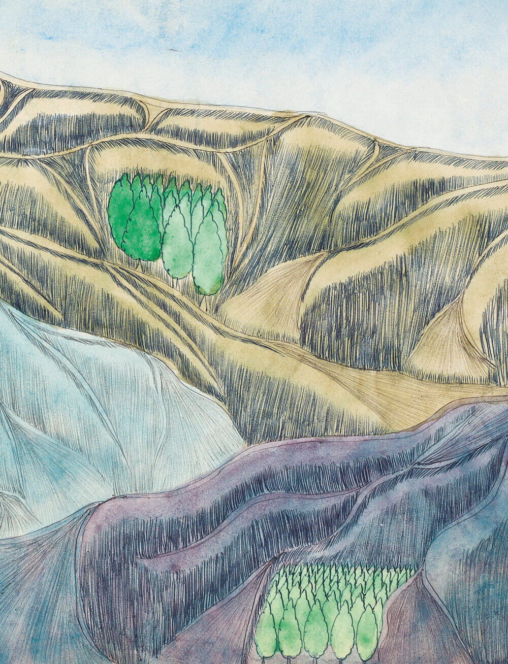
Density in the foliage, branching of the tree, structure in the bark: this book is entirely dedicated to organic, wild-growing greenery, mostly in black and white, but patterns emerge, the leaves become a frenzy, and grimaces from the thicket smile at us. The volume is deliberately overwhelming, making it impossible to get an overview. Rather this thick paperback serves as a reference for untamable, rampant, sprawling kraut.

Since 1998, Ingo Giezendanner, alias GRRRR, has been documenting the urban spaces in which he has travelled and lived. Apart from his native city of Zurich, his travels have taken him to diverse cities from New York and New Orleans to Cairo, Nairobi, Karachi and Colombo. Everywhere he travels, he captures his surroundings on location with pen on paper. His drawings have been presented in numerous magazines, books and animated films as well as in spacious installations and wallpaintings.

Cover of Bodies in Scattered Light

Nieves

Bodies in Scattered Light

Andriu Deplazes

Painting €16.00

New series of paintings by the Swiss artist, that examine the role of humankind in nature and within its social fabric on a philosophical-anthropological level.

"I asked Andriu Deplazes if he had always wished to be a painter. No, he said. For a time, he had trained to be a classical musician, but turned away from music because there was something repellent about the need to demonstrate virtuosity. To be a virtuoso, as the moral world depicted in these paintings clearly shows, is not the same as having virtue. And yet, at the same time, there are still traces of virtuosity in Deplazes' practice: in the idealised landscapes that he renders, and in the easy depiction of animal life. It is only humans that he will not denigrate with such perfection. Their overpainted faces do not allow them to be captured as things, but rather present them as subjects. They elude categorisation because they are responding, in real time, to what they see in us." Adam Jasper

Born 1993 in Zurich, Andriu Deplazes lives and works in Zurich, Brussels and Marseille. His paintings create a kind of parallel cosmos that questions the habitual ways of seeing and expectations of the beholder. Wide landscapes in colourfully powerful large format are the setting for curious characters who sometimes melt into the vegetation around them or appear strangely remote from it. His work has been exhibited throughout Europe since 2015.

Cover of TIME (edition)

Inpatient Press

TIME (edition)

Spencer Longo

TIME by Spencer Longo is a collection of printed work depicting government raids, religious visions, environmental catastrophe, and extremist fundamentalism tangled together in a narrative web of salvation, annihilation, and transcendence. Using pen plotter graphics directly on uncollated pages of Time magazine, Longo explores the conspiratorial trope that messages are secretly embedded in mass media, coaxing our millenarian anxieties out through an additive printing process using graphics from survivalist publications, end-times evangelical cartoons, and marginalia from the borders of underground occult material, all sprinkled with ecstatic bursts of star-spangled clipart. A must-have for your fallout shelter's library.

Cover of 4 Basic Kinds of Lines & Colour

Printed Matter

4 Basic Kinds of Lines & Colour

Sol Lewitt

On occasion of the Book as System exhibition, we are thrilled to publish a facsimile reprint of Sol LeWitt’s iconic Four Basic Kinds of Lines & Colour, co-published Printed Matter, Inc. & Primary Information.

Published in 1977 by Lisson Gallery, Studio International, and Paul David Press, the 34 page staple-bound book is an early example of LeWitt’s rigorous, algorithmic process in which a set of rules is run through its permutations to generate corresponding images. First in overview and then in detail, the publication sets down all possible combinations in overlaying four basic lines (vertical, horizontal, right-facing diagonal, left-facing diagonal) followed by a distinct combinatory system of four basic colors (yellow, black, red, blue).

Each spread is composed of these two parallel systems played out one at a time, with escalating line combinations on the left hand side and corresponding color combinations on the right. LeWitt’s Four Basic Kinds of Lines & Colour (1977) followed the publication of Four Basic Kinds of Straight Lines (Studio International, 1969) and Four Basic Colours and their Combinations (Lisson Gallery, 1971), and serves as a kind of synthesis of the two systems described in those earlier volumes.

Published by Printed Matter, Primary Information, 34 pgs, 20 × 20 cm, Softcover

Cover of Tot Zines #1

Self-Published

Tot Zines #1

Sarah Mayer

TOT ZINES collaborates with local artists in Antwerp, Belgium. Initiated by Sarah Stone in 2024, who invited digital creator Sarah Mayer to publish her set of paintings zing that she created in 2017. This is the first publication for TOT ZINES, RISO-printed by SO-RI in Antwerp.

Cover of Aisopika Aesopica

Ariel Ink

Aisopika Aesopica

Rūta Junevičiūtė

The bilingual book ‘Aesopica’ documents and extends Rūta Junevičiūtė’s research on the Aesopian language and the influence of political censorship to contemporary collective body, first presented in 2020 as the eponymous solo exhibition at the National Gallery of Art and as a permanent outdoor installation at the Rupert Art Center, Vilnius. 

Taking as a starting point the historical phenomenon of Aesopian language, which was widespread in Lithuanian culture during the Soviet era, and in parts of the Russian Empire as early as the 19th century, Junevičiūtė aims to investigate the interrelationship between generations, the gray zones of collective identity creation and the processes of (un)censoring the archives of our bodies.

Aesopian language – a term coined after Ancient Greek fabulist Aesop (gr. Aísōpos), is a type of cryptic communication system, where a text has several layers of meaning often contradictory to each other and which seek to convey official and subversive hidden meanings simultaneously. It is usually employed under conditions of omnipresent state censorship to communicate officially forbidden or taboo subjects and opinions. As a system it contains three members – an author, a censor, and a reader. It uses various modes of circumlocution and euphemisation, innuendo and poetic paraphrasing, which can also be seen as an aesthetic style. It has been advocated for artistic benefits as poetics of omissions, concealment, and travesty. On the other hand, it has been criticized as a sign of conformity and humiliation. In Lithuania, after the fall of the Soviet Union, it has been popularly regarded as a position of dissent, but such an interpretation received criticism from contemporary scholars. “Such a mode of expression is probably as old as censorship itself” – a historian told us.

Text contributors: Alfonsas Andriuškevičius, Edgaras Gerasimovičius, Rūta Junevičiūtė, Goshka Macuga, Anastasia Sosunova, Grėtė Šmitaitė, Tomas Venclova, Ana Vujanović

Language editors: Dangė Vitkienė, Aira Niauronytė, Gemma Lloyd

Translators: Alexandra Bondarev, Erika Lastovskytė, Justinas Šuliokas, Mantė Zagurskytė-Tamulevičienė, Aistis Žekevičius.

Illustrations: Rūta Junevičiūtė.